$35K MRR bootstrapped, 23 screens, and the cat you named on screen 3
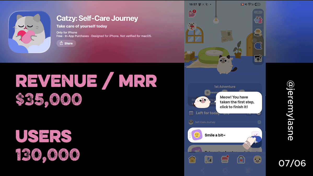
Catzy is a bootstrapped self-care app built by Chongqing niruo Technology, doing $35K MRR with 100K+ downloads and a 4.9-star App Store rating. Users describe it as Finch but more polished. Their onboarding runs 23 screens. The cat mascot is always animated and always present, reacting to every answer. The user names it on screen 3. Permissions, personalization, and email capture are alternated so they never stack into a permission wall. CBT science facts appear mid-flow as authority signals. A before/after screen shows the user's projected transformation. A commitment contract appears before the first to-do list taste. The paywall is a 49% off pop-up before a weekly pricing screen. Skipping brings you into the app -- where the paywall nudge reappears constantly. This is the full breakdown.
The Numbers
- MRR: $35K (bootstrapped, no VC)
- Total downloads: 100K+
- App Store rating: 4.9 stars
- Onboarding screens: 23
- Mascot: always-animated interactive cat
- Exercises: CBT-based
- Paywall structure: 49% pop-up → weekly plan → aggressive in-app nudging
- Category: self-care, described by users as Finch's more polished successor
The Finch Comparison: Why It Matters
Catzy is almost never discussed without Finch coming up. Users who found it describe it the same way: I loved Finch, they got greedy, I found Catzy, it's better.
Finch does $30M ARR. Catzy does $35K MRR. The comparison is not about scale. It is about what happens when a category leader slips and a well-executed alternative is waiting.
Catzy's cat mascot reacts to your mood inputs, offers comfort and suggests exercises -- which is exactly what Finch's bird does, but with a cat and more polished detail. The outfits are more creative. The interior design of the virtual home is more elaborate. The UI loads faster. The free tier is more generous.
Catzy does not try to be different from Finch. It tries to be the same thing, done better. And for a bootstrapped team, that is a coherent and executable strategy that is producing $35K MRR and growing. The onboarding is where the execution gap shows most clearly.
The Full Catzy Onboarding Breakdown
Screen 1: the cat. Always the cat.
Catzy does not open with a value proposition, a feature list, or a social proof wall. It opens with the cat.
The mascot is present from the first frame and never leaves. It is not a character that appears at emotional checkpoints, the way Finch's bird or BitePal's raccoon do. It is a constant presence: watching, reacting, animating, responding. Every screen the cat is there.
This is the most committed mascot execution in the series. Where other apps use the mascot as a punctuation mark between onboarding beats, Catzy makes it the sentence itself. The cat is not a branding element. It is the onboarding experience. Without it, there is no Catzy.
The soft pastel color palette reinforces this. Lavender, peach, cream, mint. Every visual choice signals the same thing: this is a gentle space. You are safe here. Nothing will be scary or loud.
That tone matters. The Catzy user is typically managing anxiety, low mood, sleep issues, or stress. A clinical interface would create resistance. A pastel cat that blinks at you while you answer questions creates exactly the opposite: the sense that this app already understands how you feel.
Name the cat on screen 3: the fastest ownership creation in the series
Before the user has answered three questions, Catzy asks them to name the cat.
This is the most compressed ownership creation in any onboarding in the series. BitePal takes 20 screens to get you attached to the raccoon. Finch walks you through a full personality selection. Catzy gives you a name field on screen 3 and lets the rest follow from there.
The mechanism is identical to every other mascot-naming flow in the series: naming creates ownership, ownership creates responsibility, responsibility drives retention. But the timing is more aggressive. Catzy bets that the user will name the cat before they have invested much time, and that the name alone is enough to establish the bond that makes everything after feel personal.
You'll have a pet kitten of your own, but to take care of it, you first need to take care of yourself. By completing goals, you earn cat coins to buy food and outfits for your kitten. Users report staying hydrated every day just to buy their kitten food. That is not a feature. That is a named relationship producing a daily behavioral habit. It starts on screen 3.
Permissions alternated with personalization: no permission wall
Catzy collects: notification permission, email, and account creation. Three friction points that, if stacked consecutively, would feel like a bureaucratic wall.
Instead, Catzy alternates them with personalization questions throughout the flow. A question about sleep quality. An emotion-check about current stress level. Then: notification timing. Another question about goals. Then: email. More personalization. Then: account.
The user is never aware they have given three permissions because each one arrived inside a conversation, not inside a permission sequence. This is the most sophisticated permission architecture in the self-care category. It produces higher opt-in rates than stacked requests because the user's mental state when each prompt appears is "I am being understood" not "I am being asked for things."
The practical comparison: Prayer Lock stacks its three permissions in a row immediately after the commitment signature, betting on momentum from the yes state. Catzy distributes them across the entire flow, betting on sustained goodwill. Both work. Catzy's approach is gentler and more appropriate for a mental health context where trust is the core product.
CBT science drops mid-flow: authority between the cute
Catzy is CBT-based. Cognitive behavioral therapy underpins every exercise, reflection prompt, and mood tracking feature in the product. The onboarding makes this explicit through science fact screens interspersed with the personalization questions.
"CBT-based techniques reduce anxiety symptoms in 67% of participants within 12 weeks." Shown between two questions about the user's stress patterns. Not at the start where it would feel like a credential presentation. Mid-flow, where it lands as a confirmation that the app is backed by real science, not just soft aesthetics.
This is Flo's medical authority layer, applied to a mental health context. Flo uses doctor-reviewed content screens. Catzy uses published statistics. Both serve the same function: between questions about the user's most intimate experiences, a signal appears that says people who built this know what they are doing.
For a bootstrapped app with no institutional backing, the CBT framing is the most efficient trust signal available. It costs nothing to implement and it separates Catzy from the dozens of cute wellness apps that have no scientific grounding whatsoever.
Before/after screen: your projected transformation
After the personalization questions, Catzy shows a before/after visualization. This is you now: anxious, low energy, difficulty sleeping. This is you in four weeks with daily practice: calmer, more focused, better rested.
The visualization is not statistical like Oniri's projection graph or animated like Cal AI's plan generation. It is comparative and emotional -- two states, described in the user's own terms from the personalization answers, with the app positioned as the bridge between them.
The before/after screen is the most direct form of outcome visualization in onboarding. No future projection date. No animated graph. Just: here is the problem you told us you have, and here is where you will be if you show up consistently. The cat is in both states, reflecting the user's journey.
The mechanism is the same as every outcome screen in the series: make the paywall feel like the price of the transformation, not the price of a subscription. By the time the paywall appears, the user is not evaluating features. They are evaluating whether they want the second image.
Commitment: a contract, not a gesture
Before the first to-do list taste, Catzy presents a commitment screen. Not a tap. Not a hold. A written agreement: "I commit to caring for myself every day." Terms displayed. User agrees.
This is closer to Prayer Lock's signature than to Liftoff's hold gesture. It is verbal and deliberate rather than physical. The soft pastel design makes it feel like a gentle promise rather than a legal document. But the behavioral science is the same: a written commitment to a stated intention produces measurably higher follow-through than a passive screen interaction.
The commitment lands in a mental health context differently than in a gym app. A person managing anxiety who commits to daily self-care is not making a performance promise. They are making a self-compassion promise. The emotional weight of that commitment, in a space designed to feel safe, is higher than the equivalent gesture in Liftoff's competitive gym context.
The first to-do list: product taste in one screen
After the commitment, Catzy shows a quick first to-do list. Three simple tasks. The cat reacts to each completion with an animation. Done in under 60 seconds.
This is the mandatory first-use mechanic from PictureThis and Prayer Lock, executed in one screen rather than a full session. The user does not need to find a plant or say a prayer. They tap three checkbox items. The cat celebrates each one.
The purpose is identical to every first-use screen in the series: the paywall should appear after the user has done the thing, not before. After completing three tasks and watching the cat react with joy, the user is not a person evaluating whether to download a self-care app. They are a person who just took care of themselves for 60 seconds. The paywall asks them to keep doing that. That is a different question than "will you subscribe to this?"
Review ask: while the cat celebrates
Immediately after the first task completions, Catzy asks for a review. The cat is still animating. The user just finished something. The emotional state is a small but genuine win.
Same principle as every other mid-onboarding review ask in the series. The rating captured here is not an evaluation of the product. It is a rating of a feeling: the cat celebrated, I did something small, and something in this app made me feel good for a moment. Five stars is the natural response to that feeling, regardless of how long the user has been in the app.
At 4.9 stars across thousands of reviews, that rating is doing significant App Store conversion work on every organic user who discovers Catzy through search. The review ask timing is the mechanism behind the rating, not the product quality alone.
The paywall: 49% pop-up before you see a price
Catzy's paywall opens with a pop-up. Not the paywall itself. A discount announcement: 49% off. Before the user has seen any pricing.
This sequence is structurally different from every other paywall in the series. Most apps show a price and then offer a discount on skip. Catzy offers the discount before the price has been anchored. The user's first relationship with Catzy's pricing is not "this costs X" -- it is "I am already getting 49% off something."
That framing eliminates the anchor problem. When the weekly plan appears after the pop-up, the user computes the price relative to a discount, not relative to a competitor's monthly price. The weekly structure is chosen deliberately: weekly pricing appears lower per-unit than monthly pricing, allows the app to charge more annually than a comparable monthly plan at the same perceived weekly rate, and surfaces the price point least likely to trigger sticker shock in the mental health self-care category.
The 49% pop-up before the pricing is the most sophisticated paywall entry in the series. It is an anchor before an anchor.
Skip the paywall: into the app, but never out of the conversion flow
Skipping the paywall brings the user into the app. But the paywall does not end there.
The popup to buy the subscription comes up after everything you do. This is the in-app pressure model: a soft paywall skip with an aggressive free-tier experience that surfaces the conversion ask at every locked feature. Not a countdown, not a mascot guilt trip, not a "skip forever" CTA. Just: every time you try to do something meaningful, the subscription offer reappears.
This model has the highest irritation risk in the series. One reviewer explicitly said: if they're going to bother you so much to pay, just make it a fully paid app. That is a real risk for Catzy at scale. The post-onboarding paywall nudging is working ($35K MRR is not a failure) but it is the most friction-generating element in an app that is otherwise calibrated to feel frictionless and safe.
The tension between the gentle, pastel, CBT-backed experience and the aggressive in-app paywall nudging is the most interesting product decision in the Catzy case. They have built the most emotionally safe onboarding in the self-care category and then deployed the most aggressive post-paywall pressure. Both are working for now. The question is whether the user who signed a self-care commitment and named a cat on screen 3 will tolerate repeated paywall interruptions before they churn -- or pay.
The Core Mechanism
Catzy's conversion is built on the fastest emotional ownership creation in the series combined with the most persistent in-app conversion pressure.
Screen 3: you name the cat. By screen 23: you have made a self-care commitment, done your first tasks, watched the cat celebrate, and seen a pop-up telling you the subscription is already 49% off.
Every screen between 3 and 23 is deepening the same relationship. Science facts say this is credible. The before/after says this will work. The commitment says you promised. The cat said well done. The 49% pop-up says it is cheaper than you thought.
The paywall closes something that was already mostly decided on screen 3, when you gave the cat a name.
What This Means for Your App
Three things Catzy does that revenue-focused founders should copy immediately.
- Name the mascot on screen 3, not screen 20. Most mascot apps spend 10-15 screens building toward the naming moment. Catzy does it on screen 3 and then lets every subsequent screen deepen the relationship established there. The name is the trigger. Everything else is follow-through. Front-load it.
- Alternate permissions with personalization, never stack them. Notification, email, account -- all three get yes responses when they arrive inside a conversation the user is already engaged in. The same three requests delivered consecutively produce lower opt-in rates and higher anxiety in a mental health app context. The alternation is free to implement and it produces materially better permission yields.
- Show the price after the discount, not the discount after the price. The 49% pop-up before the pricing screen eliminates the price anchor problem. The user's first number is a reduced number. Everything that comes after is evaluated relative to a deal already received, not a price already seen. Test this order in your own paywall.
FAQ
How much does Catzy make per month?
Catzy does approximately $35K MRR as a bootstrapped app with 100K+ downloads and a 4.9-star App Store rating as of 2026. It is built by Chongqing niruo Technology.
How many screens does Catzy's onboarding have?
Catzy's onboarding runs 23 screens covering the animated cat mascot introduction, naming the cat, interleaved personalization and permission asks, CBT science fact screens, a before/after transformation visualization, a self-care commitment contract, a quick first to-do list with mascot reactions, a review ask, and the paywall sequence.
What is Catzy's paywall structure?
Catzy opens the paywall with a 49% off pop-up before any price is shown. The paywall then displays a weekly subscription plan. Skipping brings the user into the app, where paywall nudges reappear at locked features throughout the free-tier experience.
Is Catzy better than Finch?
Users who have used both consistently describe Catzy as more polished than Finch. The cat outfits are more creative, the UI loads faster, and the free tier is more generous. Catzy is also bootstrapped and does $35K MRR versus Finch's $30M ARR, so the comparison is one of design quality, not scale.
What is Catzy's mascot?
Catzy features an always-animated interactive cat that reacts to every user input, celebrates task completions, and responds to mood check-ins throughout the app. The user names the cat during onboarding on screen 3, creating early emotional ownership. Earned cat coins can be spent on food, outfits, and home furnishings for the cat -- creating a daily habit loop tied to self-care completions.
What is CBT and how does Catzy use it?
CBT stands for cognitive behavioral therapy, a clinically validated form of psychotherapy that addresses the relationship between thoughts, emotions, and behaviors. Catzy's exercises, reflections, and prompts are built on CBT principles. The onboarding surfaces published CBT effectiveness statistics mid-flow as authority signals between personalization questions.
Why does Catzy show the 49% discount before showing any price?
Showing the discount before the price prevents the anchor problem: if the user sees the full price first, the discount is evaluated relative to that anchor. If the discount appears first, every subsequent price is evaluated relative to a deal already received. Catzy's 49% pop-up before the paywall screen is one of the most structurally sophisticated pricing entry sequences in the self-care category.
This teardown is part of an ongoing series on in-app optimization. Want answers like these while you build? The tasu MCP serves the same sourced benchmarks to your coding agent, for onboarding, paywalls, and pricing.