34 screens, a projection graph, and a paywall with no free trial
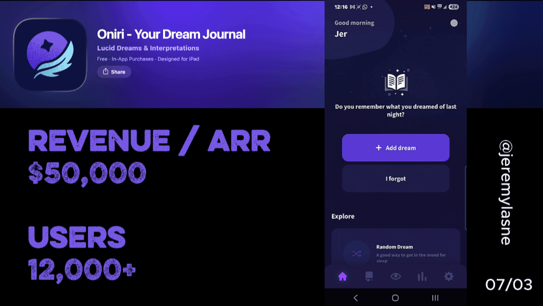
Oniri is a dream journaling and lucid dreaming app founded in 2015 by Jean-Baptiste Beau and a small Swiss team. It is the longest-running and most feature-complete app in the dream journal category. Pricing is $11.99/month or $70.99/year with a one-week free trial available. Their onboarding runs 34 screens. It opens immediately with personalization questions, surfaces a projection graph mid-flow to show what consistent journaling produces, asks for a review and notification permission at peak engagement, ends with a hold-to-commit gesture, and hits a paywall that shows real prices with no gamification. This is the full breakdown.
The Numbers
- Founded: 2015 (10 years running)
- Monthly subscription: $11.99
- Annual subscription: $70.99
- Free trial: 1 week
- Onboarding screens: 34
- Category position: longest-running, most feature-complete dream journal app
- Developer: Jean-Baptiste Beau, Oniri SA, Switzerland
- Features behind paywall: AI dream interpretation, voice recording, statistics panel, audio guides, image generation
The Category Context
Dream journaling is a niche that sits at the intersection of mental health, self-discovery, and lucid dreaming practice. It is a category defined by intimacy. The user is not tracking calories or gym reps. They are documenting their subconscious in a format they would not want anyone else to read.
That intimacy has direct implications for conversion. A user who opens a dream journal app is not casually curious. They have a specific goal -- understanding recurring dreams, developing lucid dreaming skills, processing emotional patterns through sleep. That goal pre-exists the download. The onboarding's job is not to create motivation. It is to make the user feel that Oniri understands their specific goal before any money changes hands.
Oniri's 34-screen flow executes that job with what I call Cal AI energy: fast personalization, data-driven outcome visualization, and a commitment gesture that makes the subscription feel like the logical continuation of something already started.
The Full Oniri Onboarding Breakdown
No warm-up: questions from screen 1
Oniri does not open with a mascot, a feature reel, or a social proof wall. It opens with a question. What do you want from this app? Understanding your dreams. Having lucid dreams. Processing emotions. Better dream recall.
This cold open is a specific bet. The Oniri user is not casually browsing. They downloaded a dream journal app with a specific intention. Opening with a question respects that intention and accelerates the onboarding by treating the user as someone who already knows why they are here.
The absence of a warm-up is a design statement: this app is for people who are ready. The first screen filters for that user immediately and begins building the personalized profile before the user has consciously committed to anything.
Deep personalization across three waves
Oniri runs personalization in distinct waves, separated by other screen types. The first wave covers primary goals and dream experience level. The second, after the graph and notification ask, covers sleep patterns, dream vividness, and journaling history. The third, after the review ask, covers specific interests -- lucid dreaming techniques, emotional analysis, symbolic interpretation.
The three-wave structure prevents the fatigue that plagues long single-block personalization flows. Each wave feels like a new conversation topic rather than a continuation of a form. The user is not aware they have answered 20 questions. They have had three distinct exchanges, each of which deepened their sense that the app understands them.
By the final wave, the user has described their subconscious mind, their sleep patterns, and their learning goals to Oniri in more detail than they have probably articulated to any other app. That depth of investment, spread across 34 screens, is the mechanism underneath every subsequent conversion touchpoint.
Mid-personalization: notification permission
At a natural pause between personalization waves, Oniri asks for notification permission. The framing is functional: reality check reminders, journaling nudges, lucid dreaming audio cues timed to sleep cycles.
The timing is calculated. The user is mid-flow, already invested, already feeling understood. The notification ask arrives in a context where the user is thinking about their dream practice and what consistency looks like. "Would you like reminders to journal when you wake up?" in that context is not a marketing ask. It is a practical question about building the habit they just described wanting to build.
This is the same mechanism Flo uses with its in-app notification promise and Liftoff uses with its mandatory framing. The system permission prompt follows after the user has already mentally said yes to the concept. The convert rate on that sequenced ask is categorically higher than a cold prompt on screen two.
The projection graph: your dream recall curve
Mid-onboarding, after the first personalization wave, Oniri shows a graph. It is the most important screen in the flow and borrows directly from Cal AI's animated plan generation and Flo's outcome visualization.
The graph shows dream recall frequency over time for users who journal consistently versus those who do not. The gap is significant and specific. Users who journal three or more times per week recall four times more dreams by day 30 than baseline. A personalized projection line appears with the user's name and their target date based on their stated goals.
This screen does what no personalization question can: it makes the future visible. The user is not reading a feature description. They are looking at a projection of their own progress, with their name on it, showing a specific outcome on a specific date.
The mechanism is identical to what Noom executes with its weight projection graph that animates while the app builds a program. The loading screen is not filler -- it is the paywall's opening argument. Oniri's projection graph is the dream journal equivalent: your future self, visualized, before the price is shown.
The graph also creates urgency without a countdown. The projection has a date. Starting later means pushing that date further. The implicit message is not "this offer expires" -- it is "your progress already should have started."
Review ask: while curiosity is at its peak
After the graph, Oniri asks for an App Store review. Same principle as every high-performing app in this series, same precise timing logic: capture the rating at the highest positive emotional state, before any friction.
The emotional state at this specific moment in Oniri's flow is unusual. The user has just seen a projection of their dream recall developing over 30 days. They are in a state of anticipatory excitement -- not about the app's features, but about their own potential progress. That is the emotion Oniri captures in the rating.
The resulting reviews do not describe the app's UI or the accuracy of its AI interpretation. They describe what it felt like to discover that dream recall is a trainable skill and that a consistent journaling practice produces measurable results. That type of review is worth ten times a feature review in the App Store listing because it speaks to the category-level curiosity that drives organic downloads.
Hold to commit: the physical declaration
At the end of the personalization sequence, Oniri presents the commitment screen. Not a tap. A hold.
The button instruction: press and hold. The animation plays for several seconds. The commitment is confirmed.
This is Liftoff's sustained press and Flo's biometric hold, applied to the most intimate onboarding context in the series. You are not committing to a gym rank or a health journey. You are committing to a practice of exploring your own subconscious.
A sustained physical action produces a stronger sense of completion and commitment than an instantaneous gesture. Oniri uses this principle at the precise moment the personalization investment peaks -- right after the third and final wave of questions. The hold captures the user at maximum investment and converts that investment into a physical declaration.
The hold has no technical purpose. The user could tap. The hold is purely psychological: it makes the commitment feel deliberate, ceremonial, and irreversible in a way that a standard tap does not.
Loading screen: science while you wait
After the hold, the plan-building loading screen appears. "Analyzing your dream patterns... Mapping your sleep profile... Building your personalized program..."
While it loads, Oniri surfaces legitimacy signals. Scientific references to dream recall research. Sleep stage data. The foundation in ten years of development tested with dreamers worldwide.
The loading screen is not filler. It is the paywall's opening argument. What loads during that animation is not the user's program -- it is the user's confidence that this is a serious tool built on real research, not a vibe-coded app that looks good on TikTok.
A user who spent the last 34 screens describing their subconscious in detail and then watched a loading screen citing sleep laboratory research is not the same user as one who was shown a feature list and asked to subscribe. They are a different conversion prospect entirely.
The paywall: real prices, yearly first, no games
Oniri's paywall shows two options: $11.99/month or $70.99/year. Both prices are shown in full. No crossed-out anchor prices. No spin wheel. No countdown. No "$0.00" framing.
The annual plan is highlighted. The monthly plan exists to make the annual look like the logical choice. The math -- $11.99 times 12 is $143.88 versus $70.99 -- does the conversion work without any copy needed.
No free trial on the paywall itself, though a one-week trial exists. Showing the real price without a free trial CTA is the most confident paywall in this series. It says: we have been doing this for ten years. The reviews say it works. The graph showed you what it will do for you. This is what it costs.
That confidence is the product of a decade of compounding credibility. Oniri can skip the trial psychology because the 10-year track record does what the trial is designed to do: reduce the perceived risk of subscribing. A first-year app needs a free trial to lower the barrier. A ten-year app with a review base and scientific backing has already lowered it through reputation.
The paywall in a dream journal category also works differently from health or fitness apps because the stakes are intimate rather than urgent. Nobody's health is at risk if they delay. But the projection graph introduced mid-flow created forward momentum -- a date for the user's own progress that pushes back every day they do not start.
The Core Mechanism
Oniri's conversion runs on a sequence that borrows the best structural elements from Cal AI and applies them to the most intimate onboarding category in this series.
Cal AI's mechanism: deep personalization -> animated outcome visualization -> commitment gesture -> paywall.
Oniri's mechanism: deep personalization in three waves -> projection graph showing your specific progress -> notification ask while you're in flow -> rating ask at peak curiosity -> more personalization -> hold-to-commit gesture -> loading screen with scientific legitimacy -> real-price paywall with no games.
The difference is the graph and the hold. The graph creates urgency through personalized future-projection, not manufactured scarcity. The hold converts accumulated investment into a physical declaration. Both are mechanism-level additions that a founder can copy without changing a single other thing about their paywall.
A ten-year-old app does not need a spin wheel. It needs a graph that shows your name and a date. Then it needs a button you hold instead of tap. That combination, after 34 screens of the user describing their own subconscious, converts without a single countdown or mascot in sight.
What This Means for Your App
Three things Oniri gets right that most founders miss:
Three lessons from Oniri's 34-screen playbook
- The projection graph is the most underused conversion screen in mobile apps. Not a feature list. Not a testimonial. A graph with the user's name, their goal, and a specific date. That is the paywall's opening argument, delivered five screens before the price appears. Cal AI runs it. Flo runs it. Noom runs it. Most apps do not, and it is a direct revenue leak.
- The hold gesture costs zero development effort and changes conversion. Swapping a tap for a hold on your commitment screen is a single line of code in most frameworks. The psychological effect is not marginal. A user who held a button for three seconds has made a physical investment in the decision that a user who tapped once has not. Test this on your commitment screen before testing any paywall copy.
- Showing real prices without a free trial is a confidence signal, not a mistake. The trial exists to lower risk perception. There are two ways to lower risk perception: reduce the perceived cost of trying (the trial), or increase the perceived credibility of the product (ten years of reviews and scientific backing). Choose based on what you have. A new app needs the trial. An established app with strong social proof can show the real price and win.
FAQ
How many screens does Oniri's onboarding have?
Oniri's onboarding runs 34 screens across three waves of personalization, a mid-flow notification ask, a projection graph, a review request, a hold-to-commit gesture, and a loading screen before the paywall.
What is Oniri's paywall structure?
Oniri shows yearly and monthly subscription options with real prices: $11.99/month or $70.99/year. No free trial is shown on the paywall itself, though a one-week trial exists. No countdown, discount mechanics, or gamification are used.
What is the Oniri projection graph?
Mid-onboarding, Oniri shows a data visualization comparing dream recall frequency for consistent journalers versus non-journalers over 30 days. A personalized projection line with the user's name and target date appears. This outcome visualization creates urgency through personal progress projection rather than manufactured scarcity.
Why does Oniri use a hold gesture instead of a tap?
The hold-to-commit gesture at the end of Oniri's personalization sequence converts accumulated investment into a physical declaration. A sustained press produces stronger behavioral commitment than an instantaneous tap, at the cost of zero additional development complexity.
What is Oniri and who built it?
Oniri is a dream journaling and lucid dreaming app founded in 2015 by Jean-Baptiste Beau and a small team based in Switzerland. It is the oldest and most feature-complete app in the dream journal category, covering dream logging, AI interpretation, lucid dreaming techniques, voice recording, statistics, and image generation.
Why does Oniri not offer a prominent free trial on its paywall?
A ten-year track record and a strong review base lower perceived risk more effectively than a trial for an established app with scientific credibility. Free trials are risk-reduction tools. Oniri reduces risk through reputation -- the oldest, most credible app in a niche category does not need to let you try it free to convince you it works.
What makes Oniri's onboarding one of the best dream journal app examples?
Oniri combines three-wave personalization that maps the user's subconscious goals in increasing depth, a projection graph that shows personalized dream recall outcomes with a named target date, a mid-flow notification ask timed to peak engagement, a review request at peak curiosity, and a hold-to-commit gesture before a confidence-forward real-price paywall. The result is a 34-screen flow that feels like a conversation with a 10-year-old expert on your own dreams.
This teardown is part of an ongoing series on in-app optimization. Want answers like these while you build? The tasu MCP serves the same sourced benchmarks to your coding agent, for onboarding, paywalls, and pricing.