3.1M downloads, 19 screens, and the yes/no flow that makes the paywall feel like agreement
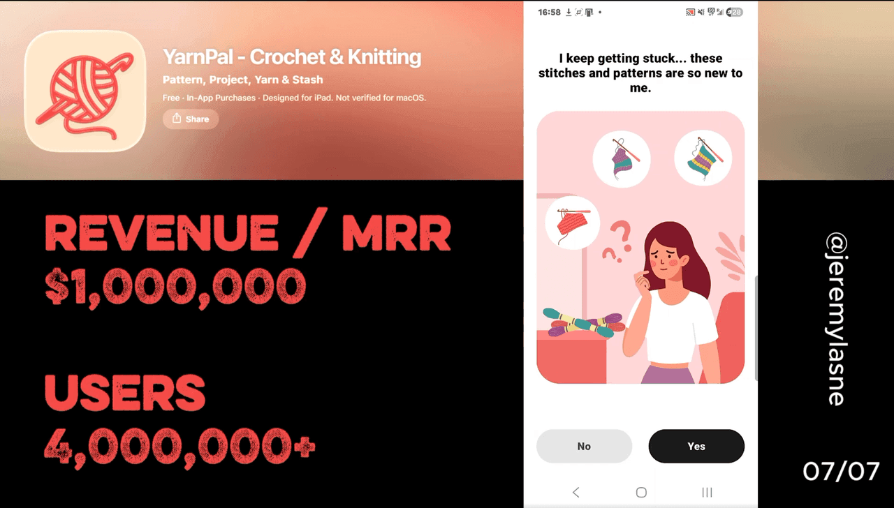
YarnPal is a crochet and knitting learning app built by PIXELCELL with 3.1 million total downloads and 360K installs in the last 30 days. It is rated 4.65/5 across 160K reviews and ranks #8 in lifestyle. Their onboarding runs 19 screens. It opens with yes/no questions that stack micro-commitments before the user has invested any time. A "we understand you now" reflection screen summarizes the user's answers back to them. Non-skippable in-app learner videos show real hands on real projects. The paywall frames the annual plan as "Try for free" versus the monthly at full price, with a toggle to receive a reminder before billing. Skipping produces a trial-explanation screen, not a discount. The CTA is "Start my free trial." This is the full breakdown.
The Numbers
- Total downloads: 3.1M
- Monthly downloads: 360K
- App Store rating: 4.65/5
- Total ratings: 160K
- Lifestyle ranking: #8
- Onboarding screens: 19
- Trial length: 7 days
- Developer: PIXELCELL PTE. LIMITED
- Database: 500+ patterns, 150+ beginner tutorials, 5 signature courses
The Category Context
New subscription app launches hit 14,700 per month by January 2026, up from 2,000 in January 2022 -- a 7x increase in supply. Revenue has not followed: apps launched before 2020 still generate 69% of all subscription revenue, while apps launched in 2025 or later account for just 3%.
YarnPal launched in late 2024 and is growing at 360K installs per month despite that headwind. It is doing it in a category -- craft learning -- that has almost no well-funded competition. Duolingo for crochet does not exist yet. YarnPal is building that position, one yes/no question at a time.
The niche bet is the business model. A crochet learning app does not compete with Duolingo or Yazio for installs. It competes for the specific user who just watched a crochet video on TikTok and wants to actually make something. That user is already motivated. The onboarding just needs to confirm it and get out of the way.
The Full YarnPal Onboarding Breakdown
Yes/no questions from screen 1: micro-commitments before micro-investment
YarnPal opens with yes/no questions. Not a dropdown. Not a multi-select. Binary taps. One question per screen.
"Have you tried crochet or knitting before?" "Do you want to make gifts for people you love?" "Would you like to learn at your own pace?" "Are you interested in making things for your home?"
Each question is answered with a single tap. Each answer is a yes. The questions are designed so that the overwhelming majority of users who downloaded a crochet learning app will answer yes to each one. They are not filtering questions. They are agreement questions.
By screen 8, the user has tapped yes seven times. Seven micro-commitments to the concept of learning to crochet, delivered before any time investment, before any value demonstration, before any social proof has been shown.
This is the most efficient commitment-building mechanism in the series. Prayer Lock uses a finger signature. Liftoff uses a sustained press. Flo uses a biometric hold. All of them require a single deliberate act at a single deliberate moment. YarnPal distributes seven small acts across the first eight screens, each one costing less than a second and each one incrementally deepening the user's sense that this app understands what they want.
The psychological mechanism is consistency bias: a person who has said yes seven times in a row to related propositions is strongly predisposed to say yes to the next one. When the paywall CTA reads "Start my free trial," it arrives as yes number eight in a sequence. The user is not making a fresh decision. They are continuing a pattern they started on screen one.
"We understand you now": the reflection screen
After the yes/no sequence, YarnPal shows a summary screen. The app reads back what it has learned about the user, in the user's own terms.
"You're a beginner who wants to make gifts for the people you love, learn at your own pace, and create beautiful things for your home. We're going to build the perfect learning path for you."
This screen is the "we understand you" moment -- the payoff for the yes/no investment. The user sees their own answers reflected back as a coherent identity: they are not just a person who downloaded a crochet app, they are a specific type of learner with specific goals and specific motivations.
The "I understand you" screen is one of the most powerful conversion tools in onboarding design. It transforms data collection into emotional resonance. The user did not fill out a form. They had a conversation, and the app was listening.
The practical conversion effect is the same as every deep personalization flow in the series: the user now owns a plan that feels built for them. Closing the paywall means abandoning that plan, not declining a subscription feature list.
Non-skippable in-app videos: real hands, no way out
After the reflection screen, YarnPal shows videos. Real people. Real hands. Real projects being made. Beginners working through their first stitch, holding up finished amigurumi, showing off a completed scarf.
The videos are not skippable.
This is the most aggressive attention-capture in the series. Rock Identifier's auto-advancing screens cannot be tapped past. YarnPal's videos cannot be dismissed until they complete.
The creative strategy behind non-skippable video is specific to the crochet category. A person deciding whether to learn crochet has one primary objection: "I don't know if I can actually do this." Stock illustrations and animations do not answer that objection. A video of someone who started exactly where the user is, doing something the user wants to be able to do, answers it completely.
Unlike fragmented social media clips, YarnPal offers complete project videos that show the entire journey. The non-skippable nature ensures the user does not tap past the moment that proves the core value proposition -- beginners can learn this, with these hands, in these videos. That moment is the aha moment. Making it unskippable guarantees delivery.
The friction of non-skippable content is real. Some users will resent it. YarnPal accepts that cost because the users who resent it were not going to convert anyway. The users who sit through it -- curious enough to watch, patient enough to finish -- are already deeper in the funnel than any skippable video would have put them.
Outcome visualization: your hands, your projects
After the videos, YarnPal shows outcome screens. Not feature lists. Not subscription benefits. What the user will be able to make.
A hat. A pair of socks. An amigurumi animal. A market bag. Each one dated: "by week 2," "by month 1," "by month 3."
This is Cal AI's animated plan generation, applied to physical craft. The user does not see a projected weight loss curve. They see the objects their hands will make, on a timeline that starts now. The outcome is concrete, tactile, and personal in a way that no digital product's outcome can be. You can hold a crocheted hat. You cannot hold a streak.
The timeline creates urgency without a countdown. Every day not started is a day further from the month-1 project. The implicit message is not "this offer expires." It is "your hands are not making anything yet."
The paywall: "Try for free" vs monthly full price
YarnPal's paywall shows two options side by side. The annual plan with a 7-day trial is labeled "Try for free." The monthly plan shows its full price with no trial.
The CTA for the annual option is not "start annual plan" or "subscribe yearly." It is "Try for free." Three words that contain no price, no commitment, no risk.
The monthly plan exists to make the annual look correct. Not cheaper -- correct. The framing is not "save 40% with annual." It is "why would you pay more per month for less access when you can try the better option for free right now?"
The best setup by one-year LTV is a weekly plan with a 3-day free trial, bringing in 1.5x the average LTV of all other configurations. However, Health and Fitness is the only category where annual plans are not just holding but continuing to grow their share. YarnPal sits in Lifestyle and chooses annual. The bet is that crochet learners are not looking for weekly commitment loops -- they are looking for a sustained learning journey, and annual framing matches that intent better than a weekly renewal would.
The trust toggle: "Remind me 3 days before it ends"
Below the plan options, YarnPal shows a toggle: "Remind me 3 days before my trial ends." It is on by default.
This is the same trust mechanic Liftoff uses before its billing screen -- "we'll remind you before your trial ends" -- but executed as a user-controlled toggle rather than a company promise. The distinction matters. A company promise can feel marketing-coded. A toggle the user controls feels like a feature.
Offering a trial-end reminder reduces cancellation anxiety and is among the paywall design elements that separate high-converting paywalls from the rest.
The toggle does three things. It signals that YarnPal is not trying to trick the user into a forgotten charge. It gives the user a sense of control over the billing timeline. And it increases trial start rates by removing the most common stated reason for not starting: "I'll forget to cancel."
A user who has turned on the reminder is not worried about the trial anymore. They start it. And users who start trials and experience value in the first session convert at dramatically higher rates than users who start and immediately cancel on Day 0.
55% of all trial cancellations happen on Day 0. 84% happen between Day 0 and Day 1. The reminder toggle is designed to push the user past Day 0 with confidence, which is the single highest-impact conversion action in any trial flow.
Skip the paywall: trial explanation, not a discount
If the user skips the paywall, YarnPal does not show a discount. It does not show a mascot. It shows a screen that explains exactly how the free trial works.
Day 1: full access to all YarnPal features. Day 4: reminder sent that the trial ends in 3 days. Day 7: trial ends. Billing begins only if you have not canceled.
This is the same skip mechanic PictureThis uses -- explain the trial when the user is not yet ready to start it -- but without any price reduction. YarnPal's bet is that the user who skipped did not skip because of price. They skipped because they did not understand the terms. The explanation converts them by removing the ambiguity.
The CTA on the explanation screen is "Start my free trial." Not "subscribe." Not "get premium." Not "unlock all features." Start your free trial. The exact same language as the paywall CTA, now presented to a user who fully understands what starting means.
This is the most transparent skip flow in the series. Daylio does something similar with its trial explanation screen. YarnPal applies the same principle with no additional offer, no urgency mechanic, and no emotional pressure -- just information, presented clearly, with a single CTA.
The Core Mechanism
YarnPal's conversion is built on the cheapest and most replicable mechanism in the series: stack seven yeses before you ask for the eighth.
The yes/no questions do not collect personalization data that changes the product experience. They collect commitment. Each yes is a small behavioral investment that increases the user's internal consistency pressure to continue. By the time the paywall CTA appears, the user has already agreed to the concept of learning crochet seven times. "Start my free trial" is not a new decision. It is the continuation of a decision already made seven screens earlier.
The non-skippable video guarantees delivery of the proof moment. The reflection screen makes the data feel like understanding. The trust toggle removes the last friction. The skip explanation removes the last ambiguity.
None of it requires a mascot, a spin wheel, a countdown, or a guilt animation. Just questions designed so the user answers yes, a video they cannot skip, and a paywall that asks them to confirm what they have already decided.
What This Means for Your App
Three things to steal from YarnPal's 19 screens:
- Replace your dropdown personalization with yes/no questions. A dropdown asks the user to decide. A yes/no question asks the user to agree. The cognitive load is lower and the commitment output is higher. Seven yes/no screens produce more behavioral investment than one multi-select screen, even though they collect the same information.
- Make your most important proof moment non-skippable. The thing that proves your core value proposition -- the scan that works, the prayer that calms, the first crochet video that shows a beginner finishing something -- is too important to be optional. If the user can tap past it, most of them will. The ones who watch it convert. Force the watch.
- Your skip flow is a sales screen, not a dead end. The user who skipped your paywall is not lost. They are a user who needs more information before they commit. Give them the information. Show them exactly how the trial works, step by step, with no ambiguity. The "Start my free trial" CTA on a trial explanation screen converts a meaningful fraction of users who would otherwise have churned from the onboarding entirely.
FAQ
How many downloads does YarnPal have?
YarnPal has 3.1 million total downloads with 360K installs in the last 30 days as of 2026. It holds a 4.65/5 rating across 160K reviews and ranks #8 in the Lifestyle category.
How many screens does YarnPal's onboarding have?
YarnPal's onboarding runs 19 screens covering yes/no micro-commitment questions, a "we understand you now" reflection screen, non-skippable in-app learner videos, outcome visualization with a project timeline, a paywall with annual trial vs monthly full price, a trust reminder toggle, and a trial explanation skip flow.
What is YarnPal's paywall structure?
YarnPal shows an annual plan labeled "Try for free" alongside a monthly plan at full price. The annual plan includes a 7-day free trial. A toggle to receive a reminder 3 days before billing is shown on by default. Skipping the paywall produces a trial explanation screen walking through each day of the trial, with a "Start my free trial" CTA.
What makes YarnPal's yes/no onboarding effective?
YarnPal's yes/no questions are designed so that users who downloaded a crochet learning app will answer yes to each one. Seven sequential yes responses build consistency bias -- a psychological pressure to continue agreeing -- that makes the paywall CTA feel like the natural continuation of a decision already made, not a fresh commercial ask.
Why are YarnPal's videos non-skippable?
The core value proposition of YarnPal -- that beginners can actually learn to crochet -- is proven most effectively by showing real learners doing it. Making the video non-skippable guarantees delivery of that proof moment to every user, including the ones who would have tapped past it. Users who watch the full video convert at higher rates than those who skip it.
What happens when you skip the YarnPal paywall?
Skipping the YarnPal paywall does not trigger a discount or a mascot guilt screen. It produces a trial explanation screen that walks through each day of the 7-day trial: when access starts, when the reminder is sent, and when billing begins. The CTA is "Start my free trial." No urgency mechanics, no emotional pressure -- just transparency.
This teardown is part of an ongoing series on in-app optimization. Want answers like these while you build? The tasu MCP serves the same sourced benchmarks to your coding agent, for onboarding, paywalls, and pricing.