6 screens against Duolingo's 38
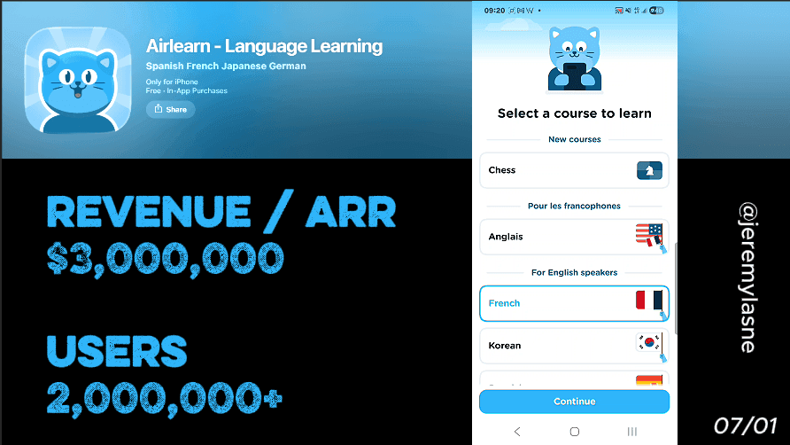
Airlearn is an AI-powered language learning app built on the opposite bet from Duolingo: instead of 38 screens of personalization, streaks, and mascot theater, it gets you learning in 6 screens. Email capture on screen 2. One level-selection question. A commitment-framed CTA before the notification ask. A mascot widget installed on your home screen before the paywall. Annual plan with a 14-day free trial. This is the full breakdown of why radical brevity in a complex category is its own conversion strategy.
The Category Context
Language learning apps generated over $1 billion in 2025, with Duolingo alone responsible for $1.037 billion -- up 39% year over year. About 48% of adults aged 18 to 24 actively use language learning apps, the highest engagement rate of any age group.
The category is dominated by complexity. Duolingo uses 38 screens, streaks, animated owls, leagues, and XP systems. Babbel runs a personalization quiz before the first lesson. Every incumbent has built more -- more onboarding, more gamification, more retention mechanics.
Airlearn's bet is that more is the wrong answer for a specific type of user: the one who has already tried Duolingo, knows what they want, and does not need to be talked into starting. That user does not need a mascot to hatch. They need 6 screens and a way in.
Around 48% of learners abandon courses before reaching intermediate levels, primarily due to lack of motivation and insufficient interaction. The dropout problem in language learning is not caused by too-short onboarding. It is caused by too-slow progress and too-little friction to re-engage. Airlearn solves both problems differently than the category default.
The Full Airlearn Onboarding Breakdown
Screen 1: Language selection -- the only question that matters
The first screen asks one thing: which language do you want to learn? No name. No email. No goal setting. No level assessment. Just the language.
This opening is a radical departure from category convention and a precise reading of user psychology. The person who downloads a language learning app in 2026 has already made the most important decision before they opened the App Store: they want to learn something specific. That decision does not need to be manufactured by onboarding. It arrived with the download.
By asking only for the language on screen one, Airlearn does what Rock Identifier does with its cinematic opening: it honors the motivation the user already has instead of interrupting it with questions designed to manufacture investment. The user who wants to learn Spanish is already invested. Screen one just confirms the target and moves on.
Screen 2: Email -- the account that enables everything
Screen two asks for an email address. Account created. User in the system.
This is the most aggressive account-creation placement in the series. Daylio does not ask for an email at all. ShroomID and Rock Identifier ask for nothing. Prayer Lock captures email after the paywall. Airlearn captures it on screen two, before any value has been demonstrated, before any personalization has been done, before the user has experienced the app at all.
The bet is specific: a user who submits their email on screen two is a different user from one who submits it on screen ten. They are earlier in their hesitation, more impulsive, more in the initial download motivation state. That motivation fades fast. 82% of trial starts happen on Day 0. The window between install and first paywall impression is the highest-intent moment in the entire user lifecycle. Email capture at screen two seizes that window at its absolute peak.
The practical business case is also clear. An email captured before the paywall creates a user record that enables win-back campaigns, trial-end reminders, and re-engagement sequences regardless of whether the user converts in session. In a category where 48% of learners abandon before reaching intermediate level, the email list is the re-engagement infrastructure.
Screen 3: One personalization question
Screen three asks the user's level. Beginner. Intermediate. Advanced. That is the entire personalization flow.
In a category where Duolingo runs 38 screens and Yazio runs 60+, three options on one screen might look like a failure of effort. It is the opposite. It is a philosophical statement about what personalization is actually for.
Personalization in most onboarding flows does two things: it collects data to tailor the product, and it creates investment through the time spent answering questions. Airlearn only needs the first. A language app needs to know where the user starts. It does not need to know their schedule, their motivation story, their past failures, or their learning style preferences. The AI adapts to those things by watching what the user does, not by asking upfront.
Clear goal setting during onboarding sets clear expectations and provides an initial commitment anchor. One level question does both. The user has stated where they are. The app will take them from there. Everything else is execution.
Screen 4: "Are you committed?" -- the CTA that reframes the notification ask
Before the notification permission system prompt appears, Airlearn shows a screen that is unlike any other permission ask in this series. Not "would you like to receive reminders?" Not "allow notifications to stay on track." Instead: a direct question framed around commitment to the learning goal -- "Are you committed to learning [language]?"
The CTA to continue is a yes. The implied alternative is to admit you are not committed.
This reframe does something no technical notification prompt can do: it ties the system permission to a self-concept. The user who says "yes, I'm committed" is not granting a marketing permission. They are declaring something about who they are and who they want to be. The notification prompt that follows is simply the technical step to honor that declaration.
Micro-commitments are small interactive steps that build emotional investment and reduce drop-off before the paywall appears. The "are you committed?" screen is the most compressed version of Prayer Lock's signature mechanic: a single question that makes the user commit to an identity before the commercial ask. Six words that do the work of a dozen personalization screens.
The notification opt-in rate on a prompt that follows "are you committed?" is meaningfully higher than one that follows "would you like reminders?" The user who just declared commitment finds it internally inconsistent to then refuse the tool that supports it.
Screen 5: The widget -- your buddy on the home screen
After the notification ask, Airlearn prompts the user to install the widget. The widget shows the mascot -- a buddy character -- directly on the home screen.
This is the highest-impact retention mechanic in the entire 6-screen flow, and it costs zero marginal development effort once the widget exists.
The widget placement on the home screen means Airlearn is present on the user's most-accessed surface every time they unlock their phone. The mascot is visible whether the user opened the app that day or not. It functions as a passive retention prompt with zero notification fatigue -- the user sees it incidentally, not intrusively.
After a lesson, apps that bundle requests for feedback, app reviews, and adding a widget capitalize on the user's positive state. Airlearn times the widget ask before the paywall, at a moment when the user is still in the initial download momentum. A widget installed in session one is infinitely more likely to stay on the home screen than one requested after the user has been using the app for a week and reorganized their apps.
The mascot buddy on the home screen also does something subtler: it changes the user's relationship with their phone. Every time they see it, they are reminded they are a person who is learning a language. That identity reinforcement is the quiet retention engine underneath the product.
Screen 6: The paywall -- annual plan, 14-day trial, nothing else
After 5 screens, the paywall appears. Annual plan. 14-day free trial. One CTA.
The trial length is the longest in this series, and it is calculated. Trials lasting 17 to 32 days convert at 45.7%, nearly double the rate of short 3-7 day trials, and users who go through a structured trial boost first renewal rates by up to 60%. At 14 days, Airlearn is approaching the higher-converting window while staying below the psychological threshold where "free trial" starts to feel like "they don't trust the product enough to charge me quickly."
Fourteen days is also long enough to complete a meaningful learning block. A user who has done 14 days of daily lessons has established a habit, seen measurable progress, and has something real to lose if they do not convert. The paywall at day 14 arrives at the moment of maximum demonstrated value -- not because a sequence of onboarding screens engineered it, but because the product itself built it through actual use.
No spin wheel. No mascot guilt trip. No "skip forever" CTA. The paywall trusts that 6 screens plus 14 days of product experience is enough. For the user Airlearn is targeting -- the one who downloaded knowing what they want -- it is.
The Core Mechanism
Airlearn's conversion architecture is built on a single insight that runs opposite to every other app in this series: the user who needs extensive onboarding to be convinced is not your user.
Every screen Duolingo adds after screen 6 is designed to manufacture commitment in users who arrived uncertain. Those screens work -- at scale, at brand recognition, with a decade of product iteration behind them. They are also expensive, complex, and irrelevant to the user who already knows they want to learn Spanish and just wants to start.
Airlearn's 6 screens identify that user, capture their email, establish their level, extract a commitment declaration, put a reminder on their home screen, and show them a 14-day trial. Everything after that is product.
The bet is not that short onboarding converts better than long onboarding. The bet is that for a specific user -- motivated, decisive, done with gamification theater -- short onboarding converts better. The 6-screen flow does not try to convert the uncertain user. It just removes every obstacle for the certain one.
What This Means for Your App
One question Airlearn answers that most apps never ask: who specifically are you trying to convert, and does your onboarding length match their patience threshold?
Duolingo's 38 screens are correct for a user who is casually curious about Spanish and needs to be sold on the habit. Airlearn's 6 screens are correct for a user who is actively motivated and would be insulted by 38 screens of questions before they can see a lesson.
Both are right. They are targeting different users. The mistake is applying Duolingo's onboarding length to an audience with Airlearn's patience threshold, or vice versa.
Three lessons from the 6-screen model
- Email capture on screen 2 only works if your user is already motivated. If your user needs convincing first, capturing the email before you convince them captures low-intent emails that churn out of your re-engagement list. Know which one you have.
- A commitment CTA converts better than a permission request. "Are you committed to learning?" before the notification ask is a reframe that costs zero development effort and produces a meaningfully higher opt-in rate. Test the commitment question in your own flow before the next permission ask.
- The widget is the cheapest retention investment in mobile. A home screen widget that a user installed themselves, during their highest-motivation session, is a daily passive retention touchpoint that costs no notification send, no re-engagement budget, and no user annoyance. If your app can have a widget, ship it and ask during onboarding.
FAQ
How many screens does Airlearn's onboarding have?
Airlearn's onboarding runs 6 screens: language selection, email account creation, level personalization, commitment CTA and notification ask, widget setup, and paywall. It is one of the shortest language learning onboarding flows available in 2026.
What is Airlearn's paywall structure?
Airlearn offers an annual subscription with a 14-day free trial. The paywall appears on screen 6, immediately after the widget setup prompt. No discount mechanics, gamification, or skip sequences are used.
Why does Airlearn capture email on screen 2?
Email capture at screen two seizes the highest-intent moment in the user lifecycle -- immediately after download, before any friction. It creates a user record enabling re-engagement campaigns regardless of whether the user converts at the paywall. The trade-off is that it requires a user who is already motivated enough to submit their email before experiencing any product value.
How does Airlearn's "are you committed?" screen work?
Screen four reframes the notification permission ask as a commitment question. By asking "are you committed to learning [language]?" before the system prompt, Airlearn ties notification opt-in to a self-identity declaration rather than a marketing permission. Users who say yes to commitment find it internally inconsistent to then refuse the notification that supports it, producing higher opt-in rates.
What is Airlearn's widget mascot?
Airlearn prompts users to install a home screen widget featuring the app's mascot buddy before the paywall. The widget creates a passive retention touchpoint on the user's most-accessed screen, visible every time they unlock their phone, without notification fatigue or push costs.
How does Airlearn compare to Duolingo?
Duolingo generated $1.037 billion in revenue in 2025 with 38 onboarding screens, extensive gamification, streaks, and a well-known animated mascot. Airlearn uses 6 onboarding screens, one personalization question, a commitment CTA, and a 14-day trial. The two apps target different user types: Duolingo converts the casually curious through sustained engagement mechanics; Airlearn targets the already-motivated learner who wants to start immediately.
What makes a 6-screen onboarding viable in the language learning category?
A 6-screen onboarding is viable when the user arrives with pre-existing motivation -- they already know what language they want to learn and have already decided to start. In that context, every additional onboarding screen is friction rather than value. 82% of trial starts happen on Day 0, and a user who reaches screen 6 with commitment declared and a mascot on their home screen is a higher-quality trial start than one who dropped off at screen 20 of a 38-screen flow.
This teardown is part of an ongoing series on in-app optimization. Want answers like these while you build? The tasu MCP serves the same sourced benchmarks to your coding agent, for onboarding, paywalls, and pricing.