The paywall built for people who hate paywalls
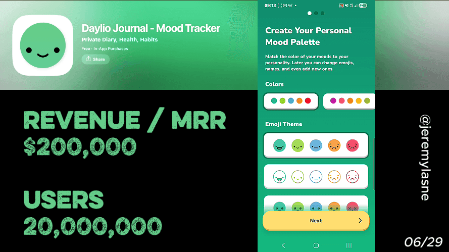
Daylio is a private mood tracker and journal app where data is stored locally on the device -- nothing is sent to servers, no ads run, no third-party tracking exists. It generates approximately $100K in monthly iOS revenue with 60K monthly downloads. Premium costs $35.99 per year with a 7-day free trial and carries a 4.8-star rating across both App Store and Google Play. Their onboarding runs 11 screens -- the shortest in this entire teardown series. The paywall appears twice: first as a simple annual-plan trial, and after a skip, as a full three-tier comparison of annual, monthly, and lifetime plans with embedded reviews and a feature breakdown. This is the full breakdown of why less is more.
The Numbers
- Monthly iOS revenue: ~$100K
- Monthly downloads (iOS): ~60K
- Monthly downloads (Android): ~100K
- Combined monthly revenue: ~$150K
- App Store rating: 4.8 stars
- In-app purchases: $4.99 to $59.99
- Onboarding screens: 11
- Data sent to servers: zero
- Ads: zero
Why 11 Screens Is a Strategy, Not a Limitation
Every other app in this series competes on depth. 43 screens (Flo). 60+ screens (Yazio). 55 screens (BitePal). The assumption across the category is that more personalization equals more investment equals higher conversion.
Daylio rejects this. Their 11-screen onboarding is not a shortcut. It is a positioning statement. The user who downloads a private mood tracker is not the same user who downloads a calorie tracker with a raccoon mascot. They are specifically seeking simplicity, low friction, and privacy. Giving them 55 screens of questions before they can open their journal would be the most on-brand conversion mistake possible.
The two-tap entry system removes every excuse not to check in -- even on the worst days when opening a blank journal page feels impossible. The onboarding communicates that philosophy in 11 screens before the user has logged a single entry.
The Full Daylio Onboarding Breakdown
Screen 1: Privacy as the value proposition, not a disclaimer
Daylio opens with its privacy architecture stated plainly: data is stored locally on the device, nothing is sent to servers, no one can access entries -- not even the company itself, with no ads, no tracking, and no third-party interference.
This is the opposite of ShroomID's disclaimer-as-conversion-tool. Where ShroomID uses a legal screen to create fear that primes willingness to pay, Daylio uses a privacy screen to create trust that eliminates the biggest objection to journaling digitally.
The user who has been hesitating to use a mood tracking app because "what if someone reads this?" or "what if this data gets sold?" has their objection removed on screen one -- before any question, before any feature is shown, before any commitment is asked for.
In the mental health journaling category in 2026, the local-first privacy approach for a mood and mental health tracking app handling sensitive personal data is genuinely meaningful. Daylio does not bury it in a settings menu. They lead with it because they know it is the first question their user is asking.
No account required: anonymity as a feature
Following the privacy screen, Daylio makes clear that no account, email, or name is required to use the app. The user enters without a digital identity attached to their emotional records.
Most apps treat account creation as standard onboarding. Daylio treats it as optional friction they are willing to remove entirely. This decision reflects a deep understanding of their user's psychology: the person tracking depression, anxiety, grief, or difficult relationship patterns is not going to provide an email address to start. The ask itself is a reason not to continue.
By removing the account requirement, Daylio converts the user who would have bounced at "enter your email" -- a segment that is disproportionately the most sensitive and therefore the most loyal user Daylio could have.
One goal question: what brings you here?
After the privacy statement, Daylio asks a single question: what brings you here? The options reflect the real reasons people open a mood tracking app -- understanding emotional patterns, building better habits, managing anxiety, supporting therapy, gratitude practice, general self-awareness.
The first screen should accomplish one thing: understand why the user is here. Asking one goal-oriented question personalizes every subsequent screen and creates the emotional frame the paywall will reference later -- users who have stated a goal are more motivated to take the next step toward achieving it.
Daylio uses this single question to do in one screen what other apps do in twenty: establish the user's intent and make every subsequent interaction feel relevant to it.
App personalization: make it yours in three taps
After the goal question, Daylio briefly shows the user how to personalize the app. Mood emoji can be changed. Activity icons can be swapped. Colors and themes can be adjusted. This is not a lengthy customization wizard -- it is a preview that communicates a core brand truth: this app adapts to you, not the other way around.
The personalization preview does two things. It differentiates Daylio from more rigid tracking tools by showing flexibility upfront. And it creates a tiny but real sense of ownership -- the user has already started making the app theirs before they have even opened the main screen.
Notification timing: preference, not permission
Daylio's notification ask is framed entirely as a preference question: when do you want to check in with yourself? Morning. Evening. Custom time. Multiple times per day.
The word "notification" does not need to appear for the system prompt to follow and convert. By the time the system permission box appears, the user is thinking "I want to check in at 9pm" -- not "should I give this app permission to interrupt me?"
This is the same mechanism Flo uses, and the same one BitePal uses with their reminder-count framing. The principle is consistent across every high-performing onboarding in this series: the system permission is just the technical step after the user has already said yes to the concept.
Paywall 1: clean annual plan, 7-day trial, no theater
After 10 screens of setup, the first paywall appears. Premium is priced at $35.99 per year with a 7-day free trial giving full premium access before committing.
The design is minimal. One plan. One trial. One CTA. No crossed-out prices. No countdown timer. No spin wheel. No raccoon.
The restraint here is the strategy. Daylio's user has just been told their data never leaves their device and no account is required. A manipulative paywall -- flashing discounts, urgency timers, gamified mechanics -- would undermine every trust signal the previous 10 screens established. The first paywall is as clean as the product philosophy it is selling.
There is also a structural efficiency to showing the annual plan alone first: it anchors the user to the annual price as the default. If they skip and see the monthly plan later, the monthly price will look expensive by comparison -- not because of a crossed-out number, but because the user's reference point is already set.
The skip: questions instead of discounts
If the user skips the first paywall, Daylio does something no other app in this series does: they ask more questions.
Not a discount. Not a surprised mascot. Not a countdown. Questions.
"What matters most to you in a journal app?" Privacy. Simplicity. Deep insights. Beautiful design. The user answers.
"What has held you back from journaling consistently in the past?" No time. Forgot to log. Felt too complicated. Didn't see the value. The user answers.
This skip sequence is a masterpiece of reverse engineering. Every answer the user gives names their own objection. And immediately after naming it, the user is presented with the second paywall -- which is designed to address exactly the objections they just articulated.
The user who said "it felt too complicated" sees the feature list emphasizing two-tap entries. The user who said "I didn't see the value" sees the reviews showing real users describing specific benefits. Daylio turns the skip from a lost conversion into a sales conversation.
Paywall 2: annual vs monthly vs lifetime, with reviews and feature comparison
The second paywall presents in-app purchases ranging from $4.99 to $59.99 per item, covering the full range of commitment levels.
Three tiers are shown together for the first time. The annual plan is highlighted as "Best Value," shown at the per-month equivalent cost, with a free trial included -- this is the target conversion for most users. The monthly plan is shown at full monthly rate, existing to make the annual plan look more attractive by comparison while genuinely serving the user who wants to try without committing to a year. The lifetime plan is a one-time purchase that unlocks Daylio Premium forever; at the higher end of the $4.99-$59.99 range, it serves the user who has decided they will journal long-term and wants to pay once and be done. The lifetime option signals confidence: a company that offers lifetime access believes in long-term retention.
The second paywall also includes embedded reviews -- specific testimonials from users describing how Daylio helped with their anxiety, their therapy sessions, their self-awareness. After the skip questions surfaced the user's own doubts, these reviews address those doubts with someone else's resolution.
And a feature comparison: free vs Premium, clearly laid out. The free plan is genuinely sufficient for most users -- core mood tracking, activity logging, and basic statistics are all available without payment. Premium at $35.99/year adds advanced statistics, unlimited goals, automatic backups, and removes ads. Daylio is transparent about what the free tier offers precisely because the transparency itself is a trust signal. They are not hiding the free tier to force the upgrade -- they are showing it honestly, which makes the premium feel like a genuine choice rather than a forced one.
The Core Mechanism
Daylio converts by doing the opposite of everything else in this series.
No mascot creates emotional dependency. No spin wheel manufactures urgency. No countdown creates artificial scarcity. No skip screen deploys guilt.
Instead: no data sent to servers, no ads, no third-party tracking. A goal question. A personalization preview. A timing preference. A clean paywall. And when the user skips -- questions that make the user articulate their own objections before showing them the paywall designed to answer those objections.
The mechanism is integrity as conversion. Every screen reinforces a single message: we are not trying to manipulate you. We are trying to show you something genuinely useful. When the paywall appears, the user is not fighting against a marketing machine. They are considering whether to upgrade something they already trust.
Apps pairing a structured onboarding flow with a free trial paywall reach 1.78% install-to-conversion -- the top-performing configuration across subscription app categories. Daylio reaches that ceiling with 11 screens because the screens they use are the right 11, not because they optimized for quantity.
What This Means for Your App
One question Daylio answers that most apps never ask: what is your user afraid of?
For every other app in this series, the fear is failure -- failure to lose weight, miss a mushroom, break a prayer streak. The paywall sells protection from that fear. Daylio's user has a different fear: that their private thoughts will not be private. That someone will see their depression logs, their relationship struggles, their worst days.
Daylio names that fear on screen one and eliminates it. Every subsequent screen is conversion in a frictionless environment, because the biggest objection is already gone.
1. The right number of screens is the minimum required to eliminate the user's primary objection and establish the goal that makes the paywall relevant. For most apps, that is more than 11 screens. For Daylio's user, 11 is already one more than necessary.
2. The skip flow is the second onboarding, not the fallback. Daylio's post-skip question sequence is more strategically sophisticated than most apps' entire onboarding. If you are not designing what happens after the skip, you are leaving your highest-intent non-converting users without a conversion path.
3. Three-tier paywall with lifetime is a confidence signal, not just a pricing strategy. Offering lifetime access tells the user: we believe you will want this for years. That belief is contagious.
FAQ
How many screens does Daylio's onboarding have?
Daylio's onboarding runs 11 screens covering a privacy statement, no-account disclosure, goal question, app personalization preview, notification timing preference, and the first paywall. It is the shortest onboarding flow in the mood tracking and journaling category.
What is Daylio's paywall structure?
Daylio offers a 7-day free trial on a $35.99/year annual subscription. If the user skips the first paywall, a post-skip question sequence surfaces the user's objections before presenting a second paywall showing annual, monthly, and lifetime plan options with embedded reviews and a free vs premium feature comparison.
Is Daylio private?
Yes. Daylio stores all data locally on the device. Nothing is sent to servers. No one can access entries -- not even the company. Backups are optional and encrypted via Google Drive or iCloud. There are no ads and no third-party tracking.
What does Daylio Premium include?
Daylio Premium adds advanced statistics, unlimited goals, automatic backups, and ad removal. The free plan includes core mood tracking, activity logging, and basic statistics -- genuinely useful without payment.
Does Daylio have a lifetime plan?
Yes. Daylio offers a lifetime purchase option alongside monthly and annual subscriptions. In-app purchases range from $4.99 to $59.99, with the lifetime plan at the higher end of that range. The lifetime option is shown on the second paywall, which appears after the user skips the initial annual offer.
Why does Daylio's onboarding only have 11 screens?
Daylio's brevity is intentional and audience-specific. Their users are specifically seeking simplicity, low friction, and privacy in a journaling tool. A long onboarding flow would contradict the product's core promise. The 11 screens eliminate the primary trust objection (privacy), establish the user's goal, personalize the experience, and time the notification ask correctly -- everything required, nothing extra.
What makes Daylio's skip paywall sequence unique?
Instead of showing a discount or a guilt mechanic when users skip the first paywall, Daylio asks two targeted questions about what the user values in a journal app and what has held them back from journaling in the past. The answers surface the user's own objections, which the second paywall is then designed to address directly -- turning the skip from a lost conversion into a personalized sales conversation.
This teardown is part of an ongoing series on in-app optimization. Want answers like these while you build? The tasu MCP serves the same sourced benchmarks to your coding agent, for onboarding, paywalls, and pricing.