The paywall you shake out of a tree
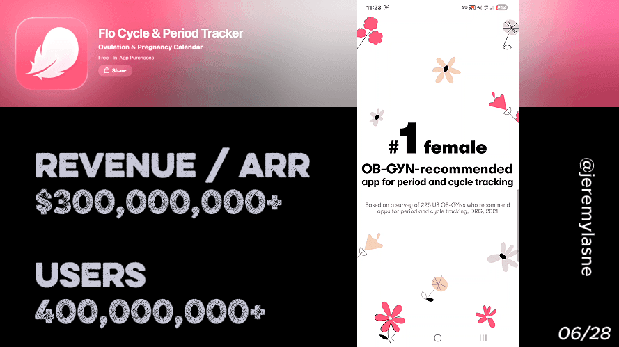
Flo made $275 million from subscriptions in 2025. It has 77 million active users, 300 million registered users, and was downloaded 48.6 million times in 2025 alone. Monthly iOS revenue is estimated at $10M with 2M downloads per month. Their onboarding runs 43 screens. It opens with authority, moves through deep emotional personalization guided by an animated battery mascot, uses a tap-and-hold fingerprint gesture as a commitment device before the paywall, and closes with a three-stage skip sequence ending in a shake-your-phone discount mechanic. This is the full breakdown.
The Numbers
- 2025 revenue: $275M
- Monthly iOS revenue: ~$10M
- Monthly downloads: ~2M (iOS) + significant Android
- Active users: 77M
- Registered users: 300M+
- 2025 downloads: 48.6M
- Valuation: $1B+
- Medical advisors: 100+
- Onboarding screens: 43
The Full Flo Onboarding Breakdown
Flo has been the largest health app by monthly active users and downloads for four consecutive years. This is not a growth story anymore. It is a dominance story. And the onboarding is the machine that converts 48 million new installs per year into one of the highest-revenue health subscriptions in the App Store.
Opening: animation authority before the first question
Flo does not open with a question. It opens with animation. Fluid, organic motion -- the visual language of biology and health, not productivity or tech. The first text the user sees positions the app directly: the #1 female health app in the world.
The combination is precise. The animation says: this is a space made for you. The claim says: this is the best version of that space. Before the first personalization question, the user's context is set -- they are in the right place, with the right tool.
This is different from PictureThis's authority opening, which leads with numbers. Flo leads with feeling. The distinction reflects the category: plant identification is a precision utility; menstrual health is an intimate, emotionally loaded topic. The opening must match the emotional register of what the user is about to share.
Personalization from screen two -- but social proof surfaces mid-flow
Flo begins personalization immediately after the opening. Cycle length. Last period date. Primary goal -- tracking, conception, pregnancy, perimenopause. These are the foundational data points that make every prediction in the app accurate.
Then, mid-flow, while the user is already engaged and answering questions, Flo surfaces the download count and App Store rating. Not on screen one, before the user has context. Not after the paywall, when the trust decision is already made. In the middle of a conversation the user is already invested in.
The long quiz feels like a guided conversation thanks to instant feedback and micro-reinforcements that validate the user's input, preventing fatigue across a 43-screen flow.
The mid-flow social proof placement is deliberate. A user who has already answered 10 personal questions is not evaluating whether to continue -- they are in the flow. The social proof at this point does not need to convince them to start. It reinforces that the decision they have already made is the right one. That is a categorically more effective use of the same data point.
The battery mascot: emotional regulation through design
Flo's mascot is a small animated battery character -- a visual metaphor for energy, health, and charge levels that maps perfectly onto the menstrual cycle's own energy patterns.
The mascot appears throughout the onboarding at regular intervals. It reacts to answers. It explains things conversationally. It expresses understanding when the user logs a difficult symptom or a challenging emotional state.
The mascot's function in Flo is more emotionally significant than in any other app in this series. Menstrual health is a domain where many users have felt dismissed by doctors, embarrassed by symptoms, or unheard by the people around them. A mascot that responds to "I feel exhausted before my period" with visible understanding and a supportive explanation is not a UX choice. It is a therapeutic signal: this app gets it.
That signal is why Flo's retention is structurally higher than most health apps. The user does not feel like they are logging data. They feel like they are being understood.
Authority screens between questions: the medical legitimacy layer
Flo's science-backed insights are created with 100+ doctors and medical experts. This is not mentioned once in the onboarding. It is woven into the flow as interstitial authority screens between personalization questions.
A question about PMS symptoms is followed by a brief explanation of the hormonal mechanism behind it, attributed to Flo's medical team. A question about cycle irregularity is followed by a note on what irregular cycles can indicate, reviewed by a gynecologist.
These screens serve three functions simultaneously. They educate, which makes the user feel the app is genuinely informative rather than just data-collecting. They establish credibility, which makes the eventual paywall feel like paying for expert-level insight rather than a generic tracking tool. And they make the questions feel purposeful -- the user is not filling out a form, they are building a medical profile with a team of doctors.
This is the deepest form of pre-paywall value delivery in this series: the education itself is part of the product, and the user receives it for free across 43 screens before being asked to pay for it.
Emotional personalization: the questions nobody else asks
The onboarding takes the user on a detailed journey, asking dozens of questions to build a personalized profile. But what distinguishes Flo's questions from a standard health app survey is the emotional depth of what it asks.
Flo asks about energy patterns across the cycle. About mood changes that the user may have noticed but never named. About how sleep feels in the luteal phase versus the follicular phase. About which symptoms have affected work, relationships, or daily life.
These are questions that a user's GP has probably never asked. Many users have never articulated these patterns out loud, let alone to an app. The act of answering them is itself valuable -- it creates self-knowledge. And the user attributes that value to Flo, not to themselves.
By the time the paywall appears, the user has gained something real from the onboarding regardless of whether they subscribe. That changes the emotional register of the payment decision: it is not "should I pay for this?" it is "I already got something -- do I want more of it?"
In-app notification framing: a promise, not a permission
Flo's notification ask is framed as a promise before the system prompt appears. Something to the effect of: "We'll send you a heads-up if anything in your cycle looks unusual, so you're always prepared."
This reframe does two things. First, it makes the notification feel protective rather than interruptive. The user is not granting a marketing permission -- they are being offered a health safety net. Second, it establishes the notification's purpose as the user's benefit, not the app's retention mechanism.
The system prompt follows immediately, in a context where the user is already thinking "yes, I want to know if something looks unusual." The allow rate on a notification prompt that arrives in that context is materially higher than one that arrives cold.
The loading screen: legitimacy while you wait
After the personalization questions, Flo shows a loading screen building the user's personalized plan. The animation is clean and medical-feeling. While it loads, Flo displays the ISO 27001 certification -- awarded to Flo as ISO 27001/ISMS Team of the Year at the 2025 PICCASO Privacy and Security Awards -- alongside the 300M user count, the 100+ doctors on the medical team, and the science-backed prediction methodology.
This is the same move as ShroomID's disclaimer and BitePal's raccoon warmth -- using transition time that would otherwise feel like friction to instead deliver trust signals. The loading screen does not feel like waiting. It feels like being shown credentials.
For a health app in 2026 handling sensitive reproductive data in a climate of significant concern about data privacy, the ISO certification is not a badge. It is the answer to the question that every woman in the onboarding has been thinking: is my cycle data safe here?
The fingerprint commitment gesture
A unique tap-and-hold gesture at a specific point before the paywall creates a moment of psychological commitment, increasing conversion potential.
The user is prompted to place their finger on the screen and hold. The animation responds to the touch -- a pulse, a glow, a visual confirmation that something real just happened. The copy frames it as a commitment to your health journey.
This is Prayer Lock's signature screen, executed through biometric touch rather than a written signature. The physical action is different; the mechanism is identical. A gesture that requires physical engagement produces a stronger behavioral commitment than a passive screen tap.
By the time the fingerprint screen appears, the user has:
- Shared their most intimate health data across 40+ questions
- Received education from Flo's medical team
- Had their emotional experience validated by the battery mascot
- Been told their data is protected by ISO-certified security
- Seen their personalized plan built in real time
The fingerprint gesture is the culmination of that journey. It is not a feature. It is a ritual -- a moment where the user physically declares that this plan belongs to them and they intend to follow it.
The paywall: yearly at half the monthly rate
Flo introduces its premium subscription after the extensive onboarding quiz, presenting a paywall with annual and monthly options. The yearly plan is prominently featured.
The pricing structure is clean. The annual plan costs approximately half what twelve months of the monthly plan would cost. There is no visual trick needed -- the math does the work. A user who has just invested 43 screens in a health journey and physically committed with a fingerprint gesture is calculating "what is a year of this worth?" not "do I want to try this?"
The paywall includes social proof -- ratings, user counts -- that the user has already encountered during onboarding. Repetition of the same social proof at the paywall moment is not redundant. It is anchoring the price against the most trusted version of the brand the user has already accepted.
Skip stage 1: the 14-day free trial
If the user skips the initial paywall, Flo does not immediately discount. After the user skips the first paywall, a special offer appears -- a free trial option that encourages continued engagement before the subscription decision.
The 14-day free trial is longer than any other trial in this series. The strategic logic is clear in the data: among apps that run trials, those offering 17-32 days convert at 45.7% -- nearly double the rate of short 3-7 day trials. Flo's 14-day trial sits close to that higher-converting window. A woman tracking her cycle for 14 days has seen real predictions, received real insights, and experienced what missing the next period prediction would feel like without PRO access.
The trial is offered at the annual rate. The user who has been in the free trial for two weeks is a categorically different conversion prospect than the user who saw the first paywall after the fingerprint screen.
Skip stage 2: shake the tree, win 72% off
If the user skips the trial offer, Flo deploys the most kinetically unique paywall mechanic in this entire teardown series.
An animation of a tree appears. The app prompts the user to physically shake their phone. The user shakes. Discount leaves fall from the tree. A 72% off offer appears. One time. Right now.
The shake mechanic is the most sophisticated version of Yazio's spin wheel. Both use gamification to deliver a discount that removes the price objection. But where Yazio's wheel is passive -- you watch it spin -- Flo's tree requires the user's own physical action to produce the result.
The psychology of earned rewards is stronger than received ones. When the 72% offer appears, the user did not receive a discount. They shook it out of a tree. They found it. The ownership of the discovery makes the offer feel more valuable than the identical number presented on a static screen would.
Post-close welcome offers that appear after the onboarding paywall is dismissed are now standard practice. The targeting precision is what makes them work: only users who showed intent but didn't convert see them. Flo adds physical engagement to that standard playbook, turning a discount screen into an interactive moment.
The Core Mechanism
Flo's conversion architecture is built on a principle no other app in this series executes as completely: make the user feel known before you ask them to pay.
The 43 screens of Flo's onboarding do not sell the product. They build a relationship. The battery mascot validates emotional experience. The doctor-reviewed authority screens prove medical legitimacy. The deep personalization questions make the user feel understood in ways that many healthcare encounters have not.
The physical commitment gesture before the paywall creates a moment of psychological commitment that increases conversion potential by making the subscription feel like honoring an intention already stated, not starting a new one.
The three-stage skip sequence -- initial paywall, 14-day trial, shake-the-tree discount -- captures three different types of users: the immediately convinced, the needs-to-experience-it-first, and the price-sensitive-but-interested.
At $275M annual revenue, they are converting all three types at scale.
What This Means for Your App
Three questions from the Flo playbook.
1. Are you surfacing social proof at the moment of maximum engagement, not the moment of first contact? Flo shows download counts mid-flow when the user is already answering questions, not on screen one before they care. The user is more receptive to validation when they are already invested than when they are still deciding whether to continue.
2. Does your loading screen deliver value or waste it? Every transition screen in your app is an opportunity. Flo uses the plan-building loading screen to display ISO certification, user counts, and medical credentials. What does yours show? A spinner is a missed conversion touchpoint.
3. Does your user physically do something before the paywall? Tap and hold. Sign their name. Shake a tree. Physical actions produce stronger commitment than passive reading. The mechanism does not matter. The physicality does.
FAQ
How much does Flo earn per year?
Flo made $275 million from its subscription service in 2025, a 4.5% increase over the previous year. Monthly iOS revenue is estimated at $10M with approximately 2M downloads per month.
How many users does Flo have?
Flo has 77 million active users and over 300 million registered users as of 2026. It was downloaded 48.6 million times in 2025 alone.
How many screens does Flo's onboarding have?
Flo's onboarding runs 43 screens covering animated authority opening, multi-stage personalization, mid-flow social proof, battery mascot reactions, medical authority screens, emotional health questions, in-app notification framing, an ISO-certified loading screen, a fingerprint commitment gesture, and a three-stage paywall skip sequence.
What is Flo's paywall structure?
Flo presents a paywall after the onboarding quiz with annual and monthly options. The yearly plan is prominently featured. If skipped, a 14-day free trial offer appears. If that is also declined, a shake-your-phone mechanic reveals a 72% discount as a one-time offer.
What is the Flo fingerprint commitment gesture?
Before the paywall appears, Flo prompts the user to place their finger on the screen and hold -- a tap-and-hold gesture framed as a physical commitment to their health journey. This biometric commitment device mirrors Prayer Lock's signature screen mechanic: physical action produces stronger behavioral commitment than passive screen interaction.
What is the Flo shake-the-tree discount?
If a user declines both the initial paywall and the 14-day trial offer, Flo displays an animated tree and prompts the user to physically shake their phone. Discount "leaves" fall from the tree revealing a 72% off one-time offer. The shake mechanic makes the discovery feel earned rather than received, producing higher acceptance rates than a static discount screen.
What is Flo's battery mascot?
Flo's animated battery mascot appears throughout the onboarding to react to user inputs, explain medical concepts conversationally, and provide emotional validation during sensitive health questions. The battery metaphor maps onto the cycle's energy patterns. The mascot's primary function is making users feel understood in a domain where many have felt dismissed, which is the core driver of Flo's retention advantage over competitors.
Why is Flo the #1 period tracking app?
Flo has been the largest health app by monthly active users and downloads for four consecutive years. Its dominance is built on three structural advantages: the deepest personalization onboarding in the category, a medical authority layer with 100+ doctors, and ISO 27001 data security certification that addresses the primary concern of users sharing sensitive reproductive health data.
This teardown is part of an ongoing series on in-app optimization. Want answers like these while you build? The tasu MCP serves the same sourced benchmarks to your coding agent, for onboarding, paywalls, and pricing.