The cinematic onboarding with no questions and no CTAs
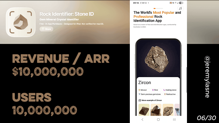
Rock Identifier Stone ID generates $300K in monthly iOS revenue with 100K monthly downloads. Its database covers 6,000+ rock and mineral types, and the 2026 update brought accuracy to 88% in independent field testing. Their onboarding runs 12 screens with no personalization questions, no CTAs until the paywall, and ambient music playing throughout. The screens advance automatically, like a film. A rock type gallery creates a personalized sense of possibility without asking a single question. The paywall appears twice -- once clean, once rewritten. This is the most unusual onboarding in the series, and it is the one that proves questions are not always the mechanism.
The Numbers
- Monthly iOS revenue: $300K
- Monthly iOS downloads: 100K
- Database: 6,000+ rock and mineral types
- Field accuracy (2026): 88%
- App Store position: first result for rock identification searches
- Onboarding screens: 12
- Personalization questions: 0
- CTAs before paywall: 0
Why No Questions Is a Strategy
Every other app in this series asks questions. Some ask 3, some ask 60. The assumption is universal: the more the user tells you about themselves, the more personalized the experience, the higher the investment, the better the conversion.
Rock Identifier rejects this entirely.
Their user is not a person with a health goal, a faith practice, or a weight to lose. They are a person holding an interesting rock who wants to know what it is. The motivation is already there. It arrived with the download. No onboarding question will add to it, and the wrong question will interrupt it.
The 12-screen cinematic onboarding is built on a precise understanding of who opens this app: someone who is already curious, already excited, and already sold on the concept. The onboarding's job is not to create motivation. It is to match the emotional energy the user already has and walk them, visually and sonically, into the paywall.
The Full Rock Identifier Onboarding Breakdown
The music starts immediately
The first thing Rock Identifier does when you open it is play music. Not a notification sound. Not a UI chime. Ambient, cinematic audio -- the kind that belongs under a nature documentary about the geological history of Earth.
This is the most underleveraged tactic in mobile app onboarding, used correctly by almost no app at scale: sound design as conversion mechanism.
The music does three things simultaneously. It signals immediately that this is a quality product -- cheap apps do not invest in ambient audio design. It creates an emotional state before any visual information lands -- curiosity, wonder, the specific feeling of discovering something ancient and beautiful. And it makes the onboarding feel like an experience rather than a setup flow.
Consistent messaging from ad to onboarding to paywall increases conversions. Rock Identifier's music establishes a tone on screen one that every subsequent screen maintains. The user is never jarred out of the experience by a system prompt or a marketing message that feels out of register with the app's identity.
12 screens that advance automatically
After the music starts, the screens begin to move. Not because the user taps. Because time passes.
This is the defining structural choice of the entire onboarding. No CTAs. No "next" buttons. No permission requests mid-flow. The user watches. The screens breathe. The content arrives.
Rock Identifier aims to be the "Instagram of rocks" -- a social, beautiful, community-driven experience rather than a utility tool. The auto-advancing onboarding communicates that identity before the user has seen a single feature. Utility apps have next buttons. Experience apps have moments.
The practical conversion effect of this choice is also precise. A user who is watching a cinematic sequence cannot click away from it. There is no friction point at which they can tap something wrong or be presented a choice they are not ready for. The onboarding progresses at the app's pace, not the user's distraction rhythm. By the time the first CTA appears -- the paywall -- the user has been in an uninterrupted immersive state for the duration of all 12 screens.
Beautiful rock photography as the product demo
The visual content of the screens is rock photography. Close-up shots of crystal formations. Cross-sections of agate. Raw mineral clusters catching light. Gem specimens on dark backgrounds.
This is the equivalent of Cal AI's product demo video, PictureThis's storytelling animations, and Flo's lush opening motion -- but executed entirely through still imagery and transitions. The user does not need to see the scanning feature work. They need to feel the wonder of what they will be scanning.
Every image answers the same question the user has been asking since they picked up the rock they downloaded the app for: what is this thing, and is it as remarkable as it feels? The photography says yes. Yes, these objects are worth knowing. Yes, the natural world produces things this beautiful. Yes, your rock might be one of them.
The images are not app screenshots. They are not UI mockups. They are editorial-quality mineral photography that positions Rock Identifier less as a scanning tool and more as a gateway to a world the user wants access to.
The number that does all the selling
Mid-flow, one screen states the core credential: 6,000+ rocks, crystals, and minerals identified instantly.
The database of over 6,000 rock and mineral types is the largest of any app tested, and the 2026 update added significant accuracy improvements.
The number is placed without explanation, without comparison, without a feature bullet list around it. It lands in the middle of a cinematic sequence as a single fact. The effect is different from a feature list precisely because of the context: surrounded by beautiful rock photography and ambient music, "6,000+" does not read as a marketing claim. It reads as the scale of what the user is about to gain access to.
This is the mechanism PictureThis uses with its 400,000 species count and Flo uses with its 300M user count -- a single authoritative number, placed at the right moment, that does more conversion work than a paragraph of feature descriptions.
Reviews appear mid-flow -- while the music plays
User reviews surface during the auto-advancing sequence. No separate social proof screen. No pause in the motion. The reviews appear against the visual backdrop, read in the same ambient emotional state as the photography.
The placement is the tactic. Most apps put reviews in a dedicated screen that breaks the onboarding rhythm -- a static testimonial block that feels like a commercial interruption. Rock Identifier surfaces them as part of the cinematic flow, which means the user processes them in the same emotional register as the beautiful images around them.
A review that reads "I found this amethyst on a hike and this app told me everything about it in seconds" lands differently when surrounded by a close-up photograph of an amethyst than when presented in a testimonial card on a white background. The context elevates the credibility.
The rock type gallery: personalization without questions
Before the paywall, Rock Identifier shows a gallery of rock categories. Igneous rocks. Sedimentary formations. Metamorphic specimens. Crystals. Gemstones. Fossils.
The user sees the full scope of what the app covers. And something interesting happens psychologically: the user begins placing their own rock into one of these categories. Mentally. Automatically. Without being asked to.
This is personalization without a question. Instead of "what kind of rocks are you interested in?" the gallery asks nothing and lets the user's own mind do the placement. The result is the same -- the user feels the app is relevant to their specific interest -- but the friction of answering a question is completely eliminated.
Micro-commitments are small interactive steps that build emotional investment and reduce drop-off before the paywall appears. Rock Identifier generates that investment through imagination rather than interaction. The user's mental engagement with the gallery -- "that's probably what my rock is, a metamorphic" -- is the commitment. No tap required.
"Your personal rock journey starts here"
The final pre-paywall screen delivers a line that synthesizes the entire onboarding philosophy: "Your personal rock journey starts here."
No question was asked. No preference was stated. No data was collected. And yet the word "personal" appears -- correctly, because the user's own curiosity and mental engagement with the gallery has genuinely made this feel personal.
This is the most efficient personalization in the series. Duolingo spends 38 screens making you feel seen. Rock Identifier spends 12 screens showing you a world, letting you imagine your place in it, and then telling you your journey starts now. The emotional result is comparable. The investment required from the user is zero.
Paywall 1: annual plan, free trial, complete silence
The first paywall is as minimal as the onboarding that preceded it. Annual plan. Free trial. One CTA. The music continues.
Benefit-driven CTAs outperform generic ones and consistent messaging from onboarding to paywall increases conversions. Rock Identifier's paywall CTA maintains the visual language and emotional register of the 12 screens before it. There is no jarring transition from cinematic experience to sales page. The paywall feels like the next screen in the film -- the screen where the user decides whether to stay in the world they have spent the last 12 screens exploring.
No countdown timer. No crossed-out price. No spin wheel. The restraint is consistent with the product philosophy: this is a premium experience for people who value beautiful things. Manufactured urgency would undermine that positioning in a single screen.
Skip: same paywall, rewritten headline, different angle
If the user skips the first paywall, a second appears. Same pricing. Same trial. Different headline. Different angle.
Where the first paywall might frame around discovery -- "Unlock 6,000+ rocks" -- the second might frame around collection -- "Build your personal geology library" or "Every find, identified and saved." The offer is identical. The emotional hook is different.
Post-close welcome offers that appear after the onboarding paywall is dismissed are now standard practice across every major category. Rock Identifier's version is the most restrained execution in this series. No discount. No gamification. Just a reframe.
The bet is that the user who skipped the first paywall did not skip because of price -- the price did not change. They skipped because the first framing did not match their specific motivation. A rockhound who cares about collection might not respond to "discover." A crystal collector who cares about identification might not respond to "save." The second paywall serves the second type.
The Core Mechanism
Rock Identifier's conversion is built on one insight no other app in this series executes: match the emotional state the user arrived with instead of trying to create a new one.
The person who downloads a rock identifier app is already in a state of curiosity and wonder. They picked up something from the ground and it fascinated them. That feeling -- the one that made them download the app -- is the strongest conversion emotion available. It does not need to be manufactured by a mascot, a quiz, or a commitment screen.
The cinematic onboarding with music does exactly one thing: sustain and amplify the feeling that was already there. The rock photography deepens the wonder. The 6,000+ number confirms the scope. The gallery makes it specific to the user's own rock. And the paywall arrives while that original feeling -- the one that started with picking up a stone -- is at its most vivid.
No other mechanism in this series leaves the existing user emotion intact for this long before asking for money. Every other app replaces the user's arrival motivation with an engineered one. Rock Identifier keeps the original and charges admission while it is still running.
What This Means for Your App
One question: what emotion did your user arrive with?
Not the emotion you want them to have. Not the emotion the onboarding creates. The emotion that existed when they searched for your app, read the description, and decided to download it.
That emotion is always your highest-converting asset. Every screen you add before the paywall either sustains it or dilutes it. Rock Identifier's 12 screens sustain it. Most apps' 50 screens dilute it.
If your core user arrives already motivated -- already holding the rock, already worried about the mushroom, already committed to prayer -- the question is not "how do we build motivation?" The question is "how do we keep what's already there long enough to reach the paywall?"
Sometimes the answer is 12 screens of beautiful photography and ambient music. Sometimes it is 43 screens of emotional personalization. The number is determined by the emotion you are trying to sustain, not by a conversion optimization framework.
FAQ
How much does Rock Identifier Stone ID make per month?
Rock Identifier Stone ID generates approximately $300K in monthly iOS revenue with 100K monthly downloads as of early 2026.
How many screens does Rock Identifier Stone ID's onboarding have?
Rock Identifier's onboarding runs 12 screens with no personalization questions and no CTAs before the paywall. The screens advance automatically while ambient music plays, functioning like a cinematic experience rather than a traditional onboarding flow.
What is Rock Identifier Stone ID's paywall structure?
Rock Identifier shows an annual plan with a free trial as the primary paywall. If skipped, a second paywall appears with the same pricing and trial but a rewritten headline and different value framing. No discount, no gamification, and no urgency mechanics are used in either paywall.
Is Rock Identifier Stone ID accurate?
In a 2026 independent field test across three geological regions, Rock Identifier Stone ID correctly identified 44 out of 50 specimens -- an 88% accuracy rate. Its database of over 6,000 rock and mineral types is the largest of any tested app.
What rock types does Rock Identifier Stone ID cover?
Rock Identifier's database includes 6,000+ types of rocks, crystals, gems, and minerals, covering igneous, sedimentary, and metamorphic rock categories as well as crystals, gemstones, and fossils.
Why does Rock Identifier Stone ID use music in onboarding?
The ambient music in Rock Identifier's onboarding sets an emotional register -- curiosity, wonder, the feeling of discovering something ancient and beautiful -- before any visual or textual content appears. It signals product quality, creates mood alignment with the app's "Instagram of rocks" positioning, and keeps the user in an uninterrupted immersive state through all 12 pre-paywall screens.
What makes Rock Identifier Stone ID's onboarding unique among rock identification apps?
Rock Identifier is the only major rock identification app that uses a fully cinematic, auto-advancing onboarding with no questions, no account creation, and no CTAs before the paywall. The approach works because it sustains and amplifies the curiosity the user arrived with rather than replacing it with engineered engagement mechanics.
This teardown is part of an ongoing series on in-app optimization. Want answers like these while you build? The tasu MCP serves the same sourced benchmarks to your coding agent, for onboarding, paywalls, and pricing.