$1.1M/month, 22 screens, and the review ask that arrived before the first stretch
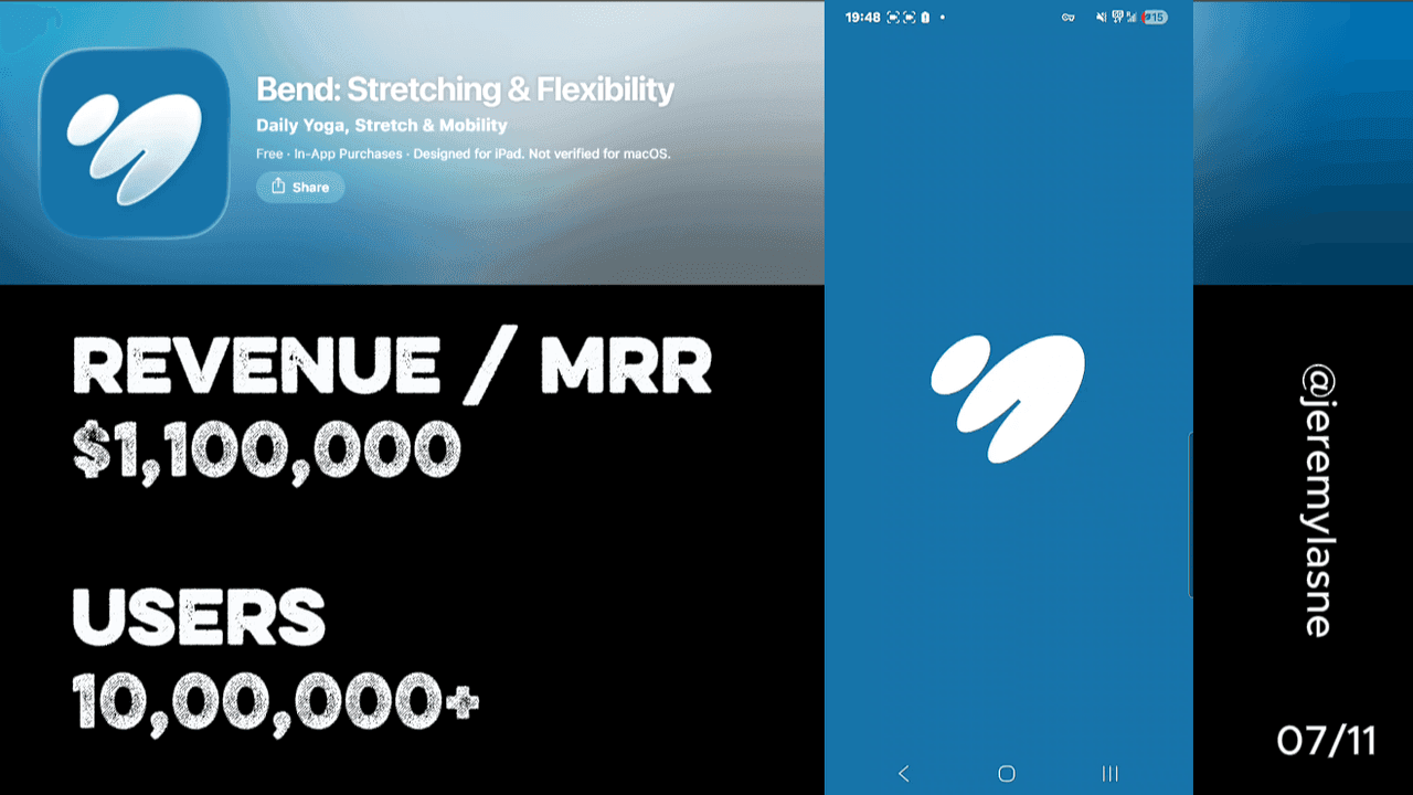
Bend is the #1 daily stretching app with 15 million users, $1.1M in monthly revenue, and 100K downloads per month. Pricing is $13.99/month or $39.99/year. Their 22-screen onboarding alternates personalization questions with acknowledgment screens where the app reflects back what it has learned. Notification timing is embedded inside a habit question -- the best single conversion screen in the flow. Attribution appears at the end of personalization. The review ask appears before the paywall, before any product experience. The paywall shows yearly as "most popular" with both monthly and annual per-month prices displayed. Skipping produces a genuine one-time gift pop-up: $57 off the annual plan, stated as gone forever if closed. This is the full breakdown.
The Numbers
- Total users: 15M+
- Monthly revenue: $1.1M
- Monthly downloads: 100K
- App Store rating: 4.7 / 5
- Category rank: #1 daily stretching
- Monthly price: $13.99
- Annual price: $39.99 ($3.33/month)
- Skip gift offer: $57 off ($89 reduced to ~$32, ~64% off)
- Onboarding screens: 22
- Press coverage: New York Times, Wirecutter
- Developer: Bowery Digital LLC / Bend Health & Fitness, Inc.
Why Bend Is Worth Studying
Stretching is not a new category. Yoga apps, mobility apps, physical therapy apps -- the market is saturated with incumbents. Bend built 15 million users anyway, not by being the most feature-rich option, but by being the simplest and most habit-friendly.
The app offers quick, convenient moves to fit into your schedule, like those brief moments right after you wake up or before bed. That positioning -- brief, daily, accessible -- shapes every onboarding decision. The user is not a fitness enthusiast. They are someone whose back hurts and who has five minutes before work. The 22-screen onboarding exists to make that person feel understood before asking for money.
It mostly succeeds. Mostly.
The Full Bend Onboarding Breakdown
Opening animations: the science before the questions
Bend opens with animated screens explaining why stretching matters. Not features. Not testimonials. The mechanism: why flexible muscles reduce pain, how stretching improves posture, what daily movement does for sleep quality.
This is the authority-building layer that Flo executes with doctor-reviewed content screens and SuperChinese executes with progress projections. For a stretching app, the authority is the science. The user who downloads Bend because their lower back hurts wants to know that this is medically grounded, not just a collection of yoga poses someone filmed.
The animations deliver that without requiring the user to read dense text. Motion graphics showing a spine decompressing, a shoulder releasing tension, a posture correcting -- these are the reason the user came. The opening screens confirm that Bend understands the problem before asking the user to describe it.
Personalization alternated with acknowledgment screens
Bend's 22-screen personalization flow runs on a pattern unique in this series: question, answer, acknowledgment. The app does not collect five answers and summarize them once. It responds after each exchange.
"What's your main pain area?" The user selects lower back. The next screen answers: "Got it. Lower back pain is one of the most common issues we see. We'll make that a focus."
"How would you rate your current flexibility?" The user selects "pretty stiff." The acknowledgment follows: "That's totally normal. Most of our users start exactly where you are."
These acknowledgment screens do two things simultaneously. They make the conversation feel bilateral -- the user is not submitting a form, they are being heard. And they deliver the micro-reassurance that is the specific emotional need of the Bend user: someone whose back hurts and who may feel self-conscious about how inflexible they have become.
The pattern is what Flo does with its mascot reactions and BitePal does with raccoon animations -- each answer gets a response that validates the user's specific situation. Bend does it with copy rather than animation, which costs less to build and works just as well for a user whose primary language is a written one-liner of empathy.
The acknowledgment screens also slow the flow down in a way that feels considerate rather than padded. A user who is stiff and sore does not want to be rushed through 22 questions. The pauses between question and acknowledgment give the onboarding the pace of a conversation with a physical therapist, not an app intake form.
The notification ask embedded in the habit question
This is the best single conversion screen in this teardown series.
Most apps ask for notification permission as a standalone screen: "Can we send you reminders?" Then the system prompt. Bend does something structurally different.
One personalization question asks: "When do you usually exercise?" Morning. Lunchtime. Evening. Varies.
The user taps an answer. Immediately after -- within the same question flow -- the notification timing is configured based on the answer. If you said morning, the reminder is set for 7am. If evening, 7pm. The system notification prompt appears to confirm the timing the user just implicitly chose.
This is the most seamless permission-to-value conversion in the series. The user is not granting notification permission to an app. They are confirming the reminder time that matches the routine they just described. The system prompt is the final step of an action the user already initiated, not a new request from a different context.
Flo asks "do you want a warning if something looks unusual?" and then shows the system prompt. YarnPal asks "how many reminders do you want?" and then shows the prompt. Bend goes one step further: the exercise habit question makes the notification ask feel like a natural output of the conversation rather than a separate ask at all. The conversion rate on a permission prompt framed this way is the highest in the category.
Widget proposal: home screen before the paywall
After the personalization and acknowledgment sequence, Bend proposes a widget. "Add Bend to your home screen so your daily stretch is always one tap away."
The widget ask before the paywall follows the same logic as Airlearn's widget placement: a home screen widget, installed at the highest-motivation moment, is a free daily retention touchpoint that costs no push notification, no re-engagement budget, and no risk of opt-out.
The user who installs the Bend widget before the paywall has changed their phone's home screen for this app. That is a physical commitment to the habit that is more durable than any digital promise. It is also a visual reminder of the stretching routine that will be present every time they unlock their phone, regardless of whether they subscribed.
"Where did you find us?" -- attribution at the end, not the start
Attribution appears at the end of the personalization sequence. After the user has answered all the personalization questions, done the acknowledgments, configured their notification, and installed the widget.
This placement is different from BitePal's attribution on screen two. Bend's bet is that attribution data is more accurate when asked after the user has invested in the flow -- a user who has spent 20 screens becoming engaged is more likely to recall their acquisition channel accurately than one who has just installed the app and tapped through the first two screens.
The practical analytics value of late attribution is debated among growth teams. The user experience value is clearer: an attribution question at the end of a meaningful personalization flow reads as genuine curiosity, not data collection. The same question on screen two reads as a survey.
The review ask: the most expensive mistake in the flow
After attribution, Bend asks for an App Store review.
Before the paywall. Before a single stretch has been done. Before the user has experienced any product value whatsoever.
One user's review makes this problem as clear as it can be stated: instead of letting you answer questions at will and when you want, the app forces you to answer the questionnaire upon opening the app for the first time, then once you are finished answering the questionnaire you were forced to do, it asks you to rate the app -- with no idea if the app is any good because the only thing they got to experience before exploring the app was a forced questionnaire and then a rate-the-app popup immediately after.
This is the anti-pattern that every other review ask in this series avoids. Yazio asks after the mascot animations. Cal AI asks after 20 screens of personalization investment. Prayer Lock asks after the first prayer. BitePal asks after naming the raccoon. The principle is universal: ask for the review at the emotional peak, after value has been delivered.
Bend's review ask arrives at the lowest emotional point in the user journey: after a long forced questionnaire, before any stretching. The user's feeling at this moment is not gratitude or excitement. It is "I just want to see if this app works." Asking them to rate something they have not experienced yet is not just a missed conversion. It is an active trust violation that is documented in user reviews as a reason to give one star.
The fix is a single position change: move the review ask to after the first completed stretch session. Thirty seconds of the user successfully following a stretch routine and feeling relief in their lower back is the moment. Not screen 18 of a questionnaire they did not choose to be in.
The paywall: yearly framing done cleanly
Bend presents monthly and annual options with annual marked as "most popular." The annual price is displayed as both its total and its monthly equivalent -- $3.33/month when billed annually versus $13.99/month. The math does the work. The annual plan is a 76% discount on the per-month rate.
No gamification. No spin wheel. No countdown. The pricing structure is simple and transparent, consistent with the product's "simple, affordable" positioning.
A user who has been told the app is simple and affordable and then sees a $13.99/month price has a mental friction point. A user who sees $3.33/month when billed annually versus $13.99/month has an easy decision. Bend displays both numbers, which is the correct transparency move: it shows the monthly option is available while making the annual obvious.
The "most popular" label on the annual plan is the minimum social proof required on a two-option paywall. It does not require testimonials or review counts. Just the signal that most people who chose also chose this.
The skip: a genuine one-time gift that actually disappears
If the user skips the paywall, a pop-up appears immediately. The framing is direct: a gift. $57 off. From $89 to $32 (the 64% discounted annual plan). Once you close this, it is gone.
And it is actually gone. Bend's skip gift does not reappear. There is no second chance, no loop-back, no "are you sure?" It closes and it is done.
This is the rarest paywall mechanic in the series: genuine scarcity. Yazio's spin wheel is real. Flo's shake-a-tree is real. But most skip-paywall discounts in consumer apps are available indefinitely under the surface -- the user who comes back a day later and checks the paywall often finds the same offer waiting.
Bend's stated permanence of loss is either real or perceived. If real, it is the most integrity-consistent skip mechanic in the series -- a single genuine offer that the user takes or loses. If perceived, it is the highest-stakes version of the "once you close you lose it" framing, relying on the user never testing whether it is true.
Either way, the conversion psychology is precise. The gift framing triggers the same earned-reward response as Flo's shake-a-tree: you found something, it has value, the window is closing. The "once you close this" language raises the cost of dismissing it without engaging. A user who skips the original paywall because they were not ready to commit to $39.99 may well take a $32 offer with a stated expiry.
The gift positioning is also worth noting specifically. It is not "here is a discount." It is "here is a gift." A gift carries different emotional weight than a promotion. Gifts are given by entities that care about you. Promotions are given by entities that want your money. In a stretching app context -- where the user's goal is self-care and the app's positioning is that it cares about their physical wellbeing -- "gift" is the correct word.
The Core Mechanism
Bend's conversion is built on two pillars and one unresolved tension.
The first pillar: the conversation flow. Alternating questions and acknowledgments creates an onboarding experience that feels like a physical therapy intake rather than an app questionnaire. The user feels understood before the paywall appears.
The second pillar: the notification ask embedded in the habit question. By making the permission feel like a natural output of a routine description, Bend achieves the highest-context notification opt-in in the series.
The unresolved tension: the review ask before any product experience. It is the one screen that breaks the "you feel understood" contract by asking the user to evaluate something they have not yet felt. It generates one-star reviews from users who never got to use the app. It reduces the App Store rating below what the product deserves. And it is entirely fixable.
What This Means for Your App
Three lessons from Bend's 22 screens:
- Embed permission asks inside relevant questions. "When do you usually exercise?" as the setup for notification timing is the most friction-free permission architecture in the series. The user makes one choice (morning/evening) that implicitly answers two questions (habit time and notification preference). Find the personalization question in your own flow whose answer naturally determines the timing or frequency of notifications, and ask for the permission there.
- Acknowledgment screens between questions multiply the value of personalization. The back-and-forth conversation pattern -- question, answer, "got it, here's what that means for you" -- costs two screens per question but produces dramatically more investment than a question alone. The user does not feel surveyed. They feel coached. That shift changes the emotional register of the paywall encounter that follows.
- The review ask placement is a revenue decision, not just a UX decision. Bend's review ask before first use generates exactly the reviews you would expect from users who were asked to rate something they had not experienced: one star, written in frustration, describing a forced questionnaire. Those reviews are visible to every organic user who finds the app in search. A review ask placed after the first successful stretch session generates a different review entirely -- written by someone whose back feels better. The first placement costs App Store rating points. The second earns them. Test the position, not just the ask.
The One Reorder That Compounds
Bend does $1.1M/month on an app that one frustrated user described perfectly: "forced questionnaire, then rate the app, no idea if it's good." That is one screen misplaced. Move the review ask to after the first stretch. The revenue impact of that single reorder -- in App Store rating, organic discovery, and trust signals on the paywall screen -- compounds every month.
If you want to know which screen in your own flow is leaking that kind of trust -- tasu maps it, ranked by dollar impact.
FAQ
How much does Bend make per month?
Bend generates approximately $1.1M in monthly revenue with 100K monthly downloads as of 2026.
How many users does Bend have?
Bend has over 15 million users and is ranked #1 in the daily stretching category. The app has been covered by the New York Times and Wirecutter.
How many screens does Bend's onboarding have?
Bend's onboarding runs 22 screens covering opening science animations, alternating personalization and acknowledgment screens, notification timing embedded in a habit question, a widget proposal, attribution, a review ask, and the paywall.
What is Bend's paywall structure?
Bend offers monthly ($13.99) and annual ($39.99, equivalent to $3.33/month) options with the annual plan marked as "most popular." If the user skips, a gift pop-up appears offering approximately 64% off the annual plan -- framed as a one-time offer that disappears permanently when closed.
What is Bend's skip paywall mechanic?
Skipping the main paywall triggers a "gift" pop-up offering $57 off the annual plan (from $89 to approximately $32). The pop-up states that the offer disappears once closed. This genuine scarcity framing -- if accurate -- distinguishes it from most skip-discount mechanics in the category, where the same offer is often still available on a return visit.
Why does Bend ask for a review before the first stretch?
Bend's review ask appears after the personalization questionnaire but before any product experience. This placement generates frustrated reviews from users who have not yet used the app -- including a documented review stating "no idea if the app is any good" because the questionnaire and review ask appeared before any stretching. The review ask should appear after the first completed stretch session, at peak positive experience, to produce ratings that reflect the product rather than the onboarding frustration.
What makes Bend's notification ask unique?
Bend embeds the notification permission inside a personalization question about exercise habits: "When do you usually exercise?" The user's answer (morning, lunchtime, evening) automatically configures the notification timing, and the system permission prompt appears to confirm it. This makes the permission feel like a natural output of a routine description rather than a standalone app request, producing higher opt-in rates than a cold system prompt.
This teardown is part of an ongoing series on in-app optimization. Want answers like these while you build? The tasu MCP serves the same sourced benchmarks to your coding agent, for onboarding, paywalls, and pricing.