$600K/month, 5M families, and the screen-5 sign-up wall bouncing sleep-deprived parents at 3am
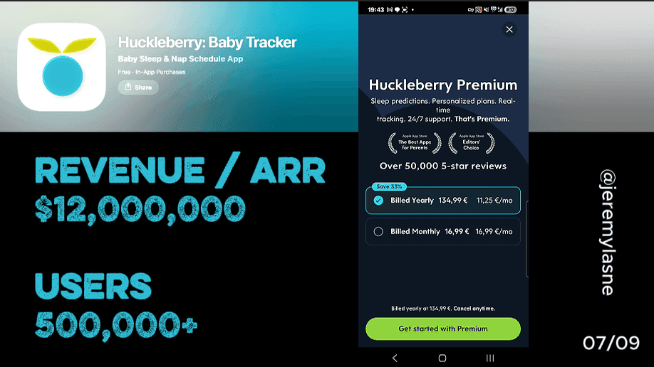
Huckleberry is the #1 baby tracking app trusted by 5+ million families worldwide, generating $600K in monthly revenue with 200K downloads per month and a 4.8-star rating. They have raised $16M in VC funding and employ 64 people. Their onboarding runs 32 screens. It opens with product feature slides, then requires mandatory account creation -- Facebook, Apple, or email -- before any product experience has been delivered. This is the single biggest conversion leak in an otherwise solid onboarding. The paywall is a well-structured two-tier comparison (Plus vs Premium) with monthly and annual options, 33% off annual, and embedded reviews. Notifications are asked last. This is the full breakdown.
The Numbers
- Monthly revenue: $600K
- Monthly downloads: 200K
- Total families: 5M+
- App Store rating: 4.8 stars (4.8 iOS, 4.8 Android)
- VC raised: $16M across 2 rounds
- Employees: 64
- Category rank: #1 baby tracker, #5 top free parenting
- Countries: 179
- Onboarding screens: 32
- Sign-up placement: screen 5, before any product experience
The Category Context
Baby tracking is a category defined by a specific user state: extreme sleep deprivation, high anxiety, and a desperate need for something that works right now. The parent opening Huckleberry for the first time is not evaluating apps in a calm moment. They are holding a baby at 3am, running on 4 hours of sleep, hoping this tool will tell them when the next nap window is.
Up to 93% of families using Huckleberry's baby sleep tracking report improved sleep patterns. That statistic is the most powerful conversion asset in the product. It means the thing works. The problem is that a meaningful fraction of the parents who need it most are not getting past screen 5 to find out.
The onboarding leak is not a design problem. It is a sequencing problem. And in a category where the user's patience is measured in seconds between feeds, sequencing is everything.
The Full Huckleberry Onboarding Breakdown
Opening slides: a good product, shown well
Huckleberry opens with feature slides. The app's core capabilities -- sleep tracking, the SweetSpot nap prediction, caregiver sync, feeding logs, diaper tracking -- are presented cleanly and visually. The SweetSpot feature predicts the ideal time for sleep with remarkable accuracy.
The slides are well-designed. They communicate what the app does without overselling. They establish Huckleberry as a serious, professionally built tool for a serious parenting challenge.
The problem is what comes immediately after them.
Screen 5: the mandatory sign-up wall
After the feature slides, before personalization, before any product touch, before entering a single data point about their baby -- the user hits a mandatory account creation screen. Facebook login. Apple login. Email and password.
This is the most consequential screen in the entire 32-screen flow, and not for good reasons. It is the highest-friction ask at the lowest-investment moment. The user has watched some slides. They have not used anything. They have not experienced any value. They have no sense of loss if they leave. And they are being asked to create an account.
Sign-ups are friction. Letting users experience your app first, then asking them to commit, converts more users and collects better data because they are already invested. Huckleberry inverts this entirely: account before investment, commitment before experience.
The sleep-deprived parent at 3am is a specific user type that is uniquely vulnerable to friction. They downloaded the app because the baby won't sleep. Their attention window is minutes, not hours. A sign-up screen at this moment -- with a decision between three auth options, a password to create, an email to verify -- is the exact wrong ask at the exact wrong time.
The users who bounce here are not uncommitted users who were never going to pay. They are exactly the parents who needed the app most, arriving at maximum urgency, encountering a gate they did not expect. Many of them close the app and never return.
The fix is not to remove the account. Huckleberry needs an account -- caregiver sync across multiple devices requires it. The fix is to move the account creation to after the first logging session. Let the parent track one sleep entry, one feed, see the interface work, and then ask for an account to save their data.
"Your data is saved -- create an account to access it across all your devices" is a completely different ask than "create an account to start." The first has a reason the user already understands because they have data to protect. The second is a barrier in front of the reason.
Personalization: the right questions, wrong position
After account creation, Huckleberry asks genuinely good personalization questions. Baby's name. Birthday. Number of caregivers. Primary sleep challenge. What the parent is hoping to track.
These questions are well-designed. They collect data that makes the SweetSpot predictions more accurate from day one. They make the app feel immediately personal to the specific baby, not to a generic infant.
The problem is that they arrive after the sign-up wall, which means only the users who cleared the wall reach them. The parents who bounced at account creation never get to tell Huckleberry their baby's name. The personalization questions are doing good work for a reduced audience.
If the personalization came before the sign-up -- if the first five screens collected baby name, birthday, and primary concern, then asked for an account to "save your baby's profile" -- the sign-up would convert at meaningfully higher rates. The user would have something to protect by the time the account was requested.
This is the same principle Deepstash executes with its skippable email: earn the account through delivered value before asking for it. Huckleberry's personalization questions are the value. They are just sequenced after the wall instead of before it.
The paywall: a well-built two-tier structure
After personalization, Huckleberry presents the paywall. Two tiers shown side by side: Plus and Premium.
Plus membership includes SweetSpot nap predictions, Schedule Creator, Insights with data-driven tips, Enhanced Reports, and AI Logging. Premium adds Berry (24/7 AI chat guidance), Custom Sleep Plans with weekly check-ins, and access to pediatric sleep consultants.
Monthly and annual options for each tier. The annual plan is shown at 33% off, with both the annual total and the monthly equivalent displayed. This is the most transparent pricing structure in the series -- both the annual commitment and the per-month cost are visible simultaneously, so the user can evaluate by the metric they prefer.
The two-tier structure is the most sophisticated paywall architecture in the series after Daylio's three-tier model. It serves two distinct user types: the parent who wants smart tracking and predictions (Plus), and the parent who wants a sleep consultant in their pocket at 3am (Premium). The feature separation is genuine -- the tiers are not Plus-as-decoy-for-Premium, they are legitimately different products for different levels of sleep crisis.
Reviews are embedded in the paywall. Real parent testimonials about specific outcomes -- "the SweetSpot told me exactly when to put her down and she slept four hours straight." In a category where the stakes are sleep deprivation, specific outcome reviews are the most powerful social proof available. A parent reading "four hours straight" at 3am with a baby who has slept in 45-minute increments for three weeks is not evaluating a subscription. They are reading a lifeline.
The 33% annual discount is shown correctly -- as the per-month equivalent -- which makes the annual plan look like the logical choice rather than the expensive one. The pricing structure does not need urgency mechanics or spin wheels. The sleep deprivation creates its own urgency. The paywall just needs to be clear and credible, which it is.
Notification ask: last, brief, functional
After the paywall, Huckleberry asks for notification permission. The framing is practical: reminders for feeding times, medication schedules, nap windows. The ask comes after the value has been established and after the subscription decision has been made.
This is the correct placement for a baby tracking app. The notification ask in this context is not a retention mechanic. It is a utility confirmation: you are going to use this app to track your baby's schedule, and you will need reminders to do that effectively. The system prompt arrives in a context where the user already understands and wants those reminders.
The Core Mechanism: A Great Product Leaking at the Gate
Huckleberry's conversion architecture has one leak and one strength, and they sit adjacent to each other in the flow.
The leak: mandatory account on screen 5 before experience. This is removing parents from the funnel at the moment of maximum urgency and minimum investment. Every parent who bounces at the sign-up screen is a parent who needed what Huckleberry offers and did not get far enough to feel it.
The strength: a two-tier paywall with embedded outcome reviews, transparent pricing, and a 33% annual discount shown as a monthly equivalent. This paywall closes well for the users who reach it. The conversion problem is not at the paywall. It is at screen 5.
The fix is a single sequencing change: move the personalization questions before the sign-up, and reframe the account creation as saving the baby profile the user just built. This change does not require redesigning any screen. It requires reordering them.
Huckleberry was founded by Jessica Toh, whose own baby woke every two to three hours for its first 20 months. The product exists because a founder lived the problem. The onboarding just needs the sequencing to match the empathy that built the product.
The Five-Tier Feature Architecture: a Lesson in Paywall Design
Huckleberry's subscription architecture is worth studying independently of the onboarding:
Free tier: One-touch tracking for sleep, diapers, feeds, pumping, growth. Caregiver sync. Medication reminders. This is a genuinely useful free product that builds the tracking habit before any subscription decision.
Plus tier: SweetSpot predictions, Schedule Creator, Insights with expert guidance, Enhanced Reports, AI Logging. The intelligence layer on top of the tracking data.
Premium tier: Everything in Plus, plus Berry (AI chat with pediatric guidance), Custom Sleep Plans with weekly consultant check-ins.
The architecture serves three user states: the parent who needs tracking (free), the parent who needs smart predictions (Plus), and the parent in active sleep crisis who needs an expert (Premium). Each tier is priced for the urgency level of its user. Premium commands a higher price because the parent buying it is the most desperate.
This is the correct way to design subscription tiers: not by feature volume, but by user urgency. The more urgent the problem your tier solves, the higher the price it can command.
What This Means for Your App
Three lessons from Huckleberry's 32 screens:
- If your app requires an account, make sure the user has something to protect before you ask for it. Huckleberry's caregiver sync genuinely requires an account. The problem is asking for it before the user has entered any data. Move the account ask to after the first data entry -- "save your baby's profile" is a fundamentally different ask than "create an account to continue." Test this single change before anything else. The bounce rate at the sign-up screen is the highest-ROI optimization in the flow.
- Two-tier paywalls work when the tiers solve genuinely different problems. Huckleberry's Plus and Premium are not marketing tiers with the same features. They solve different user problems -- smart predictions vs expert consultation. If you are considering adding a second tier, the test is simple: can you describe the user who needs tier one and the user who needs tier two without overlap? If yes, the second tier is legitimate. If no, you are building anchoring theater, not product architecture.
- Outcome reviews on the paywall, not star ratings. Huckleberry embeds specific parent testimonials describing specific sleep outcomes. A parent reading "she slept four hours straight" at 3am is not reading a product review. They are reading a future they want. In high-stakes categories -- sleep, health, anxiety, baby care -- specific outcome testimonials on the paywall outperform star ratings because they speak to the exact fear the user arrived with.
The Real Revenue Leak
Huckleberry's $600K/month is being generated despite a screen 5 sign-up wall that is bouncing sleep-deprived parents before they feel the product. Move the account ask 10 screens later and the same traffic converts at a meaningfully higher rate.
That is not a redesign -- it is a reorder. If you want to know which screen in your own onboarding is creating that kind of bounce -- ranked by dollar impact -- tasu maps exactly that.
FAQ
How much does Huckleberry make per month?
Huckleberry generates approximately $600K in monthly revenue with 200K downloads per month as of 2026.
How many families use Huckleberry?
Huckleberry is trusted by 5+ million families worldwide across 179 countries, with 506K+ active users tracked in early 2025.
How many screens does Huckleberry's onboarding have?
Huckleberry's onboarding runs 32 screens covering feature slides, mandatory account creation, personalization questions about the baby and primary sleep challenges, a two-tier paywall comparison, and a notification permission ask.
What is Huckleberry's paywall structure?
Huckleberry offers two paid tiers alongside a free tier. Plus membership includes SweetSpot nap predictions, Schedule Creator, Insights, Enhanced Reports, and AI Logging. Premium adds Berry AI chat, Custom Sleep Plans with weekly check-ins, and pediatric sleep consultant access. Both tiers are available monthly or annually, with annual pricing at 33% off shown as both a total and a monthly equivalent.
What is Huckleberry's biggest onboarding problem?
Mandatory account creation on screen 5, before any product experience has been delivered, is the primary conversion leak. The user has watched feature slides but has not logged a single data point when the sign-up wall appears. Sleep-deprived parents at 3am with limited patience are disproportionately likely to bounce at this screen. Moving the account ask to after the first logging session -- reframed as saving the baby profile the user has already started building -- would recover a meaningful fraction of these bounced installs.
What is Huckleberry's SweetSpot feature?
SweetSpot is a Plus-tier feature that predicts the ideal time for sleep for babies 2 months and older, eliminating the need for parents to calculate wake windows manually.
Is Huckleberry VC-backed?
Yes. Huckleberry has raised $16M in funding across two rounds from investors including Storm Ventures, Tamarisc, and Spero Ventures, and operates with a team of 64 employees as of 2026.
This teardown is part of an ongoing series on in-app optimization. Want answers like these while you build? The tasu MCP serves the same sourced benchmarks to your coding agent, for onboarding, paywalls, and pricing.