The skip button that feels like abandonment
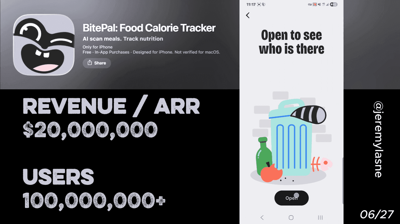
BitePal is an AI calorie tracker built around a virtual raccoon companion whose wellbeing is tied to your logging consistency. It has 3.4M downloads and a 4.62-star average as of early 2026. Its onboarding runs 55 screens. The flow culminates in the user adopting and naming a raccoon pet, immediately forging an emotional connection that every subsequent screen is built to deepen. The paywall is outcome-oriented, shows annual pricing as a monthly rate, and includes a three-stage skip sequence ending with a raccoon looking shocked at the user's decision. After the paywall: email capture. This is the full breakdown.
The Numbers
- Total downloads: 3.4M
- App Store rating: 4.62 stars
- Reviews (iOS + Android): 635K+
- Onboarding screens: 55
- Mascot: a raccoon whose health mirrors your tracking consistency
- Post-skip stages: 3 (discount, surprised raccoon, "skip forever" CTA)
The Full BitePal Onboarding Breakdown
Outcome slides before anything else
BitePal does not open with a product explanation. It opens with a sequence of outcome slides. Not "here is what the app does." Instead: here is what your life looks like after you use it. A projected weight on a target date. A habit streak reaching 30 days. A raccoon thriving because you did.
The distinction matters. A feature slide answers "what is this?" An outcome slide answers "what do I get?" Only one of those questions produces the motivation to continue through 55 screens. BitePal bets on the second from the very first screen, and then builds the entire onboarding around delivering on the promise those slides made.
Attribution on screen 2: "Where did you hear about us?"
The attribution question -- "How did you hear about us?" -- appears very early in the flow, before the emotional investment has been built.
Placing this on screen two is a deliberate product decision. At scale with 3.4M downloads, knowing which channel produces which user behavior is commercially essential. An attribution question mid-onboarding gets accurate answers because the user is not yet fatigued or emotionally attached enough to skip it carelessly. It reads as curiosity rather than a survey because it is so early that the relationship has not yet started.
The data collected here -- TikTok, Instagram, friend referral, App Store search, YouTube -- shapes every dollar of ad spend that drives the next million downloads.
Personalization tied to projected outcomes
After attribution, BitePal runs its first wave of personalization: goal type, current stats, activity level, dietary preferences, timeline. But unlike most calorie apps that collect this data and show a static plan, BitePal shows the calculation updating in real time.
"Based on your answers, you could reach [target weight] by [specific date]."
The outcome is not generic. It has the user's name, their number, their timeline. This is the same mechanism Cal AI uses with its animated plan generation -- but BitePal adds one layer that Cal AI does not: the projection is immediately tied to the raccoon's wellbeing. Your goal date is the raccoon's flourishing date. The personal becomes relational before the mascot has even been formally introduced.
The raccoon reveal: egg, hatch, name, yours
The onboarding's centrepiece moment is the user adopting and naming their pet raccoon. It arrives as an egg first -- echoing Finch's hatch mechanic -- and the user taps to hatch it. The raccoon emerges. You name it. You choose a personality trait.
The sequence is almost identical to Finch's, and the mechanism is the same: naming creates ownership, ownership creates responsibility, responsibility drives retention. But BitePal adds a layer Finch does not have: the raccoon can be customized with outfits and reacts to food choices with visible emotion. Every logging decision the user makes has a visible consequence for a character they have already named and personalized. The raccoon is not a progress bar. It is a dependent.
Mascot animations between every question
After the raccoon is named, every subsequent personalization question triggers a raccoon animation reaction. The raccoon nods when you pick a goal it approves of. It looks worried when you select a challenging timeline. It celebrates when you commit to a daily logging habit.
BitePal transforms the often tedious process of diet tracking into a delightful and motivating experience. The onboarding is a prime example -- instead of a dry form, it is a lengthy but interactive quiz.
The animations do two things simultaneously. They maintain engagement across 55 screens that would otherwise feel like an extended form. And they make the raccoon feel like a personality rather than an asset -- it has opinions, reactions, emotional responses. By screen 30, the user is not interacting with an app. They are in a relationship.
The review ask: while the raccoon warmth is at its peak
Mid-onboarding, while the raccoon animations are still fresh and the emotional connection is at maximum, BitePal asks for an App Store review. Same principle as every other app in this series, same timing logic: capture the rating at the highest positive emotional state, before any friction or price has been introduced.
The difference here is the emotional context. A BitePal user who has just named their raccoon, watched it hatch, and seen it react to their goals is not rating a calorie tracking app. They are rating a relationship they just started. The resulting reviews reflect that emotional state, not a measured assessment of the product's accuracy or features.
"How many reminders do you want?" Not: "Allow notifications."
The notification ask is the most well-designed permission screen in any onboarding in this series.
BitePal does not show a system prompt and ask for blanket notification permission. It asks: "How many meal reminders would you like each day?" Options are presented: one, two, three, customized timing.
The user selects. Then the system notification prompt appears -- but now in a specific context. It is not "allow BitePal to send you notifications." It is "allow the reminders you just configured." The user has already said yes to the concept. The system prompt is asking them to honor a decision they have already made.
This framing converts notification permission at a significantly higher rate than a cold system ask. The user is not granting a new permission. They are completing an action they already took.
The paywall: outcomes, annual as monthly, reviews, comparison
After completing the extensive personalization quiz, the user is presented with their customized plan summary, but the details are locked. The paywall appears offering a free trial that converts to an annual subscription, highlighting a significant discount from a crossed-out price to create value. It includes strong social proof with user testimonials and an average star rating directly on the paywall, plus a feature comparison table.
Four things make this paywall structurally distinct from a generic subscription screen.
Outcome anchoring: the paywall headline references the user's specific goal date from the personalization flow. You are not paying for a subscription. You are paying to reach the outcome that was projected for you specifically.
Monthly price framing on an annual plan: the price displayed prominently is the per-month cost of the annual plan. The total annual charge is visible but secondary. The comparison reads as "less than a coffee per day" rather than "a significant annual commitment."
Reviews directly on the paywall: star ratings and specific user testimonials appear below the pricing. The last piece of social proof the user sees before making the payment decision is another person describing a result they achieved.
Comparison to traditional apps: a feature table compares BitePal PRO to a generic "traditional calorie app" (structured to evoke MyFitnessPal). The comparison is designed to make the subscription feel like an upgrade, not a cost.
Skip stage 1: 60% off, same monthly framing
If the user skips the initial paywall, a second screen appears immediately. Post-close welcome offers that appear after the onboarding paywall is dismissed, offering a discounted annual plan, are now one of the most common and effective second-chance conversion patterns across categories.
BitePal's version offers 60% off the same annual plan, still presented as a monthly rate. The user who skipped the full price is now seeing a materially different number. The 60% reduction is not a small nudge -- it changes the economics of the decision significantly.
The framing remains monthly. The user never has to think about an annual lump sum. They are always comparing monthly-to-monthly, which keeps the price anchored low while the annual commitment accumulates silently in the background.
Skip stage 2: the surprised raccoon
If the user skips the discounted offer, the raccoon appears on screen. Its expression is one of visible surprise and mild distress. The copy reads something to the effect of: "Wait... you're really going to leave? I thought we had something."
This screen has no close precedent in consumer app onboarding. It is the most emotionally direct conversion attempt in any flow in this series. The raccoon the user just named, hatched, and watched react to their goals for 40 screens is now looking at them, confused and hurt, asking why they are leaving.
The psychology is not subtle. It works on the same mechanism as Finch's day-7 guilt: breaking a relationship you started is harder than breaking a habit you planned. The raccoon is not a cartoon. It is the embodiment of the investment the user has made over 50 screens of engagement. Closing the paywall now feels like abandoning something -- or someone.
The "skip forever" CTA
Below the surprised raccoon, the CTA for continuing without subscribing reads: "Yes, skip forever."
This is the most deliberate friction word in any onboarding in this series. "Skip" is neutral. "Skip forever" is a declaration. It implies permanence. It implies the user is not deferring a decision but actively choosing to leave the raccoon in a degraded state, forever.
The cognitive weight of clicking "skip forever" is significantly higher than clicking "maybe later" or "continue free." It makes the no feel larger than it is, and in doing so, converts a fraction of the users who would have clicked "maybe later" without thinking. The ones who do click it are the ones who genuinely will not subscribe at any price -- and they are allowed to opt out with a word that makes the cost of opting out psychologically real.
Email capture: after everything
After the paywall sequence -- original offer, 60% discount, surprised raccoon, skip forever -- BitePal captures the user's email address.
Email sign-up or login using the same account method activates PRO access automatically and enables support communication. But the email capture at this position serves a second function: it creates a user record that exists outside the App Store ecosystem.
An email address captured post-paywall means BitePal can send win-back campaigns to lapsed subscribers, send trial-end reminders before the renewal hits, send re-engagement emails to free users who stopped logging, and run post-onboarding nurture sequences that the App Store cannot touch.
The email ask after a long onboarding, when the user has already expressed enough interest to go through 55 screens, captures at a much higher rate than an email ask on screen one.
The Core Mechanism
BitePal's conversion architecture has a name: identity investment before price.
Every screen in the 55-screen onboarding builds one thing: the user's sense that the raccoon belongs to them. By the time the paywall appears, leaving does not mean declining a subscription. It means leaving a relationship.
The three-stage skip sequence -- discount, surprised raccoon, "skip forever" -- is the most explicit version of this mechanism in any consumer app. Each stage raises the emotional cost of saying no. Each stage is designed to convert the user who was willing to skip at the previous price, in the previous emotional context.
The raccoon does not make the product better. It makes the paywall harder to close.
What This Means for Your App
Two questions.
What does your user feel they are leaving when they close the paywall? If the answer is "an app" -- you have a character problem, not a paywall problem. BitePal spent 50 screens making the user feel like they are leaving a named, living thing. The paywall converts because the skip costs something real.
What does your skip CTA say? "Maybe later" is free. "Skip forever" costs. The words you put on the skip button change the psychological weight of clicking it. Test "skip forever" versus "maybe later" in your own flow. The conversion difference is measurable and real.
BitePal built 3.4M downloads on a calorie tracker in a saturated category. The product is not the differentiation. The raccoon is. And the raccoon only matters because 55 screens taught the user to care about it before the price appeared.
FAQ
How many screens does BitePal's onboarding have?
BitePal's onboarding runs 55 screens covering outcome slides, attribution, deep personalization, raccoon adoption and naming, mascot animations between questions, a review ask, notification preference configuration, and a three-stage paywall skip sequence ending in email capture.
What is BitePal's mascot and how does it affect conversion?
BitePal's mascot is a playful AI raccoon companion that provides encouragement, reacts to food choices, and can be customized with outfits. The raccoon is introduced mid-onboarding as an egg the user hatches, names, and personalizes. Its subsequent reactions to user inputs across 30+ screens build emotional investment that makes the paywall skip feel like abandoning a relationship rather than declining a subscription.
What happens when you skip the BitePal paywall?
BitePal runs a three-stage skip sequence. Skipping the initial paywall triggers a 60% discount offer, still framed as a monthly rate. Skipping the discount reveals a screen with the surprised raccoon asking why the user is leaving. The final skip CTA reads "Yes, skip forever" -- language designed to raise the psychological cost of declining. After the paywall sequence, BitePal captures the user's email address.
What is BitePal's paywall structure?
BitePal uses a soft paywall with a free trial that converts to an annual subscription. The paywall includes a crossed-out higher price, user testimonials and star ratings, and a feature comparison table. The annual plan is displayed as a per-month cost. A 60% discounted offer appears for users who skip the initial paywall.
How many downloads does BitePal have?
BitePal has passed 3.4M downloads with a 4.62-star average and 635K+ reviews as of early 2026.
Why does BitePal ask "how many reminders do you want" instead of a standard notification permission?
BitePal frames the notification ask as a preference selection -- the user chooses how many meal reminders per day they want -- before the system permission prompt appears. This means the user has already said yes to the concept before the technical permission is requested, producing higher opt-in rates than a cold system ask.
What makes BitePal's onboarding one of the best mobile app onboarding examples?
BitePal combines outcome-first slides, attribution data collection, projected personalized goals, a hatching and naming mascot sequence, mascot reaction animations between every question, a precisely timed review ask, a preference-framed notification ask, and a three-stage skip paywall sequence ending with a surprised raccoon and a "skip forever" CTA. The result is 55 screens that make the paywall skip feel emotionally costly rather than friction-free.
This teardown is part of an ongoing series on in-app optimization. Want answers like these while you build? The tasu MCP serves the same sourced benchmarks to your coding agent, for onboarding, paywalls, and pricing.