Sign it, then no way out
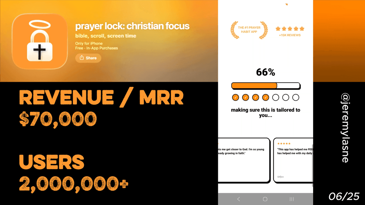
Prayer Lock is a Christian focus app that blocks your phone until you pray. Built by solo founder Mau Baron, it reached $21K MRR in 6 months with 58K downloads, 6.7K reviews, and a 4.9-star App Store rating. Its onboarding conversion rate exceeds 43%. The flow runs 36 screens. It opens by talking to the user, not selling to them. It includes a first prayer experience mid-flow, a finger-signature commitment screen, three stacked permission asks, and a hard paywall with the annual plan first and no exit button. This is the full breakdown.
The Numbers
The headline figures behind the teardown:
- MRR: $21K
- Downloads in 6 months: 58K
- App Store rating: 4.9 stars
- Reviews: 6.7K
- Onboarding conversion rate: 43%
- Onboarding screens: 36
- Team size: 1
Prayer Lock's conversion rate exceeds 43%, a prime example of how longer onboarding experiences drive better results. For context, the median app converts 2 to 5% of downloads to paid. Prayer Lock converts more than 4 in 10. The 36-screen onboarding is not incidental to that number. It is the number.
The Full Prayer Lock Onboarding Breakdown
Screen 1: A question, not a pitch
Prayer Lock does not open with a logo animation, a feature list, or an App Store rating badge. It opens with a question directed at the user: "Do you have 1 minute for God?"
This is the most important screen in the entire flow and the one that costs nothing to build. It does what no feature screenshot can: it creates a moment of genuine self-reflection before the app has asked for anything. The user is not evaluating a product. They are answering a question about their own faith and their own time.
The answer they give, even internally, even silently, is a micro-commitment. They said yes. Everything that follows is the app helping them follow through.
Prayer Lock's core pitch is simple: your phone's constant pings make prayer an afterthought. Prayer Lock flips that. Before Instagram, TikTok, or games open, you pause, pray, and then unlock. That value proposition is implicit in the opening question. The app does not explain itself. It asks the user to explain themselves.
Streaks introduced immediately
Before the user knows what the app does in detail, Prayer Lock introduces the streak mechanic. "Day 1 starts today."
This is deliberate front-loading. The streak is not introduced as a feature. It is introduced as a reality that is already beginning. The framing is not "our app has streaks," it is "you are already on day one." The user is inside the game before they have opted into it.
Gamifying engagement through a daily streak creates accountability in faith apps. Prayer Lock introduces that accountability before personalization, before permissions, before the paywall. By the time the paywall appears, the user has had a streak running for the entire duration of the onboarding. Closing the app now means breaking it.
Three personalization screens
Prayer Lock runs three focused personalization questions: faith background, prayer goals, and daily routine. Short, direct, visually clean.
These screens do two things. They collect data that shapes the prayer plan. And they ask the user to articulate their relationship with faith, which is a deeper form of investment than answering "what is your goal weight?" The act of stating your faith background, your prayer intentions, and your daily rhythm is itself a form of prayer preparation. The onboarding is not just collecting data. It is beginning the spiritual practice the app is selling.
The outcome screen: time math, not features
After personalization, Prayer Lock shows a screen that does not list features. It does math on the user's behalf.
"You spend an average of 4 hours on your phone every day. Prayer Lock takes 1 minute."
Outcome-oriented onboarding, replacing vague feature lists with specific, tangible benefits, outperforms feature-based flows consistently. The time math is not a feature. It is a mirror. The user sees their own phone behavior reflected back at them, and next to it, the cost of the solution: 1 minute. The implicit conclusion is obvious. You have 240 minutes of phone time. You cannot find 1 for God?
That is not a sales argument. It is a conviction. And conviction converts.
Reviews shown like text messages
After the outcome screen, Prayer Lock shows user reviews, but not as an App Store rating widget. They appear styled like text messages or social media comments. Real names. Real language. Emotional testimony.
"I've prayed more in the last two weeks than in the last two years."
The format matters. An App Store star rating is abstract. A text message from a real Christian who felt their faith deepen is intimate. The social proof is not "4.9 stars from 6.7K ratings." It is "here is what this did to someone like you." The format creates identification, not just credibility.
Personalization and outcomes alternated
Prayer Lock alternates more personalization questions with more outcome screens throughout the middle of the flow. The pattern repeats deliberately: collect something from the user, then show them what that means for their result.
This alternation prevents fatigue. A block of 15 personalization questions in a row reads as a form. A sequence that moves back and forth between "tell us about you" and "here is what that means for your prayer life" reads as a conversation. The user is not filling out a survey. They are being understood.
The loading screen: "Building your prayer plan"
After the personalization sequence, a loading screen appears. Progress bar. "Analyzing your habits. Building your prayer plan. Almost ready."
Adding a loading screen between the final onboarding question and the paywall, with social proof elements while it loads, has become table stakes in top-performing onboarding flows.
The loading screen serves three functions. It creates the perception that the app has done real work with the data the user provided. It adds a moment of anticipation before the plan reveal. And it buys time for one final emotional build before the first experience and the eventual paywall.
First usage: pray right now, inside the app
Before the paywall, before the review ask, before the signature, Prayer Lock has the user pray. Inside the app. Right now. A guided first prayer, short and accessible, completes in under 60 seconds.
This is the highest-value screen in the entire flow for one reason: it makes the user a person who has already used the product. They are not evaluating whether to start praying with this app. They have already started. The paywall now asks them to continue something, not begin something. That is a fundamentally different ask.
An onboarding flow that captures intent, builds commitment, delivers value, and times the paywall correctly will outperform a polished paywall shown at the wrong moment every time. Prayer Lock's first usage moment is the deliver-value step, placed at the exact right point: after investment has been built, before the price is shown.
The review ask: right after the prayer
Immediately after completing the first prayer, Prayer Lock asks for an App Store review.
The emotional state at this moment is unique in all of mobile app onboarding. The user just prayed. They feel calm, intentional, spiritually present. No other onboarding in this series, not Cal AI after the animated plan, not Yazio after the mascot sequence, can replicate the emotional peak of having just completed an act of faith.
That is when Prayer Lock captures the rating. Not after a frustrating paywall interaction. Not after a week of daily use. Right now, in the best emotional state the user will ever be in. The resulting reviews, 6.7K of them at 4.9 stars, are not a byproduct of a good product. They are a designed outcome of a precisely timed ask.
The signature commitment screen
This is the screen no other app in this series uses. Prayer Lock presents a commitment: "I commit to praying every day." Below it, a blank signature field. The user signs with their finger.
The behavioral science behind this is well established. Written commitments, especially those that require physical action, produce significantly higher follow-through than verbal or passive ones. A signature is not a notification opt-in. It is a contract. Even a symbolic one changes behavior, because breaking a signed commitment feels categorically different from breaking a loose intention.
Small interactive steps before the paywall increase emotional investment and reduce drop-off. The user is no longer a passive observer. Leaving now feels like abandoning work they have already started. The signature is the most extreme version of this principle in any consumer app onboarding. By signing, the user has made a public declaration to themselves. The paywall now asks: do you want to honor it?
Stacked permission asks: notification, camera, microphone
After the signature, Prayer Lock asks for three permissions in sequence. Notification permission. Camera permission. Microphone permission.
Each ask follows the same pattern: a brief explanation of why this permission matters for your prayer practice, then the system prompt. They are presented one after another, not bundled.
The sequencing is deliberate. The user has just signed a commitment to daily prayer. They are in a "yes" state. Asking for permissions immediately after the signature captures that state before it fades. Each "allow" is a continuation of the commitment they just made, not a new request from a new context.
Stacking three permission asks in sequence also benefits from momentum. Once you have said yes to notifications, saying yes to camera feels natural. Once you have said yes to camera, microphone follows. Breaking the sequence requires more cognitive effort than continuing it.
More reviews before the paywall
The last thing the user sees before the paywall is another round of user reviews. More text-message-format testimonials. More real names. More specific outcomes.
This placement is precise. Social proof on the paywall itself boosts credibility and trust at the exact moment the user is making the commitment decision. Prayer Lock puts that social proof in the screen before the paywall, so by the time the price appears, the user's last emotional input was "people like me are changing their prayer lives with this."
The sequence: sign a commitment, allow permissions, read how others kept theirs, see the price. Each step leads naturally to the next.
The paywall: annual first, "$0," no exit button
Hard paywall apps convert 10.7% of downloads to paid, versus 2.1% for freemium, a 5x gap. Prayer Lock chose the hard paywall. There is no "maybe later." There is no "continue with limited access." The paywall has no exit button.
The annual plan is shown first, priced at what amounts to less than a coffee per week. The CTA reads "Try for $0." A 7-day free trial, card required.
The annual-first positioning is calculated. Annual trials convert higher and produce better one-year LTV than monthly trials. By showing annual first, Prayer Lock anchors the decision to the cheaper-per-month option. The monthly plan, shown below, looks expensive by comparison. Most users pick annual. Annual users churn less and generate more revenue. The ordering is revenue-optimized, and at 43% conversion they have clearly found the balance.
The no-exit paywall is the culmination of 35 screens of deliberate commitment-building. By the time the user reaches it, they have answered a question about their faith, started a streak, shared their prayer goals, prayed once inside the app, signed their name to a commitment, and allowed three permissions. Leaving now is not closing an app. It is breaking a promise they made to themselves.
The paywall does not create that feeling. The 35 screens before it do. The paywall just makes the choice explicit.
The Core Mechanism
Prayer Lock converts 43% of downloads because it applies the deepest commitment architecture of any app in this teardown series.
Most apps build investment through personalization and sunk time. Prayer Lock builds investment through identity. Every screen asks the user to declare, in some form, who they are and who they want to be. The opening question. The faith background. The prayer goals. The signature.
By the time the paywall appears, the user is not evaluating a subscription. They are deciding whether to act in accordance with the identity they just spent 35 screens describing. The gap between "person who says they want to pray" and "person who paid for this app" is the gap Prayer Lock closes.
That is not a paywall optimization. That is identity-based conversion, and it is the strongest form of it in consumer mobile apps.
What This Means for Your App
Three questions before you design your next onboarding.
What identity does your user want to claim? Not what feature do they want. What kind of person do they want to be? Prayer Lock's user does not want a screen-time blocker. They want to be someone who puts God first. Name that identity on screen one, and everything after becomes about helping them live up to it.
Where is your first usage moment? The user needs to do the thing the app promises before they see a price. Not a preview, not a demo, the actual thing. Prayer Lock has them pray. Where in your onboarding does the user experience the core value before the paywall?
Do you have a commitment device? The signature screen is the most underused tactic in mobile onboarding. A written, active commitment, requiring physical action, changes behavior and changes conversion. If your app is about a habit or a daily practice, consider what form of commitment you can ask for before the paywall.
An onboarding process that tells a story and adds value can triple your conversion rate compared to a generic signup screen. Prayer Lock did not triple the category average. It quintupled it. The story starts on screen one, with a question. The conversion happens because by screen 36, the user has already answered it.
FAQ
How many screens does Prayer Lock's onboarding have?
Prayer Lock's onboarding runs 36 screens, including a conversational opening, a streak introduction, three personalization questions, outcome screens, two rounds of user reviews, a loading plan-builder screen, a first prayer experience, a rating ask, a finger-signature commitment screen, three sequential permission asks, and a final review block before the paywall.
What is Prayer Lock's conversion rate?
Prayer Lock converts over 43% of downloads to paid subscribers through its onboarding flow. The category median is 2 to 5%. This makes it one of the highest-converting onboarding flows documented in consumer mobile apps as of 2026.
Does Prayer Lock have a hard paywall?
Yes. Prayer Lock uses a hard paywall with no exit button. There is no free tier and no "maybe later" option. The paywall shows the annual plan first with a "Try for $0" CTA covering a 7-day free trial. Card details are required upfront.
What is the Prayer Lock signature screen?
Mid-onboarding, after the first prayer experience and rating ask, Prayer Lock presents a commitment: "I commit to praying every day." The user signs with their finger on screen. This is a behavioral commitment device. Signed commitments produce measurably higher follow-through than passive agreements.
Why does Prayer Lock ask for three permissions in a row?
Notification, camera, and microphone permissions are requested in sequence immediately after the signature commitment screen. The user is in a "yes" state after signing the commitment, which makes sequential permission asks more likely to be accepted. Each allow continues the momentum of the commitment rather than requiring a new decision.
What is Prayer Lock's revenue?
Prayer Lock reached $21K MRR within 6 months of launch, with 58K downloads, 6.7K App Store reviews, and a 4.9-star rating. It was built by a single founder.
What makes Prayer Lock's onboarding one of the best mobile app paywall examples?
Prayer Lock combines identity-based conversion (opening with a faith question), a first-usage moment before the paywall, a unique finger-signature commitment device, stacked permissions in a "yes" state, review social proof immediately before the price, and a hard paywall with no exit. The result is a 43% download-to-paid conversion rate, among the highest documented in consumer mobile apps.
This teardown is part of an ongoing series on in-app optimization. Want answers like these while you build? The tasu MCP serves the same sourced benchmarks to your coding agent, for onboarding, paywalls, and pricing.