The paywall that hits you twice
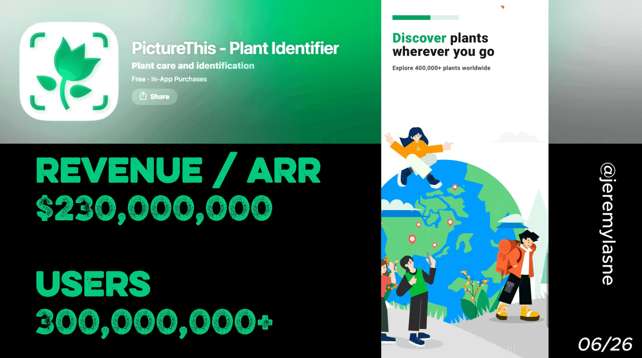
PictureThis is the world's leading plant identification app by commercial revenue. It generates $5M in monthly iOS revenue alone with 700K monthly downloads on iOS and 1M on Android. It has over 1 million App Store reviews at 4.6 stars and consistently ranks as a top-grossing education app. Its onboarding skips lengthy personalization in favor of rapid authority-building, a demo plant scan before the camera permission ask, and a paywall that appears twice -- before and after the mandatory in-app experience. This is the full teardown.
The Numbers
- Monthly iOS revenue: ~$5M
- Monthly downloads (iOS + Android): ~1.7M
- App Store reviews: 1M+
- App Store rating: 4.6 stars
- Category position: #1 among plant identification apps in commercial revenue
- Species database: 400,000+
- Daily identifications: 1,000,000+
- Accuracy: 98% (genus level)
These are not startup numbers. PictureThis is a dominant market leader operating at scale. Its onboarding is not about building trust from scratch -- it is about converting the trust it has already earned at a category level into immediate subscription decisions.
The Full PictureThis Onboarding Breakdown
The visual identity as conversion tool
Before the first screen lands, PictureThis has already made a design decision that most apps miss: the entire visual language of the onboarding is the product.
Deep greens. Lush leaf animations. Plant photography transitions. The color palette is not brand identity -- it is immersion. The user is not in a white-screen app flow. They are in a world of plants. Every transition reinforces what the product does. By the time the first word appears, the user has already had a sensory experience consistent with the app's promise.
This is design doing conversion work that copy cannot. A calorie tracker app that feels clinical. A prayer app that feels reverent. A plant app that feels alive with growth. The medium is the message, and PictureThis makes every pixel of the onboarding confirm that this is the right environment for plant people.
Screen 1: Category dominance, not a pitch
PictureThis opens with a rapid succession of social proof screens to establish authority before presenting the paywall, rather than through a lengthy feature demonstration.
The opening claim is not "try our plant identifier." It is "#1 plant identifier in the world." Backed immediately by the numbers: 1 million identifications daily, 98% accuracy, 400,000+ species, 1 million reviews.
This is category anchoring, not product marketing. The user is not being sold a plant app. They are being informed which plant app is the standard. Once that anchor is set, every other app in the category becomes the alternative to the leader. The decision is not "should I use this app?" It is "why would I use anything else?"
PictureThis leads the competitive landscape with the highest monthly active user base among paid-tier subscribers in the plant identification category. The opening screen makes that reality visible before any feature is explained.
Storytelling animations: one benefit per screen
After the authority statement, PictureThis runs a short sequence of animated screens, each telling one piece of the product story.
One photo. The camera shutter animation. The AI identifying the plant. The name populates.
Instant care guide. The plant profile appears with watering frequency, light requirements, soil type.
Disease diagnosis. A sick leaf photographed. A diagnosis appears. A treatment plan generates.
Each screen is 2-3 seconds of animation with minimal text. The user is watching the product work, not reading a feature list. The strategy is to convert users by overwhelming them with social proof and credibility upfront, rather than through a lengthy feature demonstration. The storytelling animation sequence is the bridge between the authority claim and the social proof -- it shows what the authority is for.
The lesson: animated storytelling screens that show the product in motion outperform static feature lists because they answer "what does this feel like to use?" not just "what does this do?"
Reviews immediately after the story
Right after the storytelling animations, PictureThis surfaces user reviews. Real testimonials. Specific outcomes. A gardener who saved a sick plant. A hiker who identified a toxic species before touching it. A parent who used it to teach their children on a nature walk.
The sequencing is deliberate: authority claim, then product story, then human outcomes. By the time the user reads these reviews, they are not evaluating the app's credibility -- that was established on screen one. They are reading stories about people like them, who had the same reason for downloading the app, and who got a specific result.
High average ratings and a large number of reviews add strong social proof and build trust at exactly the moment users need it most -- just before the subscription decision.
The first paywall: monthly shown, annual the real offer
PictureThis employs a soft paywall with a free trial presented very early in the user journey. It appears before the user has touched the camera, before they have identified a real plant, before any personalization.
The paywall is structured with a visible monthly price but defaults to the annual plan with a short free trial. The monthly plan exists to create a price anchor that makes the annual plan look dramatically cheaper per month. PictureThis costs $39.99 per year, which auto-renews after the free trial period unless canceled.
The "2-day free trial" framing is a compressed version of the classic trial strategy: short enough that the user makes a payment decision quickly, long enough to experience the product's core value. 90% of trial starts happen on Day 0 -- the window between install and first paywall impression is the highest-intent moment in the entire user lifecycle. PictureThis shows the paywall at that exact window.
When the user skips: the trial explanation screen
If the user closes the first paywall without subscribing, PictureThis does something most apps never do: it explains what just happened.
A screen appears that walks through the free trial journey step by step. Day 1: full access. Day 2: reminder that the trial ends. After trial: subscription begins. Here is what you are giving up by skipping.
This is not a guilt screen. It is an information screen. Many users who skip paywalls do so because they do not understand the terms, not because they have decided against the product. The trial explanation converts a fraction of those skips into delayed but genuine trial starts. It also reduces charge disputes -- a user who understood the trial terms before it ended is less likely to feel deceived when the charge appears.
The explanation screen does for the paywall what the disclaimer does for ShroomID: it makes the stakes clear, and making stakes clear increases conversion.
The fake demo scan: product experience without camera permission
After the paywall and potential skip screen, PictureThis does something technically clever and strategically brilliant: it shows you a plant scan demo without accessing your camera.
A pre-loaded plant image appears. The scanning animation runs. Species matches populate. A care guide generates. The experience is real in every respect except that it is using a prepared image rather than your camera.
The purpose is precise. Camera permission is a sensitive system ask. Users who are not yet convinced the app is worth their time will deny it. But a user who has just watched the demo scan in action -- seen the speed, the accuracy, the detail of the result -- is in a different mental state when the permission screen appears.
The fake demo scan answers "does this actually work?" before the user has to make any commitment. It converts skepticism into curiosity. And curiosity, at a camera permission prompt, says yes.
Camera permission: after the demo, not before
Immediately following the fake scan, PictureThis requests camera permission. The prompt is now arriving in the context of "you just saw what this does -- do you want to do it for real?"
That context changes everything about the permission ask. It is no longer abstract ("can we access your camera?"). It is concrete ("you just watched this work -- tap allow to do it with your own plants"). Prompts land best when timed to demonstrated value, not to arbitrary screen sequence.
This is the same principle Cal AI uses with notifications and Prayer Lock uses with stacked permissions -- timing the ask to the moment of maximum positive feeling toward the product. PictureThis manufactures that moment artificially, with a demo, rather than waiting for genuine use.
The mandatory in-app experience: you identify a real plant
After camera permission is granted, PictureThis guides the user through identifying an actual plant. Not a tutorial. Not a walkthrough. The real feature, used for real.
The user points their camera at any plant nearby -- a houseplant, a flower through the window, a leaf on the walk to work. The AI identifies it. The care guide appears. The detail is immediate and impressive.
This is the most important screen in the entire onboarding for one reason: a paywall that appears right after progress feels like a continuation -- the user is not deciding whether to subscribe to an app, they are deciding whether to keep something they have already started using. PictureThis creates that progress deliberately, through a mandatory first use, so that the second paywall arrives at the moment of demonstrated value rather than assumed value.
The second paywall: same offer, different user
After the in-app experience, the paywall appears again. Same structure. Same pricing. Same CTA.
But the user is different. They have now watched the storytelling animations, read the reviews, seen the fake demo, identified a real plant with their own camera, and confirmed that the app does exactly what it claimed.
After subscribing, a dynamic video montage immediately reinforces the value of the purchase -- a clever tactic to reduce churn and buyer's remorse. The second paywall converts the users who needed evidence to decide. The first paywall converted the users who needed authority. Together, they capture both segments without requiring either to wait.
This is a two-stage conversion architecture, and it is the most sophisticated paywall strategy in this entire teardown series.
The Core Mechanism
PictureThis builds its conversion funnel on a single insight: the paywall's job is to help users commit, not to re-explain everything from scratch. By the time the second paywall appears, re-explanation is unnecessary. The user has experienced the product directly. The paywall is simply a door they already know they want to open.
The fake demo scan is the mechanism that makes this possible without requiring the user to find a plant first. It manufactures the experience of using the product in a controlled environment, at a moment when the user's motivation is highest (Day 0, within minutes of install), and delivers it before asking for anything.
The sequencing in full: authority claim, product story, social proof, first paywall, trial explanation for skips, fake demo scan, camera permission, real first use, second paywall.
Every screen is either building the case to pay, or giving the user an experience that makes the case for them. Nothing is neutral.
What This Means for Your App
Two questions to ask before redesigning your paywall:
Do you have a demo experience before the camera permission? If your app requires camera access and you are asking for it before the user has seen what the camera does, you are losing a meaningful percentage of allows. A 30-second demo animation that shows the scan in action -- even with a pre-loaded image -- changes the context of the permission ask entirely.
Does your paywall appear twice? A single paywall converts one type of user: the one who is already convinced. A two-stage paywall -- first at peak intent, second after demonstrated value -- converts both the convinced and the skeptical. The incremental cost is one additional paywall screen. The incremental revenue from the second-chance conversion is not marginal.
PictureThis is the most technically disciplined onboarding in this series. No mascot. No signature screen. No spin wheel. Just authority, demonstration, and a paywall timed twice -- once before the user knows it works, once after they have proved it to themselves.
FAQ
How much does PictureThis make per month?
PictureThis generates approximately $5M in monthly iOS revenue with 700K monthly downloads on iOS, plus additional revenue from Android. Combined monthly revenue is estimated at $8M across platforms as of 2026.
What is PictureThis's paywall strategy?
PictureThis uses a two-stage soft paywall. The first appears early in onboarding, before the user has used the camera, showing monthly and annual options with a short free trial. The second appears after a mandatory in-app plant identification experience. Users who skip the first paywall see a trial explanation screen before entering the product demo. The subscription is $39.99 per year and auto-renews after the free trial unless canceled.
What is the PictureThis fake demo scan?
Before requesting camera permission, PictureThis runs a plant identification animation using a pre-loaded plant image. The scanning UI, species matching, and care guide all appear as they would in a real scan. This gives the user a direct experience of the product's value before any permission is asked, increasing the rate at which users grant camera access and engage with the real identification feature.
How many downloads does PictureThis get per month?
PictureThis sees approximately 700K monthly downloads on iOS and 1M on Android, for a combined total of roughly 1.7M installs per month as of 2026.
Why does PictureThis show the paywall twice?
The first paywall captures users who are ready to subscribe based on authority and social proof alone. The second paywall -- shown after the mandatory first-use plant identification -- captures users who needed to experience the product before deciding. The two-stage approach maximizes conversion across both user types without increasing friction for either.
Is PictureThis the best plant identification app?
PictureThis leads the plant identification category in commercial revenue and monthly active paid subscribers. It achieves 4.6 stars across over 1 million App Store reviews and identifies over 400,000 species with 98% accuracy. Competitors including PlantIn have narrowed the accuracy gap in recent updates, but PictureThis remains the dominant commercial app in the category.
What makes PictureThis's onboarding one of the best mobile app onboarding examples?
PictureThis establishes category authority on screen one, uses storytelling animations to demonstrate value before any text, surfaces social proof immediately after the story, shows a fake demo scan before asking for camera permission, and times a second paywall to the moment of maximum demonstrated value -- after the user has identified a real plant. The result is a conversion funnel that works without a single personalization question.
This teardown is part of an ongoing series on in-app optimization. Want answers like these while you build? The tasu MCP serves the same sourced benchmarks to your coding agent, for onboarding, paywalls, and pricing.