10M users, 24 screens, and the problem-first open that makes you feel the product before it names a price
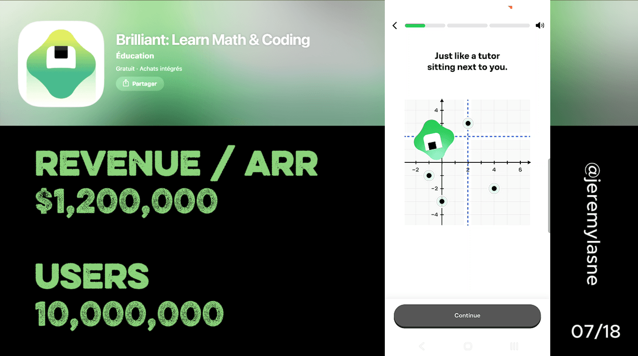
Brilliant is an interactive STEM learning app with 10 million users (2025), 90+ courses, and pricing of $149.88/year shown as $12.49/month, plus a 6-seat family plan. Its onboarding runs 24 screens. It opens with an interactive problem the user solves before any explanation, the product method demonstrated in the first 30 seconds. A mascot alternates with the problem screens. The MIT and Harvard inspiration is dropped mid-flow, after the method has been felt, so it reads as confirmation not pitch. Two dedicated screens explain the trial before the paywall. The paywall is hard: annual only, individual or family, 7-day trial or exit, no free mobile tier. This teardown is about why that hard paywall converts: 24 screens made the user feel the method work before the price appeared.
The Numbers
- Users: 10M (2025)
- Monthly price: $24.99
- Annual price: $149.88 ($12.49/month)
- Family plan: 6 seats
- Courses: 90+ across math, science, computer science, AI, and data
- Pedagogical inspiration: MIT, Harvard, Google, Microsoft teaching methods
- Funding: $4.58M from Chamath Palihapitiya's Social Capital and others
- Distribution: YouTube sponsorships including MrBeast, plus organic STEM community
- Onboarding: 24 screens
- Paywall: hard -- 7-day trial or exit, no free mobile tier
The Learning Method Is the Onboarding
The first screen is an interactive problem. Not a product tour. Not a value-proposition slide. A puzzle or question tied to the user's selected topic, which they solve before any explanation has been given.
This is problem-first learning: start with the question, discover the reasoning, then have the concept confirmed. You answer before you are taught. Get it wrong and a hint nudges you toward the right reasoning without giving away the answer. Follow-up problems rise in complexity.
Demonstrating the method on screen one is the highest-confidence decision in the flow. It is PictureThis's fake demo scan and Prayer Lock's first prayer, first usage before the paywall, but earlier and more completely: the method is the first thing that happens, before personalization, before the mascot, before social proof. The user experiences what they are buying before they know there is something to buy. A user who solved one Brilliant problem correctly, and felt the small satisfaction of reasoning to an answer, is a different prospect at the paywall than one who watched an animation about how the app teaches.
The Mascot: Warmth in a STEM Context
STEM apps have an aesthetic problem. The subject matter is rigorous, abstract, and often tied to academic failure in adults who approach it now. Most respond with clinical design that says "this is serious."
Brilliant's mascot runs the other way. A small expressive character appears at regular intervals to provide warmth and encouragement, and it alternates with the problem screens rather than appearing on every one. That cadence is correct. Too frequent and it becomes noise, the failure mode of Feynman AI's every-screen pop-up. Too rare and it fails to register. Spaced this way it functions as an emotional reset: after a problem that took real effort, the mascot appears to encourage, and the user settles before the next challenge.
It also does something specific to the demographic. For an adult who avoided math in school and is now trying to understand data science, the mascot signals that it is okay not to know. The friendly character between hard problems is not decoration. It is the reason a nervous user continues.
Authority Dropped Mid-Flow: Inspired By, Not Built With
"Inspired by the teaching methods of MIT, Harvard, Google, and Microsoft." This appears mid-onboarding. Not on screen one. After the user has already experienced the method.
The wording matters. Brilliant does not claim it was built with those institutions. It says the approach is inspired by how the best technical educators there actually teach. That is defensible, and for a technically curious audience that would immediately check, honesty is the better conversion move. A fabricated partnership would be noticed and would undermine the exact credibility the claim is trying to build.
Placement changes what the credential does. On screen one, institutional inspiration is a cold authority pitch the user has no context for. Dropped mid-flow, after the user has solved a problem and felt the scaffolded reasoning, it lands as confirmation: the approach you just experienced is the way serious technical institutions teach. That is a far more persuasive moment for the same sentence.
Personalization: Goals and the 5-Minute Permission
After the first problem and the mascot, Brilliant asks two questions. First, what do you want to learn: math and logic, computer science and programming, data analysis and AI, science and engineering. Specific enough to route the user into a relevant first course, broad enough to capture the range of motivations people bring to STEM.
Second, how much time can you commit per day, from "just 5 minutes" to "30+ minutes." The 5-minute option is the most confidence-building move in the sequence because it validates the user who can only give a little. Most learning apps treat time as a goal to maximize. Brilliant treats it as a reality to accommodate. "Just 5 minutes" says: this works even if that is all you have.
It is also direct competitive positioning. Duolingo built a business on the micro-learning daily session. "Just 5 minutes" says Brilliant competes in that format while offering STEM depth instead of gamified vocabulary drills. Same session length, different output.
Account Creation, After the Experience
Account creation, email or Google, arrives after personalization and after the user has experienced the method. Not at the start. Same logic as every well-timed account ask: earn the account through value before demanding it. A user who has solved a problem, been encouraged by the mascot, chosen a learning goal, and set a daily commitment has a reason to protect that progress. The ask reads as a natural step, not a gate before the product has started.
Two Trial Screens: Trust Before Price
Before the paywall, Brilliant spends two screens on the trial. Screen one is the timeline: Day 1, full access; Day 5, a reminder that the trial ends in two days; Day 7, billing begins or you cancel. Laid out step by step, with no ambiguity about when money moves.
Screen two is the contents: every course category, daily challenges, guided paths, offline access, itemized. The user sees what the subscription unlocks before the price.
This is the most thorough pre-paywall trust sequence in the series. The reason is the price point. $149.88/year is higher than most apps here, and at that price uncertainty about trial terms is a real conversion barrier. Two dedicated screens remove it before the paywall loads, so the only question left on the pricing screen is "is this worth $12.49/month?", not "will I get charged unexpectedly?" or "what do I actually get?"
The Paywall: Hard, Annual Only, Individual or Family
There is no "continue with limited access." No free tier to fall back on inside the app. The choice is start the 7-day trial or leave. A free web tier exists, but the mobile onboarding does not route to it.
This is Liftoff's no-exit loop and Prayer Lock's no-skip screen, but shown once, explained thoroughly across two pre-paywall screens, with no manufactured urgency. No spin wheel, no countdown, no surprise. The hard paywall works because of what preceded it. Twenty-four screens built the investment: the user felt the method, set a goal, set a time commitment, understood the trial. By the time the price loads, trial-or-exit is the logical conclusion of a conversation, not an ambush.
Annual only is the correct single-option display. Showing monthly at $24.99 next to annual would introduce an anchor that makes $149.88 look large. Showing annual as $12.49/month removes that anchor. The family plan appears as the second option: 6 seats, framed the way Duolingo frames it. The individual evaluates $149.88 as a personal investment. The person paying for six seats evaluates a per-person cost that drops at scale, and frames it as an investment in family education. Different conversation, different answer threshold.
The Duolingo Parallel: Same Format, Different Game
Brilliant gets compared to Duolingo constantly, and the comparison is mostly wrong. Duolingo uses gamification and streaks for language learning via spaced repetition, on content accessible to almost everyone, at a lower price. Brilliant uses problem-first active learning for STEM via discovery, on content that self-selects for a more technically motivated audience, at a higher price.
They compete for exactly one thing: the daily learning session slot. The person who opens an app for 10 minutes of structured learning before work is the target of both, which is what "just 5 minutes" makes explicit. The outcomes diverge. A year of Duolingo yields vocabulary and grammar. A year of Brilliant yields working understanding of calculus, neural networks, or Python. The latter is more career-relevant for most professional demographics, which is what justifies the higher price. The family plan is the sharpest parallel and the most interesting bet: Duolingo's family plan became a real revenue line because language learning is intergenerational, and Brilliant is wagering the same holds for STEM, where a parent's motivation to support a child's math may be even stronger.
What to Steal
Three moves apply regardless of category. First, the product method is the onboarding. Brilliant opens with a problem because the product is problem-first learning. Whatever your core mechanic is, the scan, the prayer, the stretch, it should happen in the first few screens, before any explanation of why it works. The user who experienced the thing will pay for more of it. The user who read about it is still evaluating.
Second, drop the authority after the experience, not before. A credential placed before the user has felt the product is a pitch. The same credential placed after is confirmation. Move your trust signals mid-flow.
Third, a hard paywall requires thorough pre-paywall trust. Brilliant's converts because two screens explained exactly what happens before the price appeared. A hard paywall without that is just a wall. The work that makes it acceptable is not the paywall design, it is the two screens before it. If you want to see where your own onboarding delivers that answer before it asks for money, and where it does not, that is what tasu maps.
FAQ
How much does Brilliant cost in 2026?
Brilliant costs $24.99/month or $149.88/year ($12.49/month billed annually), with a 6-seat family plan at a higher price. A 7-day free trial gives full access before billing begins. There is no free mobile tier in the app: the trial is the entry point.
How many users does Brilliant have?
Brilliant has 10 million users as of 2025, with 90+ courses across mathematics, computer science, science, and AI. Course design is inspired by the pedagogical approaches of MIT, Harvard, Google, and Microsoft.
How many screens does Brilliant's onboarding have?
24 screens: an interactive first problem, a mascot alternating with the problem screens, goal and time-commitment personalization, mid-flow authority placement, account creation, two trial-explanation screens, and a hard paywall with individual and family annual plans.
What is Brilliant's problem-first learning method?
Brilliant opens every lesson, and the onboarding itself, with a problem to solve before any explanation. You discover the reasoning by attempting the answer, receive scaffolded hints if wrong, then have the concept confirmed and extended. The approach is inspired by how technical educators at top universities and companies teach: by prompting discovery, not delivering lectures.
Does Brilliant have a free tier on mobile?
No. The mobile app uses a hard paywall: start the 7-day trial or exit. A free web tier exists with daily challenges and a limited number of lessons, but the mobile onboarding does not route to it. The trial is the only entry point in the app.
How does Brilliant compare to Duolingo?
Both compete for the daily micro-learning session. Duolingo uses gamification for language learning at a lower price. Brilliant uses problem-first active learning for STEM at a higher price. The outcomes diverge: language vocabulary versus conceptual understanding of math, coding, or AI. Both offer family plans with similar seat structures.
This teardown is part of an ongoing series on in-app optimization. Want answers like these while you build? The tasu MCP serves the same sourced benchmarks to your coding agent, for onboarding, paywalls, and pricing.