10M downloads, 54 onboarding screens, and the triple yes that turns the paywall into the fourth agreement
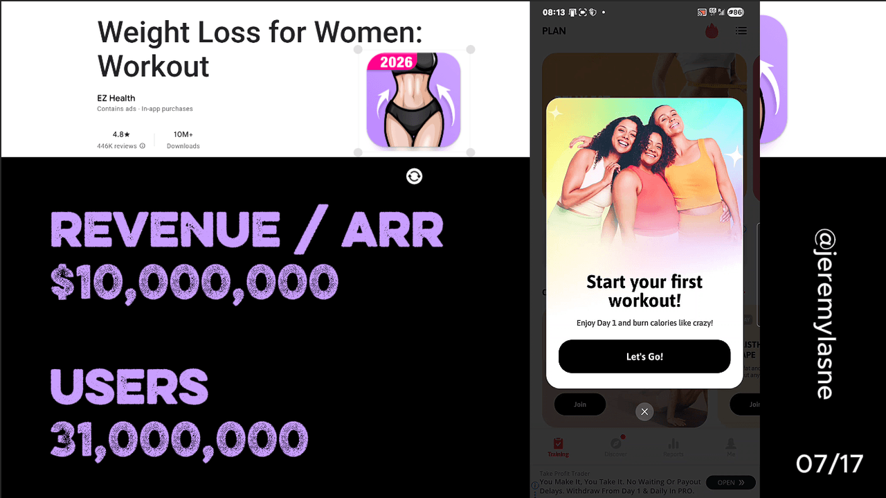
Weight Loss for Women: Workout, by EZ Health, is one of the top-grossing women's fitness apps on Android: 10M+ downloads, 4.8 stars, 446K ratings. Its onboarding runs 54 screens across three labeled steps (Goal, Know Your Body, Preferences). It opens with animated user reviews, uses a real-body tap selector for trouble zones, assimilates the goal to a specific real-life event, alternates personalization questions with animated icon grids and a mid-flow social-proof wall, and ends with three consecutive yes questions before the paywall CTA. The paywall offers monthly, 3-month (marked most popular), and yearly, all on a 7-day free trial. Cancelling produces a 50% gift toward yearly. The final skip serves an ad. This teardown is about why 54 screens convert 10M downloads: by the time the CTA appears, the user has already said what she wants three times.
The Numbers
- Downloads: 10M+ (Google Play)
- Rating: 4.8 / 5 across 446K ratings
- Rank: one of the top-grossing women's fitness apps on Android
- Developer: EZ Health (a multi-app portfolio)
- Icon: carries a live "2026" year badge, updated annually as a still-maintained signal
- Onboarding: 54 screens across 3 labeled steps (Goal, Know Your Body, Preferences)
- Paywall tiers: monthly, 3-month (marked "most popular"), yearly
- Trial: 7 days on all tiers
- Cancel offer: 50% gift discount pushing yearly
- Final skip: an ad
The Strategy: Portfolio Volume Meets Deep Onboarding
EZ Health runs the same playbook as Fast Builder from the Tai Chi teardown: build multiple apps for specific underserved demographics, drive volume with AI-generated social ad creative, and convert through deep, empathetic onboarding. The difference is scale. Fast Builder's Tai Chi app has 240K downloads. EZ Health's women's fitness app has 10 million.
The icon carries a "2026" badge updated every year. It is a trust signal that the app is actively maintained, cheap to produce, and effective on the woman who sees it in search and wonders whether the app is abandoned.
The women's home-workout category is large and competitive: WeightWatchers does $368M a year, MyFitnessPal sold for $475M, Noom raised $500M. EZ Health is not chasing the gym enthusiast. It is chasing the woman who wants to lose belly fat at home, has no equipment, and will follow a structured program. That user is large, motivated, and underserved by premium brands that skew toward the already-active. The 54-screen onboarding exists to make her feel completely understood before it shows a price.
It Opens With Animated Reviews: Proof Before Anything
The first thing on screen is not features. It is what other women said, animated. The reviews are not static testimonials in a card. They move, appear, and cycle, which signals the social proof is live and real, not a screenshot from two years ago.
This is PictureThis's authority-first open and Tai Chi's review-first strategy, animated. For a women's fitness app in 2026 the first question is not "what does this app do?". She has seen the Play listing. The first question is "did it work for people like me?". The animated reviews answer it before a single question is asked.
Step 1, Goal: The Body-Tap Selector
The first personalization step opens with the most visually original input in the series: a real illustrated female body where the user taps to select trouble zones. Belly. Butt. Arms. Thighs. Love handles. Selecting belly fat makes the belly area illuminate with a pulse or glow.
This is the body-map mechanic from the Tai Chi teardown, executed for weight loss at higher visual fidelity. The conversion mechanism is identical: spatial input creates a perception of specificity that a categorical multiple-choice question cannot. A woman who tapped her belly on a real body graphic believes the resulting plan was built around that belly. The plan may be the same for every belly-selection user. The input makes it feel personal.
The app reacts to the touch: "Great choice. We'll make belly fat your primary focus." Acknowledgment after a body tap lands harder than acknowledgment after a text answer, because the user just touched a representation of her own body. The emotional weight of that touch is higher.
The Real-Life Event Assimilation
After the body selection, the goal gets defined precisely: target weight, timeline, reason. Then the app reads it back and encourages it. "You want to lose 8kg by October for your sister's wedding. That's completely achievable. Let's build your plan."
Anchoring the goal to a specific occasion instead of an abstract health metric is the most conversion-relevant personalization in the flow. A woman who has connected weight loss to her sister's wedding is not buying a workout app. She is buying a plan to fit a dress on a specific day. That specificity makes the paywall feel time-sensitive in a way "I want to lose weight" does not. It is the same move ShroomID makes with safety stakes and Flo makes with symptom-to-outcome framing: anchor the commercial ask to a consequence the user named.
Step 2, Know Your Body: Calibration With a Live-Building Plan
The second step covers the physical profile: age, current weight, height, activity level, fitness history, current exercise frequency. These calibrate the plan's intensity and progression.
Between questions, the app shows the plan building in real time. A progress bar advances. A difficulty level adjusts. The visual feedback says: your answers are changing the output. This is Cal AI's animated plan generation applied to workout calibration. The user is not filling a form. She is watching a program assemble around her body.
The encouraging reactions continue. "At your age and activity level, here's what's realistic." "Most women with your profile see results in the first 2 weeks." Each acknowledgment resets the emotional tone after a data-entry screen and keeps the register coached, not surveyed.
Step 3, Preferences: Animated Icon Grids and Sliders
The third step covers workout preferences: style (pilates, HIIT, yoga, strength), equipment (none, resistance bands, dumbbells), duration, time of day, days per week. The UI matches the input to the answer type: binary choices get taps, continuous choices get sliders, style choices get animated icon grids that pulse when selected.
This is YarnPal's yes/no micro-commitment applied to a wider preference taxonomy. Each tap is a small investment in the specificity of the plan. By the end of Step 3 the user has made 20 to 30 individual input decisions. That accumulated investment is what makes the paywall feel like completing something, not starting something.
Mid-Flow Social Proof: The Second Review Wall
About halfway through the 54 screens, a second block of user reviews appears. The placement matches Yazio's mid-flow mascot resets and Tai Chi's mid-personalization science facts: an emotional reset inside a long flow.
The second wall does what the first cannot. The first review wall converts users who needed authority before they invested. The second converts users who are now invested enough to wonder "will this actually work for me?". Mid-flow social proof is chronologically more persuasive than an opening wall, because it arrives after a partial investment. The user is no longer deciding whether to start. She is seeking confirmation that finishing is worth it.
The Loading Screen: Reviews While the Plan Builds
After the personalization sequence, a loading screen builds the plan. While it loads, reviews cycle on screen. This is the same multi-function loading screen as Tai Chi's user count and Flo's ISO and doctor counts: use the transition time to deliver trust, not a spinner.
Showing reviews during plan loading is specifically timed. The user is most uncertain about whether the plan will be good at exactly this moment. Reviews saying "this program actually changed my body" arrive at peak uncertainty, the last reassurance before the plan reveals.
The Triple Yes: Commitment Loaded Before the Paywall
This is the most deliberate conversion mechanic in the flow and the reason the teardown is worth publishing. Before the paywall CTA, three consecutive full-screen yes/no questions appear:
- "Do you want to lose weight?" Yes.
- "Do you want to feel better in your body?" Yes.
- "Are you ready to start today?" Yes.
Then: "Get My Plan." The paywall CTA. YarnPal's seven yes questions across a whole onboarding is the precedent. This is the compressed version: three yeses in immediate succession, right before the paywall, asking questions so obviously aligned with why she downloaded the app that the answer is always yes.
The behavioral science is consistency bias. A person who has said yes three times is primed to say yes to the next thing, and the paywall is the next thing. "Get My Plan" is the fourth yes, not a subscription ask but the continuation of three commitments she just made. Prayer Lock has the signature, Liftoff has the hold, YarnPal has seven questions. Weight Loss for Women stacks three yeses directly before the CTA. The compression makes it more concentrated, and more effective, than a commitment sequence spread across the flow.
The Paywall: 3-Month as the Popular Anchor
The paywall presents monthly, 3 months (marked "most popular"), and yearly, all on a 7-day free trial. Marking 3 months most popular is unusual in this series. Most apps anchor annual as the best value. EZ Health anchors 3 months.
The logic is audience-specific. A woman setting a goal for a wedding or a summer trip thinks in months, not years. "3 months" maps to a realistic timeline for visible results. "Annual" asks for a year-long commitment that can feel excessive for a goal tied to a specific occasion. The 3-month popular anchor converts the goal-timeline thinking the onboarding spent 54 screens building.
The 7-day trial extends the yes sequence. She said yes to losing weight, yes to feeling better, yes to starting today, yes to getting the plan, and now yes to seven days free. The subscription decision defers to day 7, by which point she has either seen results or built enough habit inertia to continue.
Cancel to Gift, Then the Ad
Cancelling the paywall produces a 50% off gift, then a push toward yearly. The gift framing is Bend's $57-off pop-up and Flo's shake-a-tree discount: a reward, not a discount. A gift you receive changes the psychology differently than a price cut you were offered. It captures the price-sensitive user at a lower threshold instead of losing her.
The push toward yearly after the gift is the extra step most apps skip. A secondary screen pushes yearly specifically, converting users who responded to the gift but might have taken monthly into an annual commitment in the same post-skip sequence.
The user who declines the gift and the yearly push sees an ad. This is Medito's model applied as a consequence of skipping rather than as the primary revenue mechanism. The ad monetizes the unconverted user and creates a mild negative consequence for skipping. The implicit message: this is what the free experience looks like.
Is 54 Screens Too Long? What to Steal
54 screens is not inherently too long. The test is whether each screen earns its place. The body-tap selector earns it. The real-life event assimilation earns it. The triple yes earns it. The two social-proof walls at different emotional moments serve different conversion functions.
Where 54 screens risks becoming too long is the repetitive reaction screens between questions. After 15 encouraging reactions, the 16th is noise. The rule from the best long flows in this series: vary the screen type every 3 to 4 inputs. Question, fact, reaction, question, social proof, body input, question, commitment. If the pattern is too predictable, engagement drops before the triple yes.
Weight Loss for Women converts 10M downloads because the triple yes before the paywall is not a trick. It is the logical conclusion of 54 screens that asked the user to describe exactly what she wants. By the time the CTA appears, she has already said it three times. The paywall just writes it down. If you want to know which screens in your own onboarding are doing that work, and which are not, tasu maps it ranked by dollar impact.
FAQ
How many downloads does Weight Loss for Women Workout have?
Weight Loss for Women: Workout by EZ Health has 10M+ downloads and 446K ratings at 4.8/5 on Google Play as of July 2026, ranking among the top-grossing women's fitness apps on Android.
How many onboarding screens does the app have?
54 screens across three labeled steps: Step 1 (Goal), Step 2 (Know Your Body), Step 3 (Preferences). The flow includes animated reviews, a body-tap zone selector, animated icon grids, a mid-flow social-proof wall, a loading screen with live reviews, real-life event goal assimilation, and a triple yes commitment sequence before the paywall CTA.
What is the triple yes screen?
Three consecutive yes/no questions appear directly before the paywall CTA: "Do you want to lose weight?", "Do you want to feel better in your body?", "Are you ready to start today?". All are answered yes. The CTA that follows, "Get My Plan", is the fourth yes in the sequence. The behavioral science is consistency bias: three consecutive agreements prime a fourth.
What is the body-tap selector?
A real illustrated female body where the user taps to select trouble zones: belly, butt, arms, thighs, love handles. Selected zones pulse or glow. The spatial input produces a stronger perception of plan specificity than a categorical multiple-choice question covering the same information.
What is Weight Loss for Women's paywall structure?
Three tiers on a 7-day free trial: monthly, 3-month (marked "most popular"), and yearly. The 3-month anchor reflects the goal-timeline thinking of a user planning for a specific occasion rather than a year-long commitment. Cancelling produces a 50% gift with a push toward yearly. The final skip serves an ad.
Why is 3 months marked most popular instead of yearly?
A woman setting a weight loss goal for a specific event thinks in months, not years. The 3-month most-popular anchor converts the event-timeline framing the onboarding built (the sister's wedding, the summer trip) into a subscription duration that feels proportionate to the goal. Annual can feel excessive for occasion-specific motivation.
This teardown is part of an ongoing series on in-app optimization. Want answers like these while you build? The tasu MCP serves the same sourced benchmarks to your coding agent, for onboarding, paywalls, and pricing.