14 screens, zero paywall in onboarding
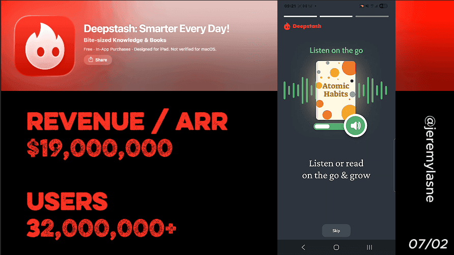
Deepstash is an educational technology platform founded in 2019 serving over 3 million users globally. It generates approximately $200K in monthly iOS revenue with 90K monthly downloads, and in-app purchases ranging from $12.99 to $119.99. Their onboarding runs 14 screens with no paywall at the end. Three feature slides open the flow. Email capture is skippable. Personalization triggers an animation that builds the user's feed in real time. Then the user is dropped into the actual product -- reading real ideas -- before any subscription is mentioned. Revenue comes from six years of brand compounding, organic reach, and a free tier that sells the Pro upgrade by demonstrating the value cap. This is the full breakdown of the most product-confident onboarding in the series.
The Numbers
- Monthly iOS revenue: ~$200K
- Monthly downloads: ~90K iOS + ~100K Android
- Total users: 3M+
- Founded: 2019 (6 years of compounding)
- Pro pricing: $12.99/month or $29.99/year
- Content library: 200,000+ ideas
- Onboarding screens: 14
- Paywall during onboarding: none
Why No Paywall in Onboarding Is a Strategy, Not an Omission
Every app in this series except Deepstash shows a paywall before the user has used the product for a meaningful session. ShroomID on screen 6. Cal AI after 32 screens. Flo after 43. The assumption is universal: capture the subscription decision while motivation is highest, which is Day 0.
Deepstash makes the opposite bet. No paywall in onboarding. The subscription surfaces later, contextually, when the user hits a natural limit inside a product they have already experienced and valued.
Paywalls before the aha moment kill conversion. Apps that let users feel the product before the paywall convert at higher rates -- this pattern holds across benchmark data across categories.
Deepstash's 14-screen onboarding is built entirely around delivering the aha moment -- that instant when the user reads an idea card and thinks "I need more of this" -- before any commercial ask appears. At $200K monthly revenue on 90K downloads, the bet is working. Not at Duolingo scale, not at Yazio scale, but sustainably, across six years of compounding user trust and organic growth.
The Full Deepstash Onboarding Breakdown
Three feature slides: show before you tell
Deepstash opens with three consecutive feature slides. Not a value proposition. Not a social proof wall. Not an animated mascot. Three screens that show, specifically, what the app does and what the user will be able to do with it.
The first mistake most apps make is showcasing features instead of outcomes. Nobody cares about an AI-powered recommendation engine. They care about finding the perfect workout or finally sticking to a meditation habit.
Deepstash sidesteps this tension by making features and outcomes the same thing in their category. The feature -- bite-sized idea cards from books, articles, podcasts -- is the outcome. The user does not need to imagine what they will get. The feature slide is a sample of it.
The three-slide sequence before any ask is an unusually generous opening. Most apps demand something -- an email, a goal selection, a permission -- before giving anything. Deepstash reverses this entirely. Three screens of value, delivered free, before the first request. The implicit message: we are confident enough in what we built to show it to you before we ask for anything.
Deepstash curates more than 200,000 ideas from books, articles, podcasts, and videos. Three feature slides are a preview of that library -- not a pitch for it.
Email: skippable, low-friction, honest
After the three feature slides, Deepstash asks for an email address. But critically -- it is skippable. A visible skip option exists. The user can continue anonymously.
This choice runs counter to Airlearn's email-on-screen-2 strategy, and the reasoning is category-specific. Airlearn targets a motivated, decided user who will submit an email early because they know what they want. Deepstash's user is often in discovery mode -- browsing for a new learning habit, not yet sure if this is the right one. Forcing an email before they have seen anything creates friction that the skip option removes.
Sign-ups are friction. Letting users experience your app first, then asking them to commit, converts more users and collects better data because they are already invested. This approach flips the psychology: instead of asking for trust upfront, you earn it by delivering value immediately.
The skippable email is Deepstash trusting the product to earn the account. A user who skips the email on screen 4 and is still using the app two weeks later is a more valuable account creation than one who submitted their email under light pressure and churned in 48 hours.
Personalization and the animated feed build
After the email screen, Deepstash asks the user to select their interests. Topics are shown as visual tiles -- philosophy, productivity, science, business, mental health, creativity, relationships. The user taps the ones that resonate.
This single personalization screen does more in the Deepstash context than 60 screens of personalization do in a calorie tracker, because the output is immediate and visible. Tapping "productivity" and "philosophy" does not produce a projected weight loss date or an estimated calorie burn. It produces a feed that the user will actually see in approximately ten seconds.
Immediately after the interest selection, an animation plays. The feed is being built. Topics populating. Ideas organizing. Stashes forming around the selections just made.
Capturing user goals during onboarding and surfacing them later -- even a single string match -- outperforms most layout experiments. The paywall should feel inevitable. Deepstash applies this principle not to the paywall but to the product itself. The personalization animation makes the feed feel inevitable -- built specifically for this user, assembling in real time, ready to be explored. Before the user has read a single idea, they feel ownership over what is about to appear.
Speed proof: "5 minutes a day, smarter than 95% of people"
Before the user enters the app proper, Deepstash shows a speed claim: in five minutes per day, you will learn faster than the vast majority of people around you.
This screen addresses the most common objection to a new learning habit without naming it. The user's unspoken hesitation is "I don't have time for another app." The five-minute daily commitment frames the entire product as compatible with the busiest schedule. It is not a feature. It is a permission to start without guilt.
Join 3 million smart people to discover new ideas, learn new things, improve yourself and inspire others. Knowledge in Deepstash comes in the form of ideas -- little cards you can read at a glance. The speed claim and the social proof of 3 million users appear in close proximity, creating a double anchor: this is fast, and this is what smart people already do.
The "5 minutes" frame also sets a behavioral contract. The user who agrees -- even implicitly -- to the five-minute daily commitment is more likely to open the app the next day than one who has made no commitment at all. The speed screen is a soft commitment device without the finger-signing ceremony.
The in-app experience: reading real ideas before any subscription
After the speed screen, the user enters the app. Not a tutorial. Not a walkthrough. The actual product, with the personalized feed built from their interest selections, showing real idea cards from real sources.
The user reads. They tap a card about a productivity concept from a book they have heard of. They save an idea. They explore a stash. They experience the core product loop -- discover, read, save, revisit -- in a session that produces real value before any subscription is mentioned.
Showing a paywall before the user has experienced value kills conversion. The pattern across benchmark data is clear: apps that let users feel the product before the paywall convert at higher rates.
Deepstash takes this principle to its logical conclusion. The in-app experience is not a demo, not a simulated version, not a limited preview. It is the actual product. The free tier has real content, real idea cards, real topics. The aha moment -- "I just learned something I didn't know in ninety seconds, and there are 200,000 more of these" -- happens inside a fully functional product, not inside an onboarding animation.
The free tier limits how many ideas you can read per day and inserts ads between cards. The user hits that limit naturally, mid-session, when they are most engaged. At that moment, the Pro upgrade presents itself not as a paywall but as a logical next step in a session they are already invested in.
Revenue without a paywall: the compounding brand model
Deepstash's conversion strategy is not an onboarding strategy. It is a product strategy executed through onboarding.
The app has been available since February 2019 -- over six years of organic compounding, press coverage from Mashable, Entrepreneur.com, and MacWorld, and consistent App Store presence as a recognized player in the personal development category. The brand recognition that Deepstash brings to a new install is categorically different from what a new launch brings.
An established app with six years of social proof does not need a spin wheel or a 24-hour countdown to convert. The user who downloads Deepstash in 2026 has often heard of it -- from a podcast, a LinkedIn post, a recommendation. They arrive with partial trust already established. The onboarding's job is not to manufacture that trust from scratch. It is to confirm it quickly and get out of the way.
The free tier limits idea access and runs ads. Premium unlocks unlimited saving, offline access, and an ad-free experience. The upgrade pitch writes itself when the user is engaged in a session and hits the daily limit -- or when they encounter an ad at a moment of focused reading. The interruption is the paywall. The Pro upgrade is relief from it.
This model requires something most new apps do not have: a product good enough to make users want more before they hit a limit. And six years of iteration to make the free tier just frustrating enough, at exactly the right moment, to convert.
The Core Mechanism
Deepstash's conversion is built on the principle that is hardest to execute and easiest to describe: make the product good enough that people want to pay for more of it after using the free version.
No commitment screen. No mascot guilt trip. No spin wheel or countdown. The free tier delivers real value, creates a genuine habit loop, and then caps at a natural limit. Pro removes the cap.
The 14-screen onboarding is not the conversion mechanism. It is the welcome mat. The three feature slides set expectations. The skippable email respects autonomy. The personalization animation creates ownership. The speed screen handles the time objection. The in-app experience delivers the aha moment.
After that, the product converts. Not the onboarding.
There is no magic number of onboarding screens. Some apps win with long, detailed onboarding; others convert better with just a few screens. The goal is to balance personalization with speed. Deepstash's 14 screens are calibrated to a product that does not need extensive pre-sell because the product can sell itself -- provided the user reaches it.
What This Means for Your App
One question Deepstash answers that every other app in this series avoids: what if the product is the paywall?
Not in the sense of locking features. In the sense that the experience itself is compelling enough that hitting a limit feels like losing something real, not encountering a sales screen.
Every other app in this series manufactures urgency through countdown timers, mascot guilt, spin wheels, or hard paywalls with no exit. Deepstash manufactures urgency by giving users something they value and then imposing a natural limit mid-session. The upgrade is not avoiding a loss of something they were promised. It is retaining access to something they already love.
Three lessons from Deepstash's model
- The free tier is the conversion mechanism, not the obstacle to it. A free tier with no real value converts nobody because nobody invests in it. A free tier that delivers genuine value and then caps converts users who have already experienced what they are paying for. Design the cap, not just the paywall.
- Six years of compounding brand recognition is an unfair advantage that cannot be shortcutted. Deepstash's no-paywall-in-onboarding strategy works in part because the brand does conversion work that the onboarding does not have to. A new app without that recognition needs more onboarding investment to build equivalent trust.
- Skippable email is a trust signal, not a missed capture. The user who skips the email and converts two weeks later is a better LTV signal than the one who submitted the email under friction and churned in 24 hours. Know which conversion you are optimizing for.
FAQ
How much does Deepstash make per month?
Deepstash generates approximately $200K in monthly iOS revenue with 90K monthly downloads as of 2026. Combined with Android, total monthly revenue is estimated above $250K.
How many users does Deepstash have?
Deepstash serves over 3 million users globally as of 2026, founded in April 2019 by a team based in the USA and Romania.
How many screens does Deepstash's onboarding have?
Deepstash's onboarding runs 14 screens: three feature slides, a skippable email prompt, a topic interest selection, a feed-building animation, a speed proof screen, and an in-app product experience. No paywall appears during onboarding.
Does Deepstash have a paywall?
Yes -- Deepstash Pro costs approximately $12.99/month or $29.99/year, unlocking unlimited idea saving, offline access, and an ad-free experience. The free tier limits the number of ideas readable per day and inserts ads between cards. The paywall is not presented during onboarding but surfaces naturally when the user hits the free tier limit mid-session.
Why does Deepstash not have a paywall in onboarding?
Deepstash's strategy is to deliver the product's aha moment before any commercial ask. By letting users experience real idea cards in a personalized feed during onboarding, the Pro upgrade becomes a desire the user arrives at naturally rather than a decision they are pressured into. Paywalls before the aha moment kill conversion -- apps that let users feel the product before the paywall convert at higher rates.
Is the email required on Deepstash?
No. The email prompt during Deepstash's onboarding is skippable. Users can continue into the app anonymously. This choice reflects Deepstash's confidence in the product to earn the account through demonstrated value rather than upfront friction.
What makes Deepstash's onboarding different from other learning apps?
Deepstash is the only major learning app in 2026 with no paywall during onboarding. The 14-screen flow is built entirely to deliver a genuine product experience -- through feature previews, skippable email capture, personalized feed animation, and direct in-app reading -- before any subscription is mentioned. The model relies on six years of brand recognition and a free tier designed to create genuine desire for the Pro upgrade.
This teardown is part of an ongoing series on in-app optimization. Want answers like these while you build? The tasu MCP serves the same sourced benchmarks to your coding agent, for onboarding, paywalls, and pricing.