38 screens before the price
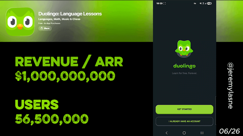
Duolingo has crossed $1B ARR. They have around 60 million monthly users and convert roughly 10% of them to paid. Their onboarding is 38 screens long. Every screen is engineered to increase what the user has to lose before the paywall appears. This article breaks down each tactic and the mechanism behind it.
Why Duolingo's Onboarding Is Worth Studying
Most mobile apps treat onboarding as a formality. A few permission screens, a quick intro, then the app. Duolingo treats onboarding as the most important revenue lever in the product.
The result: more than 10 million paid subscribers out of roughly 60 million monthly users. At scale, moving 1% more of that base from free to paid is worth hundreds of millions of dollars. The 38-screen onboarding flow is how they build the conditions for that conversion.
This is not a UX case study. It is a revenue teardown.
The Numbers First
The headline figures behind the teardown:
- ARR: $1B+ (as of June 2026)
- Monthly active users: ~60 million
- Paid subscribers: ~10 million (roughly 10% conversion)
- Onboarding screens: 38
Most founders see 38 screens and assume drop-off. Duolingo sees 38 screens as 38 opportunities to make the user feel something before asking for money. That reframe is the whole lesson.
The Full Duolingo Onboarding Breakdown
1. Deep personalization before anything else
Before a single lesson, Duolingo runs the user through a full set of questions: what language, what level, what goal, what daily commitment, what motivation. This is not padding. Every answer feeds into a learning path that feels built for that specific person.
Personalization does two things. It reduces the generic feeling that kills retention. And it creates a psychological contract: the user has invested time and shared intent, which makes leaving feel like abandoning a plan, not just closing an app.
The key question mobile app founders should ask: what do you learn about your user before they hit the paywall, and how does that change what you show them?
2. "Useless" screens that do the most work
Some Duolingo onboarding screens teach nothing. They exist to let Duo, the animated owl mascot, react to your answers, celebrate your choices, and build a relationship before lesson one.
These look like friction. They are the opposite. They are the screens that turn a tool into a character. By the time the paywall appears, Duo is not an icon, he is someone you know. That emotional attachment is what makes missing a streak feel like letting someone down. And that guilt is the retention mechanism.
Apps that skip emotional onboarding screens often wonder why their day-7 retention is flat. They optimized for speed. Duolingo optimized for attachment.
3. First lesson before the paywall
Duolingo does not show a paywall before you have experienced the product. You complete your first lesson first. You feel competent. You get a small win. Then the paywall appears.
This is the difference between a cold ask and a warm ask. A cold ask is: "pay us before you know if you like this." A warm ask is: "you already like this, keep going." Conversion rates between those two scenarios are not close.
The principle generalizes to any app: the paywall should appear at the moment of maximum value felt, not at the moment of minimum commitment invested.
4. Animated mascot and sound
Duolingo uses animation and sound throughout the flow. Duo reacts. He celebrates. He guilt-trips. The app makes noise.
Most apps are silent and static. Silent, static apps feel transactional. Duolingo feels alive. Sound and animation trigger emotional responses that text and flat design cannot reach. This is not a design choice for aesthetics, it is a retention investment.
If your onboarding is visually quiet, you are leaving emotional engagement on the table.
5. Soft paywall with no price shown upfront
When the Duolingo paywall finally appears, the first thing the user sees is not a price. It is "Try now."
Four offers are presented. Half of them are family plans. The framing is not "pay for yourself," it is "share this with the people you love." That shifts the psychology of the decision entirely. Instead of "is this worth it to me?" the question becomes "do I want my family to have this too?" That is a different conversation, with a different answer.
Hiding the price on first view removes sticker shock before the user is emotionally ready to evaluate cost. You are selling the continuation of an experience before you sell a number.
This is what a well-designed soft paywall looks like in practice: no friction before the value has been fully felt, and a framing that expands the decision beyond the individual user.
6. Re-asking permission, and getting it
Duolingo asks for notification permission during onboarding. If the user says no, they ask again later, at a moment when the user has a streak, has completed several lessons, and has something to protect.
Same for the widget.
Most apps treat a no as a permanent no. Duolingo treats it as "not yet." The re-ask works because the context has changed. On screen 5 of onboarding, the user has no investment. On day 3, after building a streak, the same permission request hits differently. Saying yes now protects something real.
This tactic requires one thing: timing. A second ask too early is harassment. A second ask after the user has experienced value is good product design.
The Core Mechanism
Every screen in Duolingo's onboarding flow does one of two things: it increases what the user has built, or it increases what the user has to lose.
By the time the paywall appears, a Duolingo user has:
- A personalized learning plan
- A completed first lesson
- A streak started
- A mascot they have a relationship with
- A notification on their phone
- A widget on their home screen
Churning means losing all of that. That is not a paywall conversion. That is a sunk-cost trigger. Duolingo does not just sell a subscription, they engineer a state where leaving feels more painful than paying.
This is the mechanism. Everything else is execution.
What This Means for Your App
You do not need 38 screens. You need to answer one question before you show your paywall:
What does the user have to lose if they leave right now?
If the answer is "nothing" (they have had no win, built no streak, felt no progress) your paywall problem is actually a pre-paywall problem. The conversion does not happen at the paywall. It happens in the 10 screens before it.
Build the loss first. Ask for money second.
FAQ
How many screens does Duolingo's onboarding have?
Duolingo's onboarding flow has 38 screens as of 2026. Each screen is designed to increase user investment or emotional attachment before the paywall appears.
What type of paywall does Duolingo use?
Duolingo uses a soft paywall. No pricing is shown on first view. The paywall leads with a "Try now" CTA and presents four options, half of which are family plans. The price is revealed only after the user engages with the offer.
Why does Duolingo ask for notification permission twice?
Duolingo re-asks for notification (and widget) permission after the user has built a streak and completed several lessons. At that point, the user has something to protect. The re-ask is timed to maximum investment, not front-loaded to a moment of zero commitment.
What is the Duolingo conversion rate from free to paid?
Duolingo converts approximately 10% of its monthly active users to paid subscribers, around 10 million paid out of roughly 60 million MAU as of 2026.
How does Duolingo use its mascot in onboarding?
Duo, the animated owl, appears throughout the onboarding flow with reactions, celebrations, and personalized prompts. The mascot builds emotional attachment before the first lesson, turning the app from a tool into a relationship. This attachment is the underlying driver of streak-based retention.
What makes Duolingo's onboarding a best practice for mobile apps?
Duolingo delays the paywall until after the first lesson, personalizes the path before it starts, and engineers sunk-cost attachment through streaks, a mascot, and re-timed permission asks. The result is a paywall that appears at maximum value felt rather than maximum friction.
This teardown is part of an ongoing series on in-app optimization. Want answers like these while you build? The tasu MCP serves the same sourced benchmarks to your coding agent, for onboarding, paywalls, and pricing.