$100K/month, 37 screens, a letter from your Future Self, and 4 paywalls if you skip them all
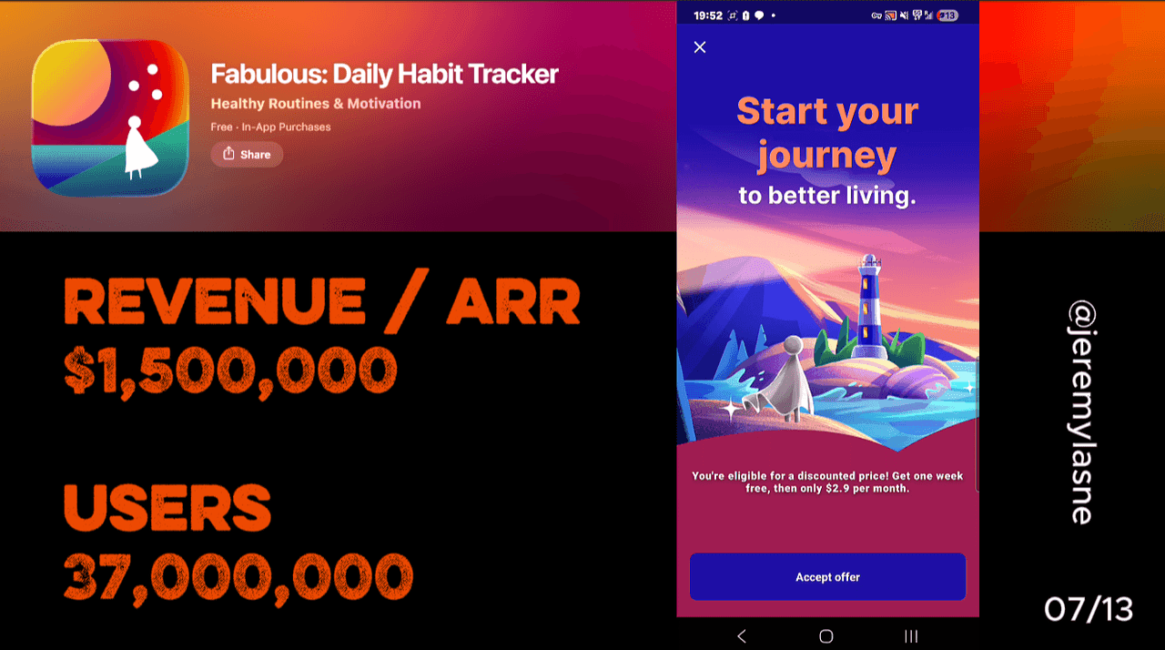
Fabulous is a habit-tracking and self-improvement app founded in 2013, built in partnership with Duke University behavioral scientists, and based in Paris. It generates $70-100K in monthly iOS revenue on 40-60K downloads a month, with in-app purchases from $16.99 to $59.99. Its onboarding runs 37 screens. Every tap has a sound. Questions are followed by acknowledgment screens. Email is required before the contract. The contract is an animated letter from the user's Future Self that writes itself on screen, and the user holds to sign. The trial explanation precedes the paywall. Paywall 1 shows annual only with a 7-day trial. Skip produces Paywall 2 (annual vs monthly, pricing so close annual is obvious). Skip again produces Paywall 3 (a deep monthly discount). Skip again produces a final "are you sure?" screen. Then a widget ask, then the in-app experience. This is the most elaborate paywall architecture in the series.
The Numbers
- Monthly iOS revenue: $70-100K
- Monthly downloads: 40-60K iOS, ~80K Android
- In-app purchase range: $16.99 to $59.99
- App Store rating: 4.7 / 5
- Founded: 2013
- Headquarters: Paris, France
- Scientific partnership: Duke University Center for Advanced Hindsight
- Onboarding screens: 37
- Paywalls in the skip sequence: 4
- Signature mechanics: Future Self letter, hold-to-sign commitment contract, Golden Ticket gifting
- Habit tracking market: $1.7B in 2024, projected $5.5B by 2033
The Design as Conversion Tool
Fabulous occupies a unique position in this teardown series. Every other app differentiates on a specific feature -- a mascot, a ranking system, an AI scan, a niche data set. Fabulous differentiates on aesthetics and emotional tone.
The design is the product. Soft gradients, hand-lettered typography, illustrated scenes of morning light through windows, animated natural textures. Users describe the app as giving them a feeling of peace from the interface alone. That is not a feature description. It is an emotional response to a visual environment.
The habit tracking market was valued at $1.7 billion in 2024, projected to reach $5.5 billion by 2033. In a market this crowded, the only genuinely scarce resource is taste. Fabulous built a brand on taste before AI optimization, before gamification systems, before behavioral nudge frameworks became standard. The visual identity is the moat.
This has a direct conversion implication. The user who downloads Fabulous is not downloading a utility. They are entering a world. The 37-screen onboarding is not gathering data. It is deepening immersion in a world the user has already decided they want to live in.
The Full Fabulous Onboarding Breakdown
Sound on every tap: the sonic identity
From the first screen, every interaction has a sound. Not a notification chime or a system beep. A designed sonic response -- warm, brief, satisfying -- that confirms each tap.
This is the only app in the series with a fully realized sonic identity baked into the onboarding itself. Rock Identifier uses ambient music. Catzy uses celebratory sounds at key moments. Fabulous uses designed sound on every interaction, turning the entire onboarding into an auditory experience rather than a visual one.
The practical conversion effect is sensory investment. A user who has heard 37 satisfying tap sounds is more engaged than one who tapped through a silent interface. Sound design activates the reward circuitry in a way visual design alone cannot replicate. Every tap deposits a small reward signal. By screen 37, the accumulated sensory experience is a form of investment no questionnaire could build.
Questions followed by acknowledgment: the conversation architecture
Fabulous runs its personalization as a conversation -- question, answer, acknowledgment -- familiar from Bend's teardown but with deeper emotional content. The questions cover sleep quality, energy levels, focus challenges, what feels hard, and what the user wants to change. Each answer is followed by a screen that reflects it back.
The acknowledgment language is designed to be validating rather than clinical. Not "based on your input, we're configuring your plan." Instead: "We understand you. You're ready to embark on an adventure." The framing is narrative, not algorithmic.
This is the Fabulous brand in miniature. Every other app in this series presents personalization as data collection for a better product. Fabulous presents it as the beginning of a story. The user is not configuring an app. They are starting a journey with a specific destination: the person they want to become.
The Duke University behavioral science partnership underpins this. The team understands that behavior change is not primarily a logistics problem -- it is an identity and narrative problem. You do not build a habit by tracking it. You build it by becoming the kind of person who does it. The acknowledgment screens are the first steps in that identity shift.
Email required: the accountability anchor
Fabulous requires an email address before the contract. Not optional. Not skippable. Account before commitment.
This is the opposite of Fishing Points' skippable account and Daylio's no-account-required approach. The mandatory email serves a specific purpose in Fabulous's architecture: accountability. A person who has given their email is a person who can be reached. Providing an email to a habit tracking app is a declaration that this person wants to be held accountable, by an entity that knows who they are.
The placement before the contract is precise. The contract is signed by a named person. That name means more attached to an email address -- a real identity in the world, not just a device session. The email makes the commitment real.
The animated contract: a letter from your Future Self
This is the most original conversion mechanic in the entire series, and the screen that defines Fabulous's identity as a product.
An animated letter writes itself on screen. The letter is from the user's Future Self -- the person they described wanting to become across the previous screens. It references their specific goals, their stated struggles, and the habits they said they want to build. It is written in the second person, from the future, looking back at the decision the user is about to make.
Fabulous builds deep user investment through a long, engaging quiz and a commitment contract where users "sign" their intention, creating strong personal buy-in before the paywall is presented. The whole experience frames the journey around a letter from the user's Future Self, turning habit-building into a personal story.
After the letter finishes writing itself, a signature line appears at the bottom. The user's name is shown above it. The instruction: hold to sign.
This mechanic combines three of the most powerful commitment devices in the series at once. Prayer Lock's written commitment. Liftoff's sustained press. Oniri's personalized projection. But none of those three use a narrative frame that makes the commitment a letter from your future self. The contract is not "I commit to practicing daily." It is a letter from the person you will be, thanking the person you are now for making the decision.
Holding to sign this letter is not filling out a form. It is answering a version of yourself that exists in the future and is counting on the present decision. The paywall that follows asks: do you want to honor that commitment?
Trial explanation before the paywall: trust architecture
Before the paywall appears, Fabulous walks the user through exactly how the trial works. Day 1: full access. Day 6: a reminder that the trial ends tomorrow. Day 7: the trial ends and the subscription begins if not cancelled.
This is the trust mechanic Liftoff uses with "we'll remind you before it ends" -- but more thorough. Liftoff says it in one line. Fabulous dedicates a screen to showing the timeline visually, step by step, before any price is visible.
The effect matches YarnPal's trial explanation screen, but positioned before the initial paywall rather than after a skip. By the time the price appears, the user fully understands the terms. The fear of an unexpected charge -- the primary emotional barrier to starting a trial -- is removed before the ask is made.
Paywall 1: annual only, 7-day trial, one CTA
The first paywall shows one option: the annual plan with a 7-day free trial. No monthly. No lifetime. One choice.
This is the rarest paywall structure in the series. Every other app presents at least two options. Fabulous presents one -- the annual plan, at a price broken down to a weekly equivalent.
The logic is behavioral: when there is only one option, the decision is not "which plan?" It is "yes or no?" That is a fundamentally simpler decision. Single-option paywalls convert at higher rates for users who are already invested, and a user who has just signed a letter from their future self is maximally invested. The weekly price breakdown is the same framing Liftoff uses: annual plans look most affordable divided by 52 weeks rather than shown as a lump sum.
Paywall 2 on skip: annual and monthly, priced so annual wins itself
If the user skips the first paywall, the second shows both annual and monthly. The pricing is structured so the gap makes annual the obvious rational choice, but the monthly option is close enough in per-month terms to feel like a genuine alternative rather than a decoy.
This is the anchoring architecture Yazio uses and the comparative pricing logic Bend uses. The monthly plan's job is not to convert monthly subscribers. Its job is to make the annual plan look sensible by providing a comparison point the first paywall deliberately withheld. There is no trial on the annual plan at this stage. The user already declined the trial offer, and showing it again would signal the trial is always available, reducing urgency.
Paywall 3 on second skip: the monthly discount
A second skip produces a materially different monthly offer -- a significant discount on the monthly plan. The architecture is similar to Flo's shake-a-tree and Yazio's spin wheel: the price that seemed fixed is revealed to have flexibility, but only for users who demonstrate price sensitivity by skipping twice.
The discount serves a specific segment: the person who wants Fabulous but is not ready for an annual commitment and was not convinced by the standard monthly price. By the third paywall this user has been through the contract, the trial explanation, the annual plan, and the annual-vs-monthly comparison. Their objection is not the product. It is the commitment level. The discounted monthly addresses that specifically.
Paywall 4: are you sure?
The fourth and final paywall is the confirmation ask. "Are you sure you want to miss out?" with a CTA to go back to the offer and a confirm-skip option.
This is the most emotionally direct skip screen in the series. It shows no discount, no mascot, no gamification. It asks a question, calibrated to the preceding 37 screens. A user who has answered questions about who they want to become, been told they are ready for an adventure, signed a letter from their Future Self, and declined three offers is being asked -- directly -- whether they are sure. The cost of clicking "yes, I'm sure" here is higher than at any other skip CTA in the series. The user is not just declining a price. They are answering "are you sure?" after a journey that was explicitly about becoming someone who does not give up on themselves.
The widget ask: between the paywalls and the experience
After the skip sequence concludes -- however many paywalls the user went through -- Fabulous asks for a widget installation. "Add Fabulous to your home screen so your daily habits are always one tap away."
The timing is precise. The user has just completed either their subscription or their decision not to subscribe. Either way, they are entering the app and looking toward the experience, not the commercial decision. The widget is not a paywall. It is a setup step for a journey about to begin.
The in-app experience: where the design earns the subscription
After the widget, Fabulous begins its first in-app experience. A morning routine screen. The first habit. The first animated completion sequence. The design that distinguished the onboarding now runs the product.
This continuity is why Fabulous retains the users it converts. Every habit completion has an animation. The daily plan is visually distinctive. The coaching content is beautifully typeset. The brand promise made in the onboarding is the brand promise delivered in the product. Users who describe the app as giving them peace through the interface alone are describing a product that delivered what the onboarding sold. The design is not a hook for conversion. It is the entire value proposition.
The Core Mechanism: Identity Before Price, Four Times
Fabulous's conversion architecture rests on one principle applied more thoroughly than any other app in this series: by the time the price appears, you are not evaluating a subscription. You are deciding whether to become the person you just described wanting to be.
The Future Self letter is the mechanism that makes this possible. It transforms the paywall from a commercial transaction into a self-fulfillment decision. The question is no longer "is this app worth $X/month?" It is "am I going to honor the commitment I made to myself?"
That question is answered differently than a price question. The four-paywall skip sequence is the same mechanism repeated: each screen asks the same question in a different register. The trial offer. The comparative pricing. The discount. The "are you sure?" Each one is a version of: are you going to do this? Some users need four asks to say yes. The sequence is built for them.
What This Means for Your App
Three things Fabulous does that most apps will never try:
- Design the sound before you design the paywall. Sound on every tap is not a premium feature. It is a sensory investment tool that works on the reward circuitry in a way visual design alone cannot. The accumulated reward of 37 satisfying tap sounds is a form of investment no questionnaire achieves. Before your next paywall optimization, ask whether your app has a sonic identity.
- Frame the commitment as a letter from the future, not a contract in the present. The Future Self letter costs nothing to write, but it requires understanding that habit formation is an identity problem, not a logistics problem. The user is not committing to using an app. They are committing to becoming someone. Your commitment screen should name who that someone is.
- Build four paywalls before you abandon the conversion. Most apps have one. Fabulous has four, each targeting a different objection: the fully convinced (Paywall 1), the price-comparing (Paywall 2), the commitment-averse (Paywall 3), and the genuinely hesitant (Paywall 4). The skip sequence is not pressure, it is targeting. The fourth paywall converts users the first three could not reach.
The Letter Closes the Paywall
Fabulous converts with a letter from your Future Self because habit formation is an identity problem, not a logistics problem. Most habit apps solve the logistics. Fabulous solves the identity. The paywall closes itself when the user realizes that saying no means answering "are you sure?" to the person they are trying to become.
If you want to know whether your own onboarding is solving a logistics problem or an identity problem -- and which one your user actually has -- tasu maps that, ranked by dollar impact.
FAQ
How much does Fabulous make per month?
Fabulous generates $70-100K in monthly iOS revenue on 40-60K downloads per month as of 2026. Combined with Android, total monthly revenue is estimated above $90K. In-app purchases range from $16.99 to $59.99.
How many screens does Fabulous's onboarding have?
Fabulous's onboarding runs 37 screens: sound-designed tap interactions, personalization with acknowledgment screens, mandatory email capture, an animated Future Self letter with a hold-to-sign commitment gesture, a trial-explanation screen, a four-paywall skip sequence, a widget ask, and the first in-app experience.
What is the Fabulous Future Self letter?
Mid-onboarding, Fabulous shows an animated letter that writes itself on screen. The letter is from the user's Future Self, the person they described wanting to become during the personalization questions. After the letter finishes, a signature line appears and the user holds to sign. It is the primary commitment mechanic and the most original conversion device in the series.
What is Fabulous's paywall structure?
Fabulous runs a four-paywall skip sequence. Paywall 1 shows annual only with a 7-day free trial. Skipping produces Paywall 2 with annual and monthly, priced so annual is obviously rational. Skipping again produces Paywall 3 with a significant monthly discount. A final "are you sure?" screen (Paywall 4) follows. Each paywall targets a different user objection.
Is Fabulous built with real science?
Yes. Fabulous was developed in partnership with Duke University's Center for Advanced Hindsight, a behavioral economics research center. Its habit-building methodology is grounded in cognitive science, including research on habit formation, morning routine design, and identity-based behavior change.
What is Fabulous's Golden Ticket feature?
Fabulous lets premium users gift premium access to friends via a Golden Ticket. This creates a word-of-mouth loop tied directly to the subscription's premium features, functioning as an organic acquisition channel built into the product itself.
What makes Fabulous's design unique among habit trackers?
Fabulous uses soft gradients, hand-lettered typography, illustrated natural scenes, and a full sonic identity where every tap produces a designed sound. Users consistently describe the app as providing emotional peace through its interface alone. The design is not decorative. It is the primary value proposition in a category where the product is a commodity and the experience is the differentiator.
This teardown is part of an ongoing series on in-app optimization. Want answers like these while you build? The tasu MCP serves the same sourced benchmarks to your coding agent, for onboarding, paywalls, and pricing.