240K downloads, 39 screens, and the interactive body map that makes a standardized plan feel built for your knee
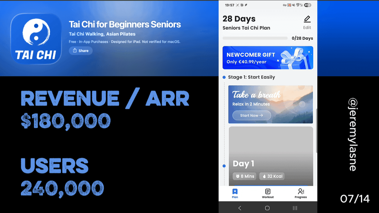
Tai Chi for Beginners Seniors is built by Fast Builder Limited, a portfolio developer running multiple Tai Chi, Qigong, and senior wellness apps with AI-generated social ad creative. The app has 240K+ downloads and 5,500+ App Store reviews. Its onboarding runs 39 screens. It opens with reviews, runs deep personalization alternated with science fact screens, includes an interactive body outline where users tap which muscles to train and where they feel pain, uses emoji mood reactions mid-flow, embeds notification timing inside a training schedule question, and loads a plan screen showing total user count before the paywall. The paywall shows the annual plan only, priced as monthly, with a 7-day trial. Skipping produces a one-time 20% off offer. This is the full breakdown.
The Numbers
- Total downloads: 240K+
- Monthly downloads: ~78K (2.6K/day average)
- App Store reviews: 5,500+
- Onboarding screens: 39
- Paywall: annual only, 7-day free trial, monthly price display
- Skip offer: 20% off, one-time framing
- Content: 28-day progressive Tai Chi plan, 7/10/20-minute session formats, 25 languages
- Acquisition: AI-generated social ads across TikTok, Instagram, Facebook
- Developer: Fast Builder Limited (portfolio of senior wellness apps)
The Model: AI Ads Into a Niche With No Competition
Fast Builder Limited is running a specific and replicable playbook. Build an app for an underserved older demographic. Generate AI social ad creative at scale -- the UGC-style videos of someone demonstrating a Tai Chi move that target "women over 60 with joint pain." Drive high-volume installs at low CPM because the demographic is underadvertised. Convert through a long, empathetic personalization onboarding that makes seniors feel understood. Repeat across multiple niche wellness categories.
The senior fitness category is one of the most valuable and most underserved in mobile. Tai Chi's core audience is adults new to the practice, often 40 and above, who need apps that accommodate limited mobility, a slower learning pace, and health-first priorities. Most fitness apps are designed for 25-year-olds who want to lose 10 pounds before summer. An app that specifically addresses joint pain, fall risk, and gentle movement for adults over 65 faces almost no direct competition.
The AI ad creative is the distribution. The 39-screen onboarding is the conversion. The niche is the moat. This is the complete modern niche fitness app model.
The Full Tai Chi for Beginners Seniors Onboarding Breakdown
Reviews first: authority before questions
Tai Chi for Beginners Seniors opens with user reviews. Real testimonials from seniors describing specific outcomes -- better balance, reduced knee pain, calmer mornings, better sleep.
This is PictureThis's authority-first opening, executed for a demographic that places exceptionally high weight on peer testimony. The senior fitness user is not a tech enthusiast who evaluates an app on its feature set. They are a person who has probably tried and quit multiple fitness programs and is cautious about investing time in something new.
Reviews from people their age, describing outcomes they recognize, reduce that caution before a single question is asked. The opening social proof does not sell Tai Chi as a concept. It sells the specific claim that this specific app produced results for people like them. Placing reviews first -- before personalization, before features, before any commitment ask -- is the correct sequencing for a trust-deficit demographic. Every subsequent screen builds on a foundation of "this worked for people like me."
Deep personalization alternated with science facts
The personalization questions cover a broad range: age, current activity level, flexibility rating, balance concerns, joint pain locations, sleep quality, stress levels, and goals (balance, flexibility, stress reduction, weight loss, social connection, fall prevention).
Between questions, Tai Chi for Beginners Seniors surfaces science screens. "Studies supported by the CDC show that regular Tai Chi practice is an evidence-based exercise that can reduce fall risk by up to 30% in older adults." A statistic about stress reduction. A note on the connection between Tai Chi and improved sleep quality in clinical studies.
These fact screens serve the same function as Flo's medical authority screens and SuperChinese's progress projections: they establish that the app is backed by real evidence, not just good intentions. For a senior fitness user who has been sold ineffective wellness products before, the science citation is the trust layer that makes the personalization feel credible.
The alternation -- question, fact, question, fact -- prevents the flow from feeling like a medical intake form. The facts arrive as interesting information rather than credential presentations, because they appear mid-conversation rather than at the start as a formal authority establishment.
The interactive body map: the most original input screen in the series
Mid-onboarding, Tai Chi for Beginners Seniors shows a human body outline. The instruction: tap where you feel pain or stiffness. Tap what you want to strengthen. The user taps their knee. Their lower back. Their shoulders. Each tap highlights the area and registers it for the personalization plan.
This is the single most original data collection screen in this entire teardown series. No other app in the series uses a spatial input -- every other personalization question is text-based, emoji-based, or multiple choice. The body map makes the input tactile and visual in a way that a "where do you feel pain?" dropdown cannot replicate.
The conversion mechanism is specificity. A user who has tapped their left knee on a body outline has communicated something much more precise than a user who selected "joint pain" from a list. And that precision makes the resulting plan feel correspondingly specific. Even if the underlying program is identical for all users, the user who pointed at their knee believes their plan was built around that knee.
"The target zone feature is brilliant -- I can focus on exactly what I want to improve," one user writes. That review describes the body map's function perfectly: it makes a standardized program feel targeted. The implementation cost is a single interactive SVG. The conversion impact is significant because it changes the nature of the personalization from "I answered questions" to "I showed the app exactly what I need."
Emoji mood reactions: emotional data without clinical language
At certain points in the personalization flow, Tai Chi for Beginners Seniors asks the user how they are feeling with an emoji selector. Smiling, neutral, sad, and variations. One tap.
This is a data collection approach calibrated to an audience that may not be comfortable with clinical self-report scales. "Rate your stress on a scale of 1-10" requires calibration. "How are you feeling right now?" with three emoji requires only recognition.
The emoji mood check-in also changes the emotional register of the onboarding at the exact moment it appears. After several questions about pain and limitations, a simple "how are you feeling?" with a smiley face provides relief. It is a moment of lightness inside a flow that otherwise deals with the user's health concerns. The data collected is less precise than a validated mood scale, but it is data the user can provide without effort, and it makes the onboarding feel conversational rather than clinical at the moments when clinical would feel heavy.
Notification ask: training schedule, then timing, then permission
Mid-onboarding, before the loading screen, the notification ask arrives inside a training schedule question. "When would you like to practice?" Morning. Lunchtime. Evening. The user selects. "We'll remind you for your next session." The system prompt follows.
This is Bend's notification-inside-habit-question mechanic applied to Tai Chi. The permission arrives in context: the user has just said they want to practice in the morning, and the notification is the tool that makes that happen. The system prompt is not asking for permission to send marketing messages. It is completing a scheduling action the user just initiated.
For a senior demographic that may be skeptical of notifications, this contextual framing is particularly important. "Allow Tai Chi for Beginners to send notifications" is a generic ask the senior user may have learned to decline. "We'll remind you for your 8am practice" is a service the senior user asked for. The language of the setup determines which version the system prompt feels like.
The graph: what you're missing, what you gain
Before the loading screen, Tai Chi for Beginners Seniors shows a graph. Not a projection of the user's future improvement -- a comparison between two states: without a Tai Chi practice and with one. The "without" column: poor balance, high fall risk, chronic stiffness, disrupted sleep, elevated stress. The "with" column: improved stability, 30% lower fall risk, reduced joint pain, better sleep, lower cortisol.
This is Oniri's projection graph and Cal AI's outcome visualization, adapted to the senior wellness context. The comparison is not the user's personal projection -- it is a category-level before/after that uses the science facts surfaced earlier in the onboarding to anchor the benefit claims.
For a senior user who has answered questions about their specific pain and flexibility concerns, this graph is not abstract. The "without" column describes their current situation. The "with" column describes what they said they want. The graph closes the logical connection between "I have these problems" and "this practice addresses them specifically."
Loading screen: user count as social proof while you wait
After the graph, the plan-building loading screen appears. While the animation runs, the screen shows the total number of users practicing with the app.
This is the same mechanic Liftoff and Flo use -- process theatre with trust signal delivery during the wait. But the specific trust signal chosen -- user count rather than medical credentials or scientific citations -- is audience-appropriate. A senior who is uncertain about technology is reassured less by ISO certifications than by knowing that a large number of other people are already doing this.
"Thousands of people are already practicing with this app" is a social proof statement calibrated to the demographic's primary concern: am I going to be alone doing this, or is there a community? The loading screen answers that before the user has even seen the paywall.
The paywall: annual only, monthly pricing, 7-day trial
The paywall shows one option: the annual plan, displayed at its per-month equivalent. The CTA: "Try for free." 7-day trial.
This mirrors Fabulous's single-option first paywall logic: one choice eliminates decision paralysis. The senior demographic is particularly susceptible to choice overload on commercial screens -- too many options produce anxiety and avoidance. One annual plan with a trial removes the decision from "which plan?" to "yes or no?"
The monthly price display for an annual plan is the standard pricing framing across the series. At the per-month rate, the annual plan looks like a small recurring cost rather than a significant annual commitment. For a user on a fixed income -- common in the 65+ demographic -- this framing matters more than in any other demographic segment in this teardown.
The 7-day trial gives the user two full practice sessions before any billing decision. A senior who does the morning Tai Chi sequence twice, feels their balance improve slightly, and gets a reminder notification has experienced enough product value to understand what they are keeping when the trial ends.
Skip: one-time 20% off
Skipping the paywall produces a single follow-up offer: 20% off the annual plan, framed as a one-time opportunity.
This is the most restrained skip offer in the series. No spin wheel. No mascot. No "are you sure?" No 72% discount. Just 20% off, stated once, with a "limited" framing.
The modesty of the discount is appropriate for the demographic. A senior user who sees a 72% discount may become suspicious -- why is the price so negotiable? A 20% discount is within the normal range of a promotional offer they have encountered elsewhere in life. It is credible. The one-time framing creates mild urgency without the aggressive mechanics that would feel out of register with an app branded around calm and gentle wellness.
The Core Mechanism: Empathy at Scale Through Specificity
Tai Chi for Beginners Seniors is a fast-built niche app driven by AI ads. It is not the most artfully designed product in this series. The onboarding flow shares structural DNA with dozens of other Fast Builder portfolio apps, and the personalization plan is largely standardized.
And yet the onboarding produces genuine feelings of being understood. The body map makes the user's specific pain point visible on screen. The emoji reactions meet the user where they are emotionally. The science facts validate the user's belief that this practice is real and proven. The graph shows the exact before/after the user described wanting.
The mechanism is precision of input, not depth of personalization. A user who tapped their knee on a body map, chose morning sessions, and saw a graph showing fall risk reduction believes the resulting plan was built for their knee, their morning, and their specific balance concern. Whether it was or not is secondary. The specificity of the inputs creates the perception of the specificity of the output.
This is the insight available to every niche app founder who cannot afford Flo's 43-screen behavioral science onboarding: you do not need 43 questions to make a user feel understood. You need one input mechanism that captures something specific enough that the user feels seen. The body map is that mechanism. For a stretching app it might be a posture assessment photo. For a sleep app, an interactive sleep window on a clock face. For a nutrition app, a plate where the user arranges their typical meal. The input that captures specificity is worth more than ten multiple-choice questions about the same subject.
What the AI Ad Model Means for Founders
Fast Builder Limited is not building products in the traditional sense. They are building conversion pipelines: AI ad creative to high-volume install to long empathetic onboarding to annual subscription paywall to the next niche app.
This model is replicable at a level of speed that traditional product development cannot match. Monthly subscription app launches have grown 7x since January 2022, from 2,000 to 14,700 per month, with the steepest iOS acceleration beginning in early 2025, coinciding with the rise of AI-assisted development tools.
AI writes the ad creative. AI assists the development. The onboarding is a template adapted to the niche. The paywall is standard. What differentiates the apps is the niche selection and the empathy calibration of the onboarding -- how well the questions and screens match the specific concerns, language, and trust patterns of the target demographic.
For the senior fitness demographic, those calibrations are: lead with peer reviews not features, use science not hype, provide spatial inputs not just text selections, frame notifications as scheduling not marketing, and keep the paywall simple and the trial credible. For your demographic the calibrations are different. The body map works for seniors with joint pain. It would not work for a Mandarin learning app. The principle -- find the input mechanism that captures something specific enough to feel personal -- transfers. The implementation depends on what specificity means for your user's primary concern.
What to Steal
Three things from this 39-screen flow that generalize to any wellness or fitness app:
- The body map. Any physical wellness app -- stretching, yoga, physical therapy, pain relief, posture, fitness -- can replace one multiple-choice personalization question with an interactive body input. Spatial inputs produce a perception of specificity that categorical inputs cannot match, and the implementation cost is one interactive SVG asset.
- Science facts between questions, not before them. Authority screens positioned before the personalization questions feel like a credentials presentation. Positioned between questions, they feel like useful information arriving in the middle of a conversation about the user's specific needs. The placement changes whether the science feels relevant or performative.
- Notification ask inside training schedule selection. Embed the notification ask inside a question about when the user wants to practice. The permission arrives as a scheduling confirmation, not a marketing request. The opt-in rate difference between those two framings is material across every fitness app that tests it.
The Input Creates the Perception
Tai Chi for Beginners Seniors converts at scale because one screen -- the body map -- makes a standardized plan feel like it was built around the user's specific knee. The specificity of the input creates the perception of the specificity of the output.
If you want to know which screen in your own onboarding is doing that work -- and which one is letting the generic feeling leak through before the paywall -- tasu maps exactly that, ranked by dollar impact.
FAQ
How many downloads does Tai Chi for Beginners Seniors have?
Tai Chi for Beginners Seniors has been downloaded 240K+ times, averaging about 2.6K downloads per day (~78K per month) over the past 30 days. It holds 5,500+ App Store reviews.
How many screens does the onboarding have?
The onboarding runs 39 screens covering reviews, deep personalization questions, science fact screens, an interactive body map, emoji mood checks, a before/after graph, a training-schedule notification ask, a plan-building loading screen with a user count display, and the paywall.
What is the interactive body map?
The body map is a screen showing a human body outline where the user taps to indicate where they feel pain or stiffness, or where they want to build strength. Each tap highlights the area and is incorporated into the personalization summary. It is the most spatially specific input mechanism in this teardown series and the feature users most frequently cite as making the app feel targeted to their specific situation.
What is Tai Chi for Beginners Seniors' paywall structure?
The paywall shows an annual subscription only, displayed at its per-month equivalent, with a 7-day free trial and a "Try for free" CTA. Skipping produces a single follow-up offer of 20% off the annual plan, framed as a one-time limited offer.
Who makes Tai Chi for Beginners Seniors?
The app is developed by Fast Builder Limited, a portfolio developer that produces multiple senior wellness apps including Chair Tai Chi for Seniors, QiGong for Beginners Seniors, and Tai Chi Walking: Weight Loss. The company uses AI-generated social ad creative to drive installs across the portfolio.
What makes the senior fitness niche attractive for app founders?
Tai Chi's core audience is adults new to the practice, often 40 and above, who need apps that accommodate limited mobility, a slower learning pace, and health-first priorities. Most fitness apps target younger demographics, leaving the 65+ user underserved by both product design and acquisition creative. AI-generated social ads targeting senior-specific pain points -- joint pain, fall risk, balance -- reach this demographic at lower CPMs than mainstream fitness categories.
This teardown is part of an ongoing series on in-app optimization. Want answers like these while you build? The tasu MCP serves the same sourced benchmarks to your coding agent, for onboarding, paywalls, and pricing.