A spin wheel after you say no
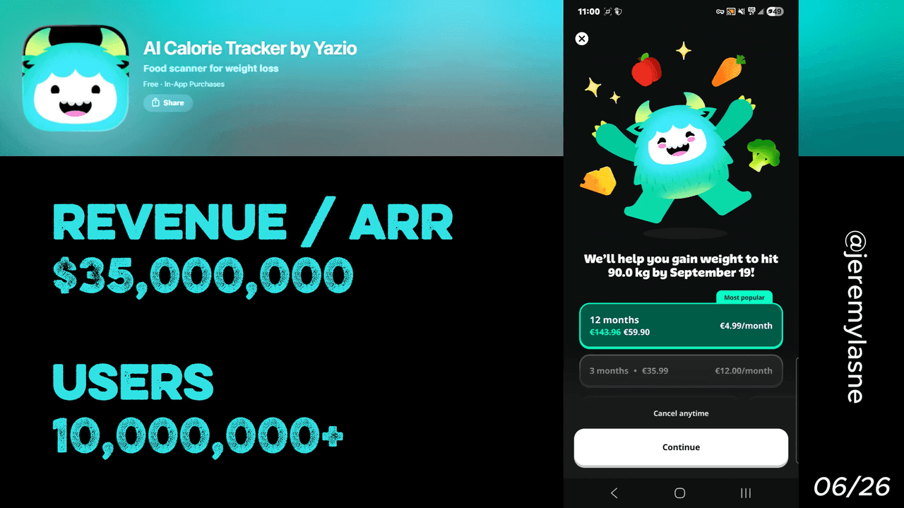
Yazio is a calorie tracking app doing $35M ARR with 10M+ users and roughly 700K new installs per month. Their onboarding runs 60+ screens. They ask for a review before the paywall while the user is still emotionally invested. If the user skips, a spin-wheel gives them 83% off and a 24-hour countdown starts. The free tier is deliberately limited. Every screen in this flow earns its place. This article breaks down each tactic and the mechanism behind it.
Why Yazio Is Worth Studying
Most calorie trackers look the same. Same features, same design language, same paywall. Yazio is not winning on product differentiation. They are winning on conversion architecture, the systematic engineering of every screen between install and paid subscription.
$35M ARR. $5M per month. 700K installs per month. A 60+ screen onboarding that most founders would call reckless and Yazio calls their growth engine.
This is a full teardown of how it works.
The Numbers
The headline figures behind the teardown:
- ARR: $35M (as of June 2026)
- Monthly revenue: ~$5M
- Monthly installs: ~700K
- Total users: 10M+
- Onboarding screens: 60+
The Full Yazio Onboarding Breakdown
Screen 1: Social proof before the first question
Before a single question is asked, Yazio shows you the numbers. App Store rating. Total user count. Real reviews. Ten million people made this choice before you.
This kills the first objection before it forms. The mental question "is this app worth my time?" is answered on screen one. Everything after that is execution, not persuasion. Most apps bury social proof in their App Store listing and hope the algorithm delivers. Yazio surfaces it at the exact moment the user is most uncertain: the first second after install.
The lesson: social proof belongs at the top of onboarding, not on the product page.
The category claim, stated twice
Yazio tells you it is the top calorie tracker in its category. Then it tells you again. This is not repetition for emphasis. It is anchoring. By the time the third screen loads, the user's mental model has already locked in: "I am using the best tool for this." That anchor holds through 60 screens of questions and makes the paywall feel like paying for the market leader, not a random app.
Notification permission on screen 3
No relationship built. No value demonstrated yet. Just: can we notify you?
The bet here is that intent peaks at install. The user just chose to download a health app. They are motivated, they have a goal, and they have not yet hit any friction. Asking for notification permission at maximum motivation, before a single slow screen or confusing question, gets a higher yes rate than asking on screen 30 after patience has worn thin.
If they say no, Yazio asks again later. The no is never permanent.
60+ screens of personalization
The survey covers goals, physical stats, activity level, past habits, weekend eating patterns, and intermittent fasting preferences. It is comprehensive in a way that would feel invasive on a form. Inside a conversational flow, one question at a time, it feels like being understood.
Each screen gives something back immediately: a motivational fact, a data point about the user's own body, a progress bar moving forward. The investment compounds. By screen 60, the user has shared more about their health than they have told most people in their life. Leaving now means abandoning a plan built entirely around them.
The key mechanism is not length. It is return on investment per screen. Every question has to either collect data Yazio uses to personalize, or give the user something back that makes them feel understood. Screens that do neither get cut.
"How did you hear about us?" mid-flow
At a point mid-onboarding, Yazio asks where the user came from. App Store search. A friend. A social post. An ad.
At scale across 700K monthly installs, this is a live attribution engine running inside the product. It shapes every ad budget decision. It tells Yazio which channels attract users who convert versus users who churn after trial. It is also a moment of perceived intimacy, the user reads it as curiosity, not a survey. That is good design.
The review request before the paywall
This is the highest-leverage move in the entire flow and the one most founders miss entirely.
Yazio asks for a rating mid-onboarding. Not after a week of use. Not after the paywall. Right now, while the mascot is cheering, while the personalized plan is being built, while the user feels understood and optimistic.
The emotional state at this moment is the highest it will ever be. The user has not seen a price yet. They have not been rejected by a paywall. They feel like the app was made for them. That is when you ask for the review.
The result is five stars. Not because the app has proven itself over weeks of use, but because the user is rating a feeling, the feeling of being understood and about to fix something. Yazio captures that feeling in a rating before reality has a chance to interfere.
The practical consequence: thousands of five-star reviews that make the App Store listing convert better for every user who discovers Yazio organically. The review ask mid-onboarding is an ASO strategy, not just a UX choice.
The mascot every two or three screens
Yazio's mascot, the small teal character, reappears at regular intervals throughout the flow. Not every screen, which would become visual noise. Every two or three, which keeps it feeling like a presence rather than a repeating asset.
Sixty screens is a long journey. Attention drifts. Fatigue sets in. The mascot's job is emotional reset: each appearance signals that this is a friendly, energetic experience, not a medical intake form. Completion rates across long onboarding flows drop sharply when the tone goes flat. The mascot is the mechanism that keeps tone consistent across a flow that would otherwise feel exhausting.
The benefits summary screen
Before the paywall, Yazio shows a full list of everything the PRO plan unlocks. Recipes. Detailed macro analysis. Advanced fasting programs. Barcode scanner. AI food photo logging. Wearable sync.
This screen changes the frame of the next one. The paywall does not present a price. It presents access to a list of specific things the user now knows they want. The personalization flow built the desire. The benefits screen names it. The paywall is just the door.
The paywall: monthly and annual, then gamified
The initial paywall is clean. Monthly plan. Annual plan. The annual is positioned as the obvious choice. No free trial on the first view.
If the user closes it, a spin-the-wheel modal appears. The wheel always lands on a significant discount, 75 to 83% off the annual plan. A 24-hour countdown starts immediately.
The psychology of winning is categorically different from the psychology of receiving a discount. A static "83% off" banner reads as a sales tactic. A wheel that you spin and win reads as luck, reward, and urgency all at once. The gamification does not just offer a better price, it creates a story: you got this deal because you were here, at this moment. That story has a deadline.
The 24-hour countdown and the deliberately painful free tier
The 83% offer badge does not disappear when the user closes the paywall. It lives in the app. Every time a PRO feature is locked, the badge is visible. The countdown is running.
The free tier is functional but constrained by design. The barcode scanner is PRO-only. Detailed recipe data is PRO-only. Most analytical screens are PRO-only. The limitation is not a product decision, it is a conversion mechanism. Every locked feature is a reminder of the deal that is still running out.
The free tier at Yazio is not a product. It is a 24-hour sales floor.
The Mechanism
Yazio runs two types of pressure simultaneously, and this is what separates it from apps that only do one.
Investment pressure: After 60+ screens of personalization, a mascot relationship, a review request, and a full benefits summary, leaving feels like abandoning something that belongs to you. The sunk cost is real and it was engineered screen by screen.
Loss pressure: The 83% deal expires. The badge is always visible. The free tier shows exactly what you are missing. The countdown never pauses.
Investment pressure makes the user want the product. Loss pressure makes them act now instead of tomorrow. Tomorrow, in subscription apps, is usually never.
What This Means for Your App
Three questions to ask before you finalize your onboarding flow:
- What has the user built by the time they see the paywall? If the answer is "nothing," the paywall is doing all the conversion work. Move value and personalization before it.
- When are you asking for the review? If it is after the paywall, you are asking in the wrong emotional state. Mid-onboarding, before any friction, is when users rate the feeling. That is when to ask.
- What happens when they say no to the paywall? If your answer is "they get the free tier and nothing changes," you have no second conversion flow. The spin wheel, the countdown, the persistent badge, these are a system for converting the no. Design that system.
Yazio's paywall converts because it is not one screen. It is a multi-touchpoint flow that begins when the first paywall closes and ends when the user either pays or uninstalls. Every day they stay on the free tier, the system is still running.
FAQ
How many screens does Yazio's onboarding have?
Yazio's onboarding runs 60+ screens as of 2026. The flow covers goals, physical stats, activity level, weekend habits, intermittent fasting preferences, and more. Each screen is designed to increase personalization investment before the paywall.
What is the Yazio spin wheel?
If a user declines the initial paywall, Yazio triggers a gamified spin-the-wheel modal. The wheel always lands on a large discount, typically 75 to 83% off the annual plan. A 24-hour countdown then starts, creating urgency to claim the offer before it expires.
Why does Yazio ask for a review during onboarding?
Yazio requests a rating mid-onboarding, before the paywall appears and before any friction has been introduced. At this point users are at peak emotional investment in their personalized plan. This produces significantly higher ratings than asking after a paywall interaction or after weeks of use.
What happens if you don't pay on Yazio?
The Yazio free tier is deliberately limited. The barcode scanner, detailed macro analysis, advanced recipes, and most analytics are PRO-only. The 83% discount badge remains visible throughout the free experience as a persistent conversion prompt, alongside the 24-hour countdown if it is still running.
What is Yazio's revenue in 2026?
Yazio generates approximately $35M ARR as of 2026, with around $5M in monthly revenue and 700K new installs per month across iOS and Android.
What type of paywall does Yazio use?
Yazio uses a two-stage paywall. The first offer shows monthly and annual plans with no free trial. If declined, a gamified spin-wheel appears offering 75-83% off, followed by a 24-hour countdown timer. PRO features remain visibly locked in the free tier as ongoing conversion pressure.
What makes Yazio's onboarding one of the best mobile app onboarding examples?
Yazio combines deep personalization across 60+ screens, a mascot that maintains emotional tone throughout, a mid-flow review request timed to peak user sentiment, and a two-stage gamified paywall with countdown urgency. The result is an onboarding flow that simultaneously maximizes investment, App Store ratings, and subscription conversion.
This teardown is part of an ongoing series on in-app optimization. Want answers like these while you build? The tasu MCP serves the same sourced benchmarks to your coding agent, for onboarding, paywalls, and pricing.